Circle Graphs
Round Up Your Insights
It takes a lot of work to draw comparisons in your data and discover insights. Circle Graphs provide a familiar and powerful method for visualizing data and uncovering the stories behind the numbers.
When you make a Circle Chart for your data, the most critical details jump right off the page. You’ll be finding new correlations and other insights in no time.
Google Sheets
Microsoft Excel
Free 7-day trial (no purchase necessary). Pricing starts at $10 per month.
 ChartExpo for Google Sheets is
 used by 330,000+ users worldwide!
Click this link to watch a ChartExpo for
Google Sheets single-user installation video.
Click this link to watch a ChartExpo for
Google Sheets admin installation video.
Click this link to watch a ChartExpo
for Excel single-user installation video.
Click this link to watch a ChartExpo
for Excel admin installation video.
What Is a Circle Graph?
Circle Graphs are popular, versatile visualization tools, especially when exploring how small parts contribute to a whole.
A Circle Chart is easy to read and serves a variety of analysis goals. It will quickly become one of your go-to chart types!
Learn what makes Circle Graphs so unique and effective for data analysis.
Circle Graph Definition & History
A Circle Graph describes any data visualization that displays data using circular components or axes.
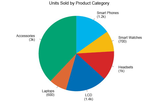
The most common example in the Circle Graph family is a pie chart. In a pie chart, multiple wedges come together to form a complete circle, just like slices of pie or pizza form a whole.
However, the Circle Graph category contains many other round charts, including the following types of Circle Graphs:
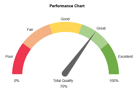
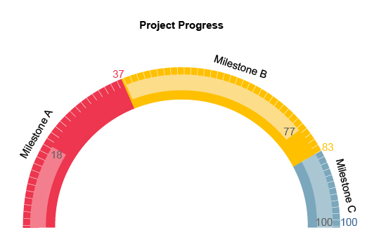
- Gauge charts
- Sunburst charts
- Polar charts
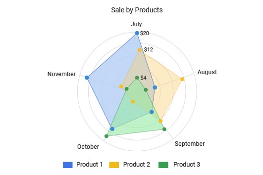
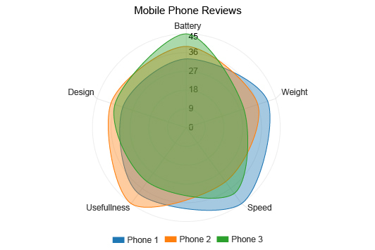
- Radar charts
- Radian charts
- Radial bar charts
- Overlapping circles charts
- And more
The credit for the earliest Circle Graph often goes to William Playfair (he also gets credit for developing bar graphs). He made a colored pie chart in 1801 to show land area.
The color of each wedge reflected the type of world power. For example, Asia was colored green to reflect it was a maritime power.
It’s unclear whether this is actually the first Circle Graph ever made, but it is the most noteworthy from this time.
Florence Nightingale should get an honorable mention for putting Circle Charts on the map with her chart, Diagram of the Causes of Mortality in the Army in the East.
Not only did she build off the simplistic pie chart design, thereby showcasing the advanced applications of Circle Graphs, but she also used her visualization to drive positive change and improve conditions for soldiers during the Crimean War.
What Is a Circle Graph Used for?
The many types of Circle Graphs and their versatile nature mean there are several uses and applications for this visualization category.
Many Circle Charts, like the pie graph, help data users compare individual parts contributing to a whole sum. Donut, gauge and radial bar charts work similarly, showing how different items perform compared to a sum or complete, 100% value.
This analysis is useful when you must determine and/or compare the best and worst values from a group.
You can also use Circle Graphs to display hierarchical data. Sunburst or overlapping circles charts are perfect for this analysis approach. Your primary categories sit at the innermost circle. Subcategories then branch out into outside rings. The colors and size of each part can reflect additional details about the nodes or levels.
Hierarchical visualizations, like the sunburst chart, are great when you want to understand relationships between many categories and subparts.
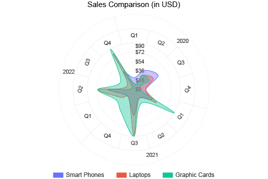
The third use for Circle Graphs is tracking performance over time. Since time follows a circular pattern (think the faces on the clock), it makes sense to use a round chart to see how data changes hourly, daily, monthly, etc.
The round axis shows the time, while the shape of the data reflects when performance is high or low.
How to Read a Circle Graph
How you read a Circle Graph depends on what type of chart you’re using and the data you’re analyzing.
For instance, reading a simple pie chart is very easy. The size of each pie slice corresponds to the value of that particular part. Thus, the largest pie piece is your most significant value, while the tiniest sliver is your least important one.
However, what if you aren’t comparing parts of the whole? Instead, let’s say you’re viewing hierarchical data in a sunburst Circle Graph. Reading this type of chart requires a different approach.
Here, larger sections still demonstrate value and significance, but the position of these sections matters more. A large section on the outermost ring isn’t the most significant piece. The circles towards the center actually demonstrate the highest elements in your hierarchy.
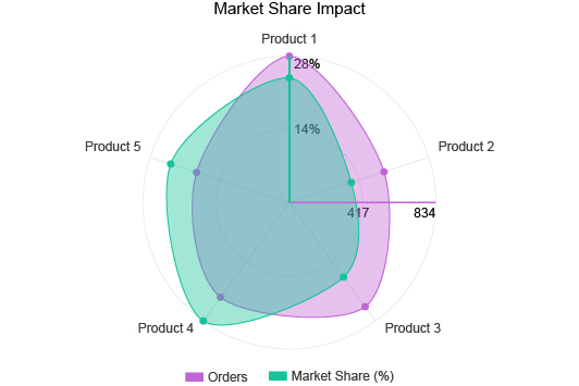
Another example is a radar chart showing performance over a week. In this type of Circle Graph, there aren’t pie slices but an amoeba-like blob showing how performance has ebbed and flowed through each day in the week.
If you’re unfamiliar with a certain type of Circle Graph, ChartExpo offers tutorials to help. You can also see a sample dataset for every visualization type, giving you insight on how to structure your own spreadsheets.
Circle Graph Examples
The best way to understand how to read and use Circle Graphs is to look at some examples. The following sample Circle Graphs will help demonstrate some of the different uses of this visualization and how to read them.
Circle Graph Example 1: Anthony owns a small bookstore. He’s rearranging the shelves, attempting to optimize his book selection to target the most popular genres.
He decides to look at his sales by genre using a pie chart. This Circle Graph will help him determine the best-selling genres that should command the most extensive sections in the store.
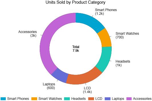
While this is a good start for Anthony, he finds some slices are too similar in value to read properly. He decides to change to a donut chart because it is easier to analyze for his needs.
With this visualization, it is clear to identify the best and worst genres for sales. Anthony can better rearrange his store using this new intelligence.
Circle Graph Example 2: Morgan is a pay-per-click advertiser using Google Ads to target searches and keywords relevant to her business.
She wants to try optimizing her results by time. Morgan knows her audience is active and more likely to convert at specific times. She just isn’t sure when.
Luckily, a radar chart can help. Morgan plots her PPC metric performance by times of the day and days of the week. These two visualizations will help her target her audience using the exact best days and hours to maximize her results.
She stops wasting her ad budget when audiences are inactive or unlikely to act on ad offers.
Circle Graph Example 3: Tom is the head of human resources for a large corporation. Sadly, uncertain times for the company has pushed a tough decision: layoffs.
As the head of HR, it’s Tom’s job to organize the employee data and make his own recommendations for the impending layoffs.
Tom decides to create a sunburst chart showing the company’s employee hierarchy. The concentric circles will show employees at every level, from ownership and executives, down to associates and interns.
So, every individual chart component represents an employee. The size of the segment corresponds to that employee’s salary. Tom also uses colors in his sunburst circle graph design to distinguish each department.
With this visualization, Tom can make his recommendations thoroughly. He can look at the innermost circles (the higher levels in the company) to determine which departments or teams require the most payroll.
Tom can also look within each level to spot overstaffed teams or employees the company is overpaying based on their position.

Types of Circle Graphs
The term “Circle Graph” describes any visualization displaying data in a circular pattern, such as Radar Charts, Gauge Charts, Donut Charts, Pie Charts and more.
It’s these different chart types of round charts that make Circle Graphs so versatile and valuable to data users.
Find out about the different types of Circle Graphs and when to use them.
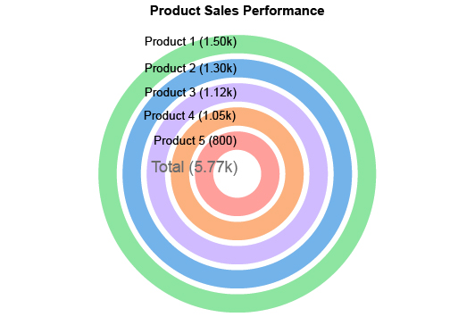
Donut Chart
Donut and pie charts share many similarities. In some instances, the two visualizations act identically and display the same type of parts-to-whole data.
The only difference is the hole in the middle of a donut chart. When you make a pie chart, you fill this space.
This leads some people to incorrectly assume the only difference between these charts is aesthetics. In reality, there are cases where donut charts read differently from pie charts.
For example, the blank center isn’t always an empty space. Sometimes it contains a label that tells you what the sum of the parts represents. If it says “Total Sales,” then you know that all of the parts add up to 100% of your sales.
The individual parts in a Donut Chart are also easier to compare. Like reading a bar chart, you compare the length of each section, instead of the total area, as you do in a pie graph.
The other benefit of donut charts is when you want to make an overlapping circles chart.
Let’s say you run an electronics store and want to track changes to your top-selling products. You can use two concentric donut charts (one inside the other) showing sales data by product for this year and last.
With this Circle Graph design, you can compare how sales have changed across each category, reflecting shifts in the most popular items in the store.
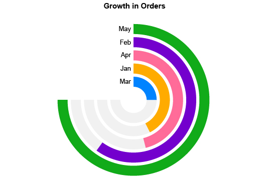
Radial Bar Chart
The radial bar chart marries the Circle Graph design with bar charts, giving you the best of both visualization categories.
The radial bar chart uses polar coordinates instead of the typical Cartesian (X and Y) plane. The value of each bar increases the longer it is. You may also see radial bar charts with a numerical scale along the outside, allowing you to estimate the value of each chart component.
For example, you want to measure your sources of inbound traffic on your website. You pull data from each marketing channel and display the results using a radial bar chart.
Let’s say Twitter was your worst inbound channel. It only produced fifteen visitors to your website. The bar for this channel will barely be past the starting position. Meanwhile, PPC ads brought 20,000 visitors.
This bar will be more extended, nearly a complete circle. You can continue evaluating the length of each bar compared to the traffic for that respective channel.
In appearance, your typical radial bar chart looks like several incomplete donut charts layered on top of one another. It also resembles the gauge chart, since most bars don’t fully encompass the central circle.
You can also use a radial bar chart to separate each part of the whole, instead of connecting them in a pie or donut chart. This helps you compare the values more accurately and gauge the best and least significant pieces.
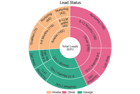
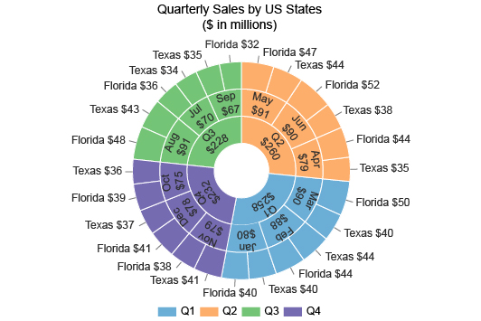
Sunburst Chart
We’ve looked at two types of Circle Graphs that primarily help with comparisons and parts of the whole analysis. Sunburst charts are a type of overlapping Circle Graphs that typically serve hierarchical data analysis.
The center ring reflects the most important parent categories. These are the roots from all other items or subcategories stem.
The next innermost ring represents one level down in the hierarchy. The third ring represents another level down in the order and so on.
Let’s say you have a huge sales team spanning across multiple regions, store locations and departments. You want to display a complete hierarchy of the sales figures for the last year.
At the center of the sunburst is your total sales. The first ring reflects the three main sales regions: Asia, Europe and North America. Colors distinguish these areas from each other.
The next ring shows sales from individual countries within the primary region. You could then have a third ring for store locations within each country and so on.
With this hierarchical visualization, you may spot performance outliers (good or bad) across the world. It’s a more organized method of displaying lots of items and moving parts.
It’s also helpful when your data has complex correlations and relationships. You may not even know how these hierarchies look until you visualize them with the sunburst chart!
Radar Chart
Radar charts are a unique style of Circle Graphs. Rather than using bars, slices, rings or another defined shape, radar graphs are amorphous and blob-like. The form of this blob depends on the values for each category or measure.
These categories influence the form and shape of the data in the middle. In this respect, the radar chart works opposite to most other types of polar graphs.
Rather than a numerical scale along the perimeter of the diagram, radar charts plot the categorical data here. Then, radians from the radar’s center act as a linear scale to measure the value of the data for each category or metric, like spokes on a wheel.
Sports use radar charts to analyze players. For example, in baseball, player scouts use the ‘five tools’ to evaluate players: hitting, hitting for power, running, fielding and throwing.
Using a radar chart, they can assign a grade for each of these tools. The shape of the resulting data tells the scout the player’s strengths and weaknesses, whether they are well-rounded, more defensive than offensive, etc.
Another popular use for radar charts is displaying performance over a stretch of time. In this case, the categorical data categories are specific times, like the days of the week or hours of the day.
You can then display sales, clicks or any other performance metric by time. The value of this analysis is seeing when exactly performance is highest and lowest. You can then strategize based on the periods when the target market is most active.
You can also layer radar plots on top of one another. By comparing the shape of each one, you can better understand the differences and similarities between the items.

How to Graph a Circle
There is significant value to gain by using a round chart. However, you need to know how to make a Pie Chart and other Circle Graphs in Excel, Google Sheets, etc. Otherwise, you won’t be able to use these visual tools to make valuable discoveries in your data.
Luckily, creating a Circle Graph is easy when you have the proper tools. Using a top-rated Circle Graph creator, you’ll transform your data into insights in just minutes.
See the best ways of how to graph a circle using your favorite applications.
Choose from the Types of Circle Graphs
Before you make a Circle Graph, you have to decide which one you should use. Is it best to make a pie chart for your data? Or, do you need something more, like a radar or sunburst chart?
It isn’t always obvious which chart is best for your data. However, there are a few questions you can ask to narrow down your options.
The most important question to consider is: What is the purpose or goal of your analysis? In other words, what do you hope to learn from your chart?
A simple pie or donut chart should suffice if you want to compare individual parts of a whole. The hierarchical sunburst chart is the better option when you have lots of parts, separated by different degrees or levels.
You also want to consider your data values. Some Circle Graphs struggle to display data with very similar values.
Let’s say you have four items in your dataset, with the values 22, 23, 24 and 25. In a pie chart, these slices will look almost identical. It won’t be immediately apparent which value is the highest, lowest and in between.
It would be better to use a radial bar graph. With this Circle Graph type, it is more evident which item’s value is the largest. Each segment is parallel to one another; you only need to look at the length of the curved bars to determine the biggest one of the group.
The more you think about your data goals and the types of information you’re trying to display, the easier it will be to select the correct chart for your data.
How to Make a Circle Graph in Excel
You already know how to make a pie chart in Excel. It’s a simple chart readily available with the program. However, you may need more preparation to create advanced Circle Graphs, like radar, radial bar or sunburst charts.
Luckily, ChartExpo makes it incredibly easy and works as an Excel add-in. You can keep using your favorite spreadsheet application. ChartExpo only helps you use it even better!
To get started, you need to download the ChartExpo data visualization tool from the Microsoft App Source site. You’ll have plenty of directions on your device to download and install the tool properly.
The next time you open Excel with ChartExpo installed, you can find the tool by clicking “Insert” from the top toolbar and selecting the app-related option from the resulting menu. In some versions of Excel, you’ll find your apps for Office under the “File” menu instead.
Once you open ChartExpo, the tool’s main chart library page greets you. You can start searching for the Excel Circle Graph you want instantly!
After selecting the Circle Chart in Excel you want, you need to add your data to the equation. You can input values into ChartExpo’s interface directly. Or, if your spreadsheet is neatly structured, you can simply highlight the data you want to visualize and create a Circle Graph based on the selection.
The last step of the ChartExpo chart creation process is the easiest. If you’re happy with your chart type and data selections, you hit the Create Chart button to finalize your visualization.
Your new visualization appears immediately. You can make soft edits, like changing colors or adjusting labels.
When the work is done, don’t forget to save your new Circle Graph in Excel. ChartExpo allows you to save any chart as an image or PDF file, making it easy to attach to any email, document, etc.
How to Make a Circle Graph in Google Sheets
Want to use the ChartExpo chart creator online? ChartExpo is also available to make Circle Graphs in Google Sheets.
Again, you probably already know how to create a pie chart in Google Sheets, but ChartExpo is here to help you make other Circle Graphs and save time and headaches!
The process is not much different from using ChartExpo to make a circular graph in Excel. The biggest difference is how to download ChartExpo for Google Sheets.
This time, open your Google Sheets page and move your mouse over “Extensions.” Continue using your mouse to navigate to “Add-ons” and “Get add-ons.”
This will open the Google Workspace Marketplace, where you can search and download ChartExpo for Google Sheets. Use the on-screen instructions to complete the installation.
The next time you open Google Sheets, you’ll find ChartExpo in the same “Add-ons” menu you just used.
From here, you’ll follow the same instructions as before. You’ll search and select a chart type, add your data and then hit the Create Chart button.
ChartExpo does the rest. You can actually create a chart in Google Sheets with just three clicks! It’s all thanks to this intuitive data visualization tool and Circle Graph maker.
Remember to save all your Google Sheets pie charts, sunbursts, radar graphs, etc. This will make it easier to communicate your visual analysis findings later.
Perfecting Your Circle Graph Design
Once you make a Circle Graph, there are subtle ways to improve the visualization.
Perfecting your Circle Graph Design will make your visualizations more engaging to audiences. You’ll hold everyone’s attention and interest during your next report or presentation!
Sometimes, design elements make the chart (and data) easier to understand.
For example, colors are your best friend when working with hierarchical data. You want to ensure each “family” or cluster uses the same color. Otherwise, it will get confusing which parts belong with each root node.
You can also use different shades or transparencies to differentiate significant items from less important ones.
This is a great design strategy when presenting charts to others. You can use bright colors to make the most critical details stand out. Then, the viewer’s eyes will go to the components you want them to see.
Your chart labels may also require some attention. Since everything in a Circle Graph is on a curve, displaying labels can be a challenge. The best solutions are to include a key that tells the viewer what each component means and use shorter label titles when possible.
The last thing to consider when refining your design is whether or not to overlap Circle Charts to add more detail. Maybe you’re showing two Circle Graphs in a report, asking the audience to compare the results of each to see how the data changed.
Why not use one chart instead of two? Not only will it save you space in your reports, but it’s also easier to draw comparisons with an overlapping Circles Chart.

Advantages of Circle Graphs
With so many ways to use Circle Graphs, this visualization type has many powerful benefits waiting to be utilized.
The structures of a Circle Pie Chart and similar visual models allow you to effortlessly compare pieces of data to determine the most and least significant parts.
Explore why data users rely on Circle Graphs for their complex datasets.
A Familiar Chart Type Audiences Know
When presenting data findings to others, you want to be able to speak their language, right? You may be very comfortable talking raw figures because you work with the numbers daily. The audience does not.
This is one of the reasons we use charts to present findings and insights. However, even charts can be difficult to read when the audience is unfamiliar with them.
If you show a complex or unfamiliar chart, you’ll spend more time explaining the visualization than the audience will analyzing it.
The bottom line is simple; confusing charts aren’t engaging and will deter people from looking. That’s the exact opposite of what you want!
The popularity of Circle Graphs helps you avoid this issue when using these chart types. People are familiar with pie charts, donut charts, etc.
Thus, they are comfortable interacting with the visuals and understanding their meanings. There is no explanation necessary!
You may even find the audience gravitating towards familiar charts first. When designing reports and data presentations, you can use this detail to your strategic advantage.
Plus, even the more complicated Circle Graph models, like the sunburst or radar diagrams, use many of the same principles. This means the audience will pick up on how to read these charts very quickly.
You can’t go wrong with Circle Charts!
Make Parts of the Whole Comparisons In Less Time
The most common use of Circle Graphs is comparison analysis. Typically, you compare individual parts and how they contribute to a sum or whole.
Circle Graphs are excellent for this analysis because a whole circle is a great representation of a total sum. Each sectioned slice or part, depending on what type of Circle Graph you’re using, perfectly shows the individual components and their contribution to the whole.
When you match the perfect chart to your analysis needs (in this case, parts of the whole comparisons) insights and understanding occur almost immediately.
This is why many analysts rely on Circle Graphs for dashboards and reports. They just work. And, they are tight and compact, giving you insights in an even more concise manner than bar charts and other visualizations.
Agile visual analysis isn’t just a convenience or time-saver (although those benefits are certainly worthwhile).
When you extract insights from your data in less time, you have more time to react and make the necessary changes or decisions.
Let’s say that your Circle Graph reveals you’re losing money in a vital area of your business. That’s a huge red flag, right? The longer this issue goes unnoticed, the more potential loss you’ll face.
When you have a Circle Graph immediately showing you this issue and allowing you to resolve it promptly, you can mitigate the risk entirely.
In short, the faster you can act on your data, the more value there is to preserve or gain.
Circle Graphs Can Include Multiple Datasets
Charts have the exceptional ability to distill lots of information and present it in a more digestible format.
You can take a wall of numbers from your spreadsheet and reduce it to one simple chart.
This is why visualization is so vital in a data-driven world. You need to be able to acquire insights at a glance. A rigorous, raw analysis takes too long to be applicable in every scenario. Not to mention, it’s incredibly tedious.
With Circle Graphs, you can include more than one dataset in your design — an added benefit of their ability to present lots of intel with a single visual.
Overlapping Circle Charts, sunburst diagrams and even radar charts allow you to merge data from multiple sets into one visualization.
The advantage is that you pack more stuff —more data— into one chart. This makes your visual analysis process richer with potential insights.
You’re not only seeing the story behind one dataset, but two and how the pair interact with one another. It gives you a complete picture, rather than just a single snapshot.
Again, there’s an element of time efficiency. If you can do and see more with a single chart, you save energy for more critical tasks and have the agility to address any issues or opportunities in the data proactively.
That said, there is a tipping point. Including too much data in a single chart can drastically decrease its readability. An overwhelming chart is just that. It becomes too difficult to process properly.
As you’re adding multiple datasets to your Circle Graphs, be weary of whether the chart is still concise, engaging and readable.
Different Circle Chart Types Offer Supreme Versatility
Aside from being a powerful and familiar chart type, Circle Graphs are also highly versatile.
As mentioned in previous sections, there are many types of polar graphs, each with its own advantages and best uses.
This enables the Circle Graph category to fulfill many analysis goals, depending on which chart you use.
For instance, if you need to conduct a comparison analysis, any overlap Circle Chart, radar or radial bar chart will work. When those comparisons are parts of the whole, use the same options minus radar.
Have data in a hierarchical structure? Sunburst Circle Graph is the answer.
The beauty of such a versatile charting category is you can always rely on it for your analysis needs. Like a carpenter’s hammer, you have a go-to tool for every data project.
Circle Graphs carry many similarities besides being round charts. Once you master the rules and principles behind one of these visualizations, you should have a solid handle on the rest.
These charts are also versatile because of their shape and size. A Circle Graph’s design is compact, meaning it can fit into tight spaces in your reports.
Bar and line graphs don’t have this benefit. Their square axes and scales require more space, making them harder to squeeze into concise reports.
Often, you don’t need as many labels or scales in Circle Graphs. This is the reason why round visualizations are a favorite for developing dashboards. You can easily arrange multiple round charts next to one another and not waste space or overload the viewer.

Why ChartExpo Is the Best Circle Graph Maker
With so many visualization tools available, what makes ChartExpo the best tool for making circular charts in Excel and Google Sheets?
Simplicity.
You won’t find another Circle Graph generator as straightforward and quick to use as ChartExpo. Stop fussing with clunky, complex tools.
Experience the ChartExpo difference and start making professional Circle Graphs today.
ChartExpo Library Includes More Chart Types Than Ever Before
ChartExpo is a powerful data visualization tool with a robust library of different chart types ready to transform your data into insights.
It’s much more than just a Circle Graph maker. You can make any type of chart you can think of with just one tool. And, ChartExpo’s team is adding new visualizations all the time.
ChartExpo offers more than twice the charting options of Excel or Google Sheets. You can effectively double your visualization arsenal with ChartExpo.
Thus, you’ll never need to download another chart template or tool again. You’ll already have every visualization you need (and more).
It’s not just a matter of convenience. Having more charts can also help you conduct a more thorough data analysis and extract greater insights.
Remember, you can display the same data using more than one chart. Each unique visualization presents a new perspective on the same data. In other words, each chart adds to your understanding of what’s happening behind all the numbers and figures.
ChartExpo’s visualization gallery and straightforward chart creation process enable you to view your data using several different graph types.
In minutes, you’ll have seen your data from every valuable angle, maximizing your insights and understanding. You’ll also determine which visualizations effectively present your findings in reports.
Create Circle Charts in Minutes, with as few as Three Clicks
ChartExpo simplifies the charting process down to the three most essential parts:
- Selecting your data
- Choosing a chart type
- Creating your chart
You already have your data, which removes one of these obstacles. With ChartExpo, you can simply highlight the areas in your spreadsheet you wish to visualize.
This makes it exceptionally easy to incorporate your data into whichever chart type you select.
The real challenge is knowing what visualization best matches your data and analysis goals. You have many options to choose from, even in the category of Circle Graphs.
This decision gets even more challenging when you’re also considering different types of bar charts, line graphs, etc.
Luckily, ChartExpo has a few tools to help you. First, you can search any chart type by name, allowing you to see the visualizations you want to use quickly.
If you aren’t familiar with a chart type, you can view a sample dataset for each visualization. This will help you structure your own data and troubleshoot any issues during the final chart creation.
Creating the chart itself is actually the easiest step in the entire process. You only need to click the “Create Chart” button.
ChartExpo does the rest.
Essentially, ChartExpo enables you to create insightful charts in only three clicks. You click to highlight your data, click on the chart type you want, and click “Create Chart.”
ChartExpo Requires Zero Coding to Make Visualizations
The ChartExpo system should seem obvious. After all, what else do you need to make a chart? Unfortunately, very few pie chart makers and data visualization tools use such a straightforward process.
Other charting software tools and so-called ‘best data visualization’ solutions incorporate unnecessary steps.
These steps are cumbersome and time-consuming, hurting your chances of achieving agile charting and analysis.
The most common offender in the unnecessary step category is scripting. Many visualization tools provide additional chart types through the use of script templates.
These bits of code require you to edit the script templates with your own data, labels, etc. If you don’t have experience writing code or using a programming language, this step becomes as tedious as it is unnecessary.
The reason for scripts in data visualization has to do with how programs like Excel or Google Sheets allow you to create custom charts and other advanced visualizations. You can’t insert these foreign chart types into your favorite programs without these scripts.
So, doesn’t that make scripts a necessary evil in data visualization? Not quite.
When using ChartExpo, you never have to interact with any scripts or coding. As you interact with the tool’s menus and settings, ChartExpo automatically updates the script in the background.
So, while it is still using script templates, you never have to see a bit of code to create charts. This saves tremendous time and headaches, enabling you to make charts faster than ever.
Improve Your Data Communication and Culture
The direct impact of using one of the best data visualization tools is clear: you more effectively translate raw data into visual insights and understanding.
However, other positive effects occur from using a tool like ChartExpo, such as improved data communication.
Reports using ChartExpo visualizations stand out to clients and stakeholders. These audiences will love your improved charts and how easy it is to “see” their data.
When you have a tool as straightforward as ChartExpo, charting becomes accessible to everyone —not just the select few with coding experience.
This encourages more people to participate in the analysis process, interact with their data and make insight-driven decisions and changes.
Over time, you'll witness a profound change in your company culture. Collaborative conversations start occurring between departments about the latest insights.
Instead of separating from one another in data silos, teams begin brainstorming together on the best data-driven strategies.
It’s this type of organizational culture that uses data to gain a competitive edge in the Digital Age. ChartExpo’s visual insights eliminate guesswork and opinion-driven arguments, replacing them with creative brainstorming and data-informed decision-making.
Once you make charting accessible to more individuals, you’ll see the transformation in culture happen. It all starts with ChartExpo.
ChartExpo Pricing
ChartExpo for
Google Sheets
$10*
per month
(no purchase necessary)
*pricing starts at $10
per user per month.
Only in-app purchase available
ChartExpo for Google Sheets
single-user purchase video.
ChartExpo for Google Sheets
domain-users purchase video.
ChartExpo for Google Sheets
single-user installation video.
ChartExpo for Google Sheets
admin installation video.
ChartExpo for
Microsoft Excel
$10*
per month
(no purchase necessary)
*pricing starts at $10
per user per month.
Only in-app purchase available
ChartExpo for Excel single-user
purchase video.
ChartExpo for Excel domain-users purchase video.
ChartExpo for Excel single-user
installation video.
ChartExpo for Excel admin
installation video.
Custom Pricing
Blogs
How to Conduct a Profitable Crypto Chart Analysis?
Click to learn how to conduct a productive Crypto chart analysis. Also, we’ll address...
Top 5 Different Types of Charts for Representing Data
Click to discover the different types of charts for representing data in businesses and workplaces.
How to Use a Radial Chart Maker to Visualize Data?
Click to learn how to get started with a Radial Chart maker. We’ll also address...
How to Create IELTS Band Score Charts?
Click to learn how to visualize data with IELTS Band Score Charts?
How to Create Sunburst Graph Using Sunburst Chart Generator?
Click to learn the best Sunburst Chart generator you can use to create…
