Slope Chart
Compare, Rank and Track with One Chart
You can gain a lot of value by looking at the difference between just a couple of data points, even only two. This is the design behind Slope Charts.
Slope Charts’ simple and concise design delivers actionable intelligence in a highly efficient format perfect for reporting.
Find new insights by eliminating complexity with simple Slope Charts.
Google Sheets
Microsoft Excel
Free 7-day trial (no purchase necessary). Pricing starts at $10 per month.
 ChartExpo for Google Sheets is
 used by 330,000+ users worldwide!
Click this link to watch a ChartExpo for
Google Sheets single-user installation video.
Click this link to watch a ChartExpo for
Google Sheets admin installation video.
Click this link to watch a ChartExpo
for Excel single-user installation video.
Click this link to watch a ChartExpo
for Excel admin installation video.
What Is a Slope Chart?
A Slope Chart is a simple line chart used to investigate data between two instances or track shifts and changes over a few points in time. The Slope Chart is also called a Slopegraph.
Compared to other line charts, Slope Charts are more concise. They strip away many of the unimportant details, allowing you to focus on the changes and insights.
Learn how Slope Charts work and help you rank items, detect significant changes and more.
History of the Slope Chart
In 1983, Edward Tufte published a book called The Visual Display of Quantitative Information. In this publication, he introduced a “Table-Graphic,” which he later renamed a Slopegraph.
Tufte wanted a simple diagram with the purpose of showing “a progression of univariate data among multiple actors over time.”
Essentially, he wanted to make a concise chart to show the change of a single variable across multiple items over time.
Tufte’s Slope Chart was more slimmed down than a typical line graph. We’ll look at the various components of how to make a Slope Graph in the following sections.
Tufte can’t take all the credit for this chart. Two crucial components made his work possible: the slope formula and the line graph visualization.
For the slope formula, credit goes to Rene Descartes. Slope measures how sharply a line inclines or declines between points. A significant slope suggests a more dramatic change.
Credit for the creation of the line graph goes to William Playfair. He published a lengthy titled work that included not only the first line graph, but also the first bar chart.
Playfair is known as the father of charting because of his work on different graphical methods of displaying data. Almost all chart types owe Playfair some amount of credit for his early groundwork in the field.
Definition of a Slope Chart
Tufte’s explanation of a Slopegraph as a “progression of univariate data among multiple actors over time” gives us a pretty good foundation to work with when defining this type of chart.
That said, there are some instances of Slope Charts that don’t fit this definition because of how the chart type has evolved.
An easier way to think about Slope Charts is a way to show developments or changes between points, like two instances of time or another dimension.
Many Slope Charts focus on just two points. You may see other definitions of Slope Charts that directly say it is a comparison between two points in time. However, this is not correct.
You can use Slope Charts to show changes between several instances, similar to how a traditional line graph presents data.
The difference is that the Slopegraph focuses on the direction of changes and significance of those shifts, rather than the complete evolution of the data.
Time is another element that many Slope Chart definitions include, but it is not a necessary component. For example, you could make a Slopegraph to rank keywords based on clicks and conversions.
If a keyword ranks high on the clicks side of the Slope Chart, but low on conversions, it suggests an expensive, non-converting search term.
This is a case of a Slope Chart that doesn’t use univariate data. We’ll look at more examples of Slopegraphs in a later section.
How to Read a Slope Chart
Since a Slope Chart shares many similarities with a line graph, reading this visualization should come very naturally. That said, the appearance and design of Slopegraphs are slightly different.
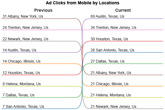
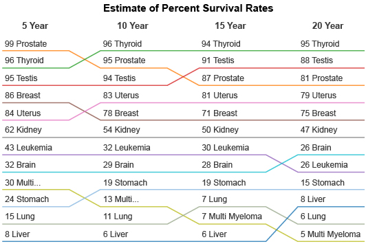
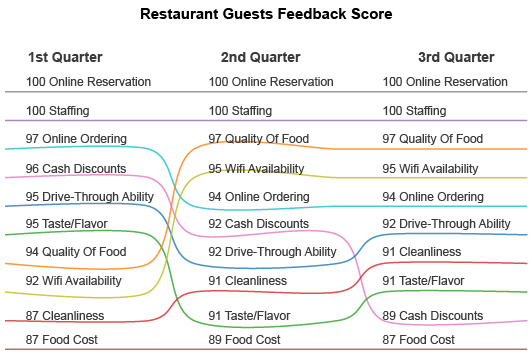
Slope Charts use parallel vertical axes to represent two instances in time or differing variables — whatever you’re hoping to track or compare in your visualization.
Each individual item appears on both of these vertical axes. However, the order will change, which is why Slope Charts are excellent at displaying changes in rankings or significance.
For example, you have a Slopegraph showing the difference in sales across five store locations between 2020 and 2021. Along the right vertical axis, displaying data from 2020, Store 1 had the best sales, followed by Store 2, 3, etc.
On the opposite axis, representing sales from 2021, the order changes. Now, Store 3 is at the top, followed by 1, 4, 2 and then 5. This shows how each location’s performance and ranking has changed between these two years.
The lines between each store help show whether a store has improved, declined or stayed the same. For instance, the line for Store 3 will have a steep incline because this location went from an average, middle-of-the-pack performer to the top earner.
In some Slopegraphs, these lines purely show changes in rankings, while other charts use the slopes to express changes in value.
Remember, properly labeling your Slopegraphs will ensure you and others read them correctly and understand the meaning behind each component.
Slope Graph Examples
There are many ways to utilize Slope Charts. To better understand how this chart type may provide value to your own visual analysis projects, let’s look at some examples of Slopegraphs.
Slope Graph Example 1: A competitive sales team uses a Slope Chart to show how each person’s individual sales performance changes each quarter.
Not only does this chart help the team understand how sales fluctuate throughout different times of the year, but the rankings also create healthy competition between each seller.
If a particular salesperson continues to lose or gain ranking throughout each quarter, the team can investigate further. They’ll correct recurring issues and capitalize more on continued successes.
Slope Graph Example 2: George is a pay-per-click advertiser who wants to optimize his search campaign to only include the keywords with the highest returns.
He uses a Slopegraph where one vertical shows the costs for these keyword investments and the other shows the total conversion values.
With this Slope Chart, Paul can quickly identify his most valuable keyword prospects. He only has to look for terms low on the ranking for costs and high on total conversion value. Thus, any line with a significant upwards slope is a valuable target.
The simplicity of the Slopegraph enables him to chart many keywords in a single data visualization and detect the ones with the best returns.
Slope Graph Example 3: Mr. Fit is a high school gym teacher. After the latest fitness test, he discovers a troubling spike in obesity among students of all ages.
He wants to present his findings to the school board and push for healthier options in the cafeteria. He hopes that this will cut down on obesity in the school.
Mr. Fit decides that a Slope Chart is the best way to show the comparison of obesity rates from 5 years ago versus now. Each item shows obesity percentages for each grade and gender of students.
With his Slope Graph data visualization, Mr. Fit can clearly showcase that obesity percentages are on the rise, across the board. Thanks to his Slope Chart, the school board quickly approves his new health initiative!

When to Use a Slopegraph
The Slopegraph data visualization has many of the same uses as a standard line chart. It is incredibly versatile and serves many analysis methods.
You can use a Slope Graph Chart to compare data across two points or show trends over time using more than two instances. Thus, you can use Slopegraphs to show shifts, before and after views, rankings and more.
See all of the ways Slope Graphs provide value and insight.
You Need to Chart Lots of Data Items
When working with a small dataset, it’s easy to detect and analyze changes over time. It’s a much different story when you have several items in play.
Slopegraphs excel at displaying many data items using only a single chart. There are a few reasons behind this.
First, line graphs are already proficient data visualization tools for larger datasets because the lines themselves take up very little room. This makes it easy to include several items in a limited space.
Slope Charts are even better in this respect because they offer a more concise way of displaying the information that uses fewer chart components. This saves more room for showcasing your data items.
Another unique component of Slope Charts is that data labels appear horizontally. In other line graphs, they appear vertically or staggered under the X-axis.
Not only does this compromise the readability of those labels, but it can actually limit how long they can be and how many you can include. Otherwise, the text begins to overlap and becomes too cluttered to read.
Horizontal labels show the titles in the way we naturally read text. Plus, it is easier to display longer names without the text becoming unreadable.
In short, Slopegraphs are excellent visual analysis tools for tracking changes and comparing results in datasets with many unique items.
Tracking Changes Over Time
Arguably the most common use for a Slopegraph is to look at changes between two or more points in time.
Each vertical axis in your Slope Chart represents your data items at a different point in time. The position on the scale shows how performance changes between each period.
For example, you could use a Slopegraph to look at how sales for certain items change between 2017 and 2022. In these five years, consumer interests are bound to shift. The “best-selling” products of 2017 are likely not the same in 2022.
The Slope Chart will show you which products have gained and lost interest, giving you clear insight into the most sought-after items and the ones you should be pushing marketing campaigns to sell today.
There are many other ways to apply Slopegraphs to track results over time. It can be a useful way to make a before and after picture regarding a significant change in strategy.
An online business might overhaul its website, including a new design, fresh copy, more features, etc.
A Slope Chart can help test the effectiveness of this change across all of their site pages. Every page should show an increase. If there are any that stay stagnant or decline, the team can investigate why these parts of the website are suffering.
Ranking Items by Value or Significance
Charts that order items by frequency or significance carry immediate value. It tells you the most and least critical things in your dataset.
Even without the links between each vertical axis, Slopegraphs would still provide some insight simply by showing you the order of your items, especially when you’re working with a substantial dataset.
Slopegraphs go even further by depicting how these rankings change between instances. Not only does this ensure that you’re always aware of your most and least important items or factors, but it also helps you detect when shifts occur and change the order.
For example, a competitor analysis aims to show you businesses in the same space and how you stack up to these competitors.
However, these companies, like everything else, are constantly changing. New businesses enter the space and old ones leave. This means that your most serious competitors are never set in stone.
A competitor analysis Slope Chart can help you monitor your position in the market and how other competitors are moving up or down. Your biggest competitor one day can easily be replaced the next.
Ranking data and tracking changes to this order are also valuable for strategizing your digital marketing efforts. You can see how performance evolves for different channels, keywords, audiences, etc., giving you the chance to optimize your efforts to match the best strategies.
Compare Results between Two Related Measures
Most Slope Charts show changes over time, meaning the vertical axes represent different periods. However, another use for Slopegraphs is to compare results over two metrics that share a correlation.
This approach to using a Slope Chart enables you to understand how one variable impacts another. It will even give you insight in how to optimize one variable to improve the results of the other.
There’s a great example of this in sports. The book Moneyball (later adapted into a movie) investigated how a low-payroll team, the Oakland Athletics, was able to continuously compete and win against teams like the New York Yankees, despite having a fraction of the same budget.
A fan took this concept and used a Slope Chart to graph every team’s win-loss records versus their payrolls. Teams that ranked high for wins and low on salary effectively implemented “Moneyball” strategies.
However, teams with a low record and high payroll represented a ball club with poor budget utilization.
Another example is to use a Slopegraph in marketing to compare key metrics like conversions versus costs. Similar to the baseball example, this visualization would help you identify strategies with promising returns.
Again, this Slope Graph data visualization approach only works if you know these two variables have a correlation. Without this connection, you can’t guarantee that the results from one variable have any impact on the other.

Advantages of the Slope Chart
The most significant benefit of Slope Charts is their simplicity. When you can resolve complex data with a simple Slope Graph visualization, the results are astounding.
This simplicity makes Slope Charts so versatile and effective tools for data reporting. You can deliver exceptional reports that bring the most critical insights to the surface, whether you’re comparing results or tracking them over time.
Explore the powerful impact of Slope Charts in visual analysis.
Visual Analysis Always Trumps Analyzing Raw Figures
One of the most critical advantages of Slope Charts is really a benefit of any type of data visualization. It’s the ability to efficiently and more thoroughly understand complex information.
When we chart data, the onus of analysis falls primarily on our eyes. This is a substantial advantage because your eyes are one of the most effective tools for analyzing data.
In fact, we process visual information 60,000 times faster than raw text or numbers. Plus, we remember visuals longer and can recall them more accurately than numerical data.
Imagine if someone tried to describe their house to you, or even just one room. It would take lots of time to explain every detail, and you’d still have only a vague idea of what it truly looked like. However, if you walked into that space, you’d instantly know it.
This is where the expression “a picture is worth a thousand words” comes from. Well, a chart is worth a thousand numbers, if not more.
It is this speed and efficiency that makes visual analysis so crucial to analytics and big data. Without charts, making sense of your data takes too long to be of value. By the time you uncover something actionable, the data is outdated and no longer valuable.
Once you see a chart, you begin to understand the information immediately. Slope Graphs are particularly powerful visual tools because of their simplicity. You can quickly identify changes in rankings or see how data has evolved between each period.
A Concise Chart Type Ideal for Limited Spaces
When choosing between different chart types, it’s sometimes important to consider the space the visualization requires.
For instance, a grouped bar chart will require more space than a stacked column visualization showing a similar amount of data.
The space a chart requires is critical to consider if you plan to include your visualizations in reports, presentations or other communications. You may have a minimal amount of space that you need the chart to fit.
Slopegraphs work well in most limited spaces, making them ideal tools to include in these reports. There are a few reasons for this.
First, Slope Charts are generally concise visualizations. As mentioned, they remove many components that standard line graphs include, meaning there’s less stuff you need to display.
Moreover, the length of the lines in a Slope Chart doesn’t really matter. You’re mostly just concerned about the direction of the change between each axis and the steepness of each link.
So, you can resize the chart to fit even tighter spaces when necessary.
Another perk of the Slope Chart’s size is that they are more vertical than a typical line chart. This allows you to fit the data visualization in margins and other spaces that other graphs wouldn’t be able to fill.
A Slopegraph may just be the perfect-sized chart you need to polish your report!
Slope Charts Are Versatile and Serve Multiple Analysis Types
Slopegraphs have many uses, from comparison analysis to tracking changes over time and more. This means they are a highly versatile chart type that can serve many analysis roles.
A versatile chart type is always valuable because it is something you can rely on for many different analysis projects, like a favorite wrench in your toolbox.
This versatility also translates into the types of insights you can receive and what actions you may take due to your Slope Graph storytelling with data.
For instance, when looking at the changes between items over time, you can identify the new most significant performers. This insight allows you to switch your strategies to optimize for these opportunities.
Conversely, you may also detect items losing performance that are no longer worth an investment of your time or other resources.
You can also use Slope Charts as a monitoring tool for staying up to date with the latest rankings of your data. This lets you track any significant changes and take action when necessary quickly.
You can make many insights and discoveries with this one simple chart. It’s what makes the Slopegraph so powerful as a data visualization tool!
Find the Most Significant Changes in Your Data
During the analysis process, detecting significant changes and items in your data are some of the most valuable insights to discover.
A significant change typically means a major departure from what is normal or expected. For instance, if you have a product that is routinely your best-selling item, you expect it to continue selling at a high volume.
If it suddenly drops in sales, you need to recognize this dip and determine why it is happening and what to do next.
Slopegraphs focus on presenting these types of changes. You’ll be able to quickly identify how performance items are changing based on the incline or decline of each link in the chart.
The change in rankings also enables you to swiftly detect the ways your most important details shift and evolve. This is particularly useful when you aren’t sure what the best items in your dataset are.
Slope Charts’ ability to order data by value or magnitude means you can quickly assess the best and worst performers in a group, even when those rankings change.
The top items in this order will be the data with the most significant values, meaning optimizing for these values is often the most crucial activity you can perform.
Similarly, it’s also valuable to look at items at the bottom of the Slopegraph — your least significant pieces. These items may represent certain strategies that produce poor returns and need to be paused or removed.
In other cases, you may be able to intervene and improve their performance. Thus, your lowest ranked data items have the greatest potential room for improvement, which generates tremendous value for your results!

How to Make a Slopegraph
Given the simplicity of Slope Charts, you may assume they are easy to create. While this is true, to effectively make a Slope Graph online, you need some help.
To make a Slopegraph in Excel of Google Sheets, we recommend using ChartExpo. Not only does it have an easy-to-use Slope Chart template, but it is also a faster and more effective tool for Slope Graph storytelling with data.
Discover why ChartExpo is the best data visualization tool to make a Slope Graph.
Begin by Asking a Question or Stating Your Goal
To ensure the most successful visual analysis process possible, you must start with a goal. Often, this goal comes in the form of a question you want to answer by creating a Slopegraph or another chart type.
This is something you should do at the start of any analysis because it better ensures that you collect the correct data and even helps you decide which visualization to use.
Without a goal or analysis question, it’s easy to become distracted by data that seems interesting but isn’t actually valuable to your current objectives. You may start analyzing one thing and end up chasing something else.
Since your analysis goal will align with the overarching objectives of your company, it protects you against creating charts that aren’t relevant to the pursuits of your organization. Thus, you won’t waste resources on analysis projects with no value.
You’ll want to write down your goal or initial analysis question and keep it somewhere easy to access. You may need to refer back to it during different points of the analysis, like when you begin gathering data.
Keeping your goal recorded is also helpful if you pause the analysis for any reason and need to return later. You’ll be able to quickly read the objective and recall the chart’s purpose.
It also comes in handy if others join the analysis. There is no awkward phase where these individuals have to try and figure out what the chart is showing. It is clearly identified in this goal or analysis question!
How to Make a Slope Graph in Excel
Despite the simplicity of Slope Charts, it can be a little tricky to create a Slope Graph in Excel. While Excel is one of the best tools for collecting and organizing your data, its charting features leave something to be desired.
This is why ChartExpo is a valuable data visualization tool to have. It gives you access to many different chart types that aren’t available in Excel and is one of the fastest and most straightforward Slope Graph creators out there.
Thanks to ChartExpo’s straightforward approach to data visualization, you can transform a dataset into an insight-rich Excel Slopegraph in just a few easy steps.
The first step is to download ChartExpo’s Excel graph maker. You can find it on the Microsoft AppSource site.
After you successfully install the tool, you’ll need to restart Excel. When the program loads up again, click on the “Insert” menu from the top toolbar. Then, you’ll find ChartExpo either under the “My apps” or “Add-ins” submenus (it depends on which version of Excel you’re using).
If you don’t find these menu options, you may have to look for the ChartExpo add-in under the “File” tab. Again, it depends on the version of Excel you have.
Once you locate and open ChartExpo, the tool will ask you to select a chart type. Since ChartExpo’s data visualization library is so vast, you may want to take advantage of the search bar function. You can type “Slope Chart” into this field and immediately find the option.
With the Slopegraph Excel visualization selected, you now need to insert your data. You have two options for this step. You can manually enter the values into ChartExpo’s intuitive interface. Or, you can simply click and drag to highlight the data you want to visualize.
If you’re happy with the chart type and data you selected, you can click “Create Chart” to finalize your efforts and immediately see your new Slope Chart.
You can complete the entire process (aside from initially downloading the tool) in as little as three clicks.
How to Create a Slope Graph in Google Sheets
Google Sheets users will face a similar dilemma. This is another tool that is fantastic at organizing your data, but has limited charting options, meaning it isn’t the best interface for creating Slopegraphs and other visualizations.
Luckily, ChartExpo also exists for Google Sheets users!
To install this Google Sheets chart maker, click on “Extensions” from the top toolbar of any open Google Sheets tab. From the resulting submenu, hover over “Add-ons” and then click “Get add-ons.”
This will take you to the Google Workspace Marketplace, the place to download extensions and other add-ons for Google Sheets, Docs and other tools. You can search and download ChartExpo using this page.
If you return to the “Extensions” and “Add-ons” menus after downloading ChartExpo, you’ll see the tool listed and can click to open it.
From here, the process is very similar to making a Slope Chart in Excel. You search your chart name by name, select it and begin entering your data.
Again, you can do this manually or choose the faster route by highlighting the data you want to chart.
After you make your Google Sheets Slope Chart, it’s crucial to save your visualization. You can save it in most image formats or as a PDF. This makes it exceptionally easy to share your Slopegraphs via emails, reports, presentations, etc.
Less Is More When Making Slope Charts
One lesson to keep in mind when you create a Slope Graph is the old adage that less is more. While the chart enables you to include many items in visualization, you don’t want to overdo it.
This is particularly true if the data frequently changes. You’ll have so many crisscrossing links in your Slopegraph that it will be hard to unravel all these connections and draw insights from the chart.
Remember, the purpose of Slope Graph data visualization is to make the numbers easier to understand. If you develop a chart that is too overwhelming, it defeats this advantage.
Unfortunately, there is no perfect recipe for how many items you should include in your chart. Ideally, you want to find the perfect balance of having as many details as possible, without overloading the visualization.
Here are a few things to consider helping you find this sweet spot:
Who is the audience?: This is one of the most critical factors to consider. If you’re creating this chart for yourself, including more options isn’t as big of a risk. You’re comfortable with the data and willing to analyze the chart for longer.
However, if your Slope Chart appears in a report in front of stakeholders or clients, you may want to limit how many details you include. These reports need to be concise and deliver insights as efficiently as possible.
What data matters most?: Sometimes, it is best to remove some data items so the audience can focus on the details that matter most. These may be the most significant changes or the top-ranking items in the dataset.
Just be careful that the details you omit aren’t critical in understanding the chart or insights!
Include an explanation: This should be a last resort and only necessary when you have many data items and changes that you must include in the chart. You can include a brief explanation highlighting what’s happening and the key areas for viewers to focus on.
Again, this should be your last resort. Explanations tend to take away from the chart itself and can require too much reading and non-visual analysis to understand.

Why ChartExpo Is the Best Slope Graph Creator and Visualization Tool
ChartExpo brings many features and qualities to the table that other Slope Graph data visualization tools don’t.
These features enable ChartExpo to be the most accessible and effective Slope Graph creator and data visualization software.
You can go from raw data to a professional chart in as few as 3 clicks, getting you through the visual analysis process faster than any other tool.
Experience the difference ChartExpo makes.
Expand Your Number of Available Chart Types
Excel, Google Sheets and similar programs come with several preloaded chart types. This includes many of the classics, like bar charts, line graphs, pie charts, etc. Excel and Google Sheets also include some more interesting visualizations, like treemaps or candlestick charts.
These options offer a good start and can be helpful with many simple analysis projects. However, when your data grows more complex and the need for advanced charts become apparent, Excel and Google Sheets become restrictive in visual analysis.
The ChartExpo Excel add-in or Google Sheets extension fixes these limitations by expanding the number of available charting options.
In other words, ChartExpo is much more than a slope graph creator. It is a complete chart gallery that more than doubles how many data visualization choices you have.
There are several benefits to increasing your charting options. Versatility is the most obvious, but it goes deeper than that.
ChartExpo offers every chart type imaginable and the team continues to push new visualizations out as the needs of data users evolve.
This means no matter how complex or unique your data needs are, ChartExpo offers the visualization tools you need to visually analyze your data properly.
More chart types also provide deeper insight by allowing you to look at the same data from more than one angle, like looking at the same problem from a new perspective.
No More Fussing with Scripts or Coding
Adding new chart types to Excel, Google Sheets, etc., requires you to use JavaScript coding. What most data visualization tools offer is a library of prewritten script templates.
These templates enable you to enter your own data into the script and adjust certain other settings to customize your visualization.
There are several problems with these typical Slope Chart templates. The most obvious issue is the time it takes to edit these scripts and complete the coding of your visualization.
No matter how fast you are at coding, manually entering values and settings will take time. When you have many charts to make or other responsibilities, wasting precious minutes quickly becomes problematic.
If you make even a small mistake, you may have to review the script line-by-line to find the source. This adds more time to the clock and keeps you from acquiring the latest insights.
What happens if you aren’t familiar with JavaScript? Then, you face a steep learning curve as you attempt to understand how to use these scripts.
This skill gap hurts a lot of teams because it limits charting to only the individuals with coding expertise.
If this sounds like a bunch of unnecessary headaches, you’d be right. That’s why ChartExpo removes the need to manually edit these scripts.
Any change you make to your Slopegraphs (or other visualizations) in the ChartExpo interface automatically updates the script for you. You never have to interact with the code yourself.
This makes creating advanced charts in Excel or Google Sheets efficient and accessible to everyone. No more skill gaps to data visualization!
Straightforward Chart Creation Saves You Time
Removing the need to manually edit scripts and code your charts profoundly affects the turnaround times of your charts.
ChartExpo also improves chart creation efficiency by reducing the data visualization process to its two core elements: chart type and data.
This simple yet effective approach to a Slope Graph creator delivers the most straightforward way to make charts. It’s the reason you can turn complex data into compelling visualizations.
Your first click will select your chart type. Remember, ChartExpo has an extensive visualization library that includes more than twice the options of most other tools.
Next, you need your data component. ChartExpo makes it easy to simply click and drag to highlight the parts of your dataset you wish to use in your Slope Chart or other visuals.
The last click is the easiest of all. You tap the “Create Chart” button to finalize your work (after double-checking all of your other inputs are correct, of course).
Your new chart appears instantly, meaning you can get straight to the visual analysis portion and begin extracting valuable intelligence to make data-driven decisions.
You won’t find data visualization software more efficient and easy-to-use than ChartExpo.
Build an Internal Data Culture with Better Communication
The collective benefits of ChartExpo (no more scripting, faster charting, more visualization types, etc.) deliver one final advantage to your team: a solid data culture and better communication.
Eliminating the typical skill gap that exists in charting means everyone can interact with their data and make compelling data visualizations.
No longer is this activity restricted to only the handful of individuals with coding experience.
Thus, chart creation and visual analysis become common ground among all your teams and departments. This leads to more people talking about the latest data, brainstorming on new analysis projects and swapping critical insights.
With your teams freely collaborating on their analysis projects, charting redundancy stops. This means you aren’t wasting time and resources charting data or answering questions others have already asked and answered.
In other words, you remove any risk of data silos appearing, where teams only communicate findings within themselves.
Many businesses today are pushing to become more data-driven. This means acting on evidence and insights, rather than opinions or assumptions.
The foundation of a successful data-driven organization is a strong data culture. ChartExpo’s accessible, straightforward charting tool helps create this environment.
Thanks to ChartExpo, your teams will be making data-driven decisions that push your company’s overall performance and growth!
ChartExpo Pricing
ChartExpo for
Google Sheets
$10*
per month
(no purchase necessary)
*pricing starts at $10
per user per month.
Only in-app purchase available
ChartExpo for Google Sheets
single-user purchase video.
ChartExpo for Google Sheets
domain-users purchase video.
ChartExpo for Google Sheets
single-user installation video.
ChartExpo for Google Sheets
admin installation video.
ChartExpo for
Microsoft Excel
$10*
per month
(no purchase necessary)
*pricing starts at $10
per user per month.
Only in-app purchase available
ChartExpo for Excel single-user
purchase video.
ChartExpo for Excel domain-users purchase video.
ChartExpo for Excel single-user
installation video.
ChartExpo for Excel admin
installation video.
Custom Pricing
Blogs
How to Create a Slope Chart Using Slope Graph Maker?
Click to learn how to use a Slope Graph maker. Also, we’ll address...
Top 4 Text Visualization Examples
Click to learn the best text visualization examples. Also, we’ll address...

The Tested and Proven Year-over-Year Comparison Chart
Click to discover the tested and proven year-to-year Comparison Chart. Also, we’ll address...

Top 10 Types of Comparison Charts for Data Visualization
Click to discover the top ten types of Comparison Charts you can use in your data stories.
Top 5 Easy-to-Follow Data Presentation Examples
Click to learn the top 5 data presentation examples. Also, we’ll address...

