Tornado Chart
Resolve Chaos in Your Data
Tornados in nature conjure images of devastation and chaos. Ironically, a Tornado Chart does the exact opposite. It solves complex data and creates order in confusing sets of information.
Tornado Charts allow you to quickly identify the most and least significant values in your dataset. You can follow this analysis with immediate action to improve performance.
Discover what this versatile chart type can offer your business.
Google Sheets
Microsoft Excel
Free 7-day trial (no purchase necessary). Pricing starts at $10 per month.
 ChartExpo for Google Sheets is
 used by 330,000+ users worldwide!
Click this link to watch a ChartExpo for
Google Sheets single-user installation video.
Click this link to watch a ChartExpo for
Google Sheets admin installation video.
Click this link to watch a ChartExpo
for Excel single-user installation video.
Click this link to watch a ChartExpo
for Excel admin installation video.
What Is a Tornado Chart?
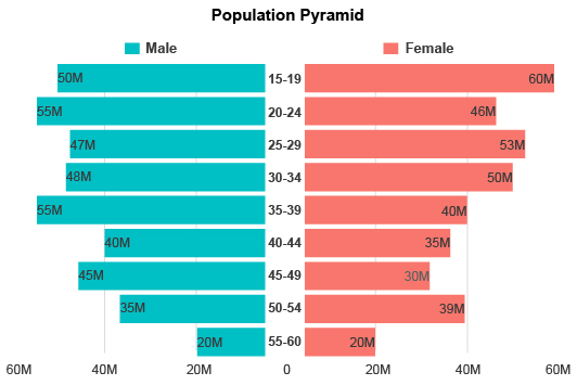
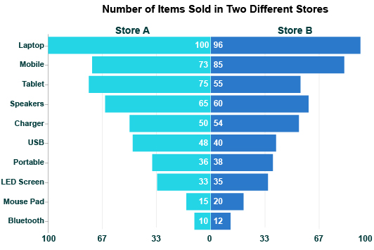
Tornado Charts are a bar graph visualization that orders data from largest to smallest. This creates the signature look of the Tornado Chart. Tornado Chart is also known as a Butterfly Chart.
Analyzing a Tornado Chart can expand your understanding of the items with the highest and lowest magnitudes.
These insights enable you to prioritize resources and optimize your strategies to achieve the best possible results.
Learn what Butterfly Charts can do for your team.
Tornado Diagram Explained
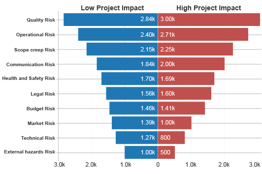
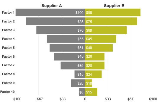
To reiterate, a Tornado Chart or Butterfly Chart is an ordered bar chart. The bars appear horizontally in descending order, with the most significant values at the top and the lowest magnitudes or frequencies at the bottom.
This creates the upside-down pyramid or tornado shape from which the chart gets its name.
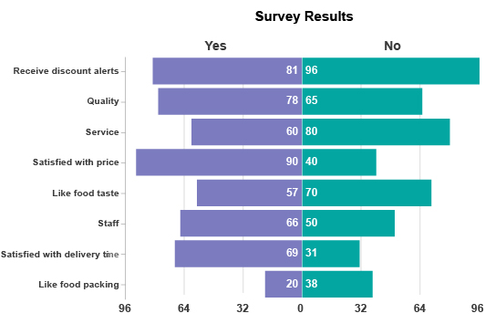
Typically, a Tornado Chart will look at two series of data across the same categories. For instance, you might use this visualization to compare sales data from two stores across each month this year.
With this analysis approach, you can identify the largest and smallest values in your dataset and compare the results over different categories and series.
Ordering the data is particularly valuable. You can start at the bottom of the visualization to see why these lower values aren’t higher on the list. There may be previously undetected issues limiting results for these categories.
Alternatively, you can start at the top and move down the list. After all, the top of the Tornado Chart reflects the most important items in your dataset.
This top-down approach is particularly valuable when using the Tornado Diagram for risk analysis or conducting a Tornado Plot sensitivity analysis.
In these cases, the biggest bars are the ones that need the most attention, while smaller ones pose no issue and don’t require any work.
We’ll further break down Butterfly Charts throughout the rest of this section and beyond. This will give you a complete understanding of how to read Tornado Charts and make sense of them.
Parts of a Tornado Diagram
A Tornado Diagram is a unique visualization that operates slightly different from more traditional bar charts.
To understand how this chart functions, it’s valuable to go through each part. This will enable you to read and analyze Tornado Diagrams effectively.
Horizontal bars: Each bar in a Butterfly Chart reflects one of the items or categories in your dataset. The length of the bar shows the value, range or frequency of each part, depending on the scope of your Tornado Diagram.
Vertical axis: Along the vertical axis are the labels for your different bars. This helps you distinguish which items belong to each chart component. When you notice something that needs further analysis, you can follow the bar to this axis to find out what that item is.
Bar color: Often, Tornado Charts show bars of different colors diverging from one another. This allows you to compare two primary categories across multiple items. Typically, you’ll have two bars heading in opposite directions, but you may have more categories you want to visualize.
You may want to include a key in your Butterfly Chart that lets viewers know what each color means.
Middle divide: In between these diverging bars is a centerline. Not only does this divider separate these bars, but it can also act as a midpoint for your scale. The range of the scale and the value of this middle will depend on your data and the type of Tornado Chart analysis you’re conducting.
Horizontal axis and range: The range mentioned above puts numbers and values behind the lengths of each bar. Sometimes, this range will go from negative to positive values. Or, it may show the same values on either side of the centerline, giving you an excellent visual analysis tool for comparing results from two separate categories.
Examples of a Tornado Chart
Let’s explore some Tornado Chart examples to show the different ways to utilize this visualization. This will also help you understand the various parts and how they work.
Tornado Chart example 1: A growing retail business has two locations and wants to visualize its monthly sales performance across both stores.
The Tornado Chart allows this team to make a side-by-side comparison of the two stores across each month.
Most chart types list each month chronologically (January, February, March and so on). Butterfly Charts list these items in order of their significance or value.
Thanks to this design element of the Tornado Diagram, decision-makers for this retail business will also identify the best and worst months from a sales perspective. This intel will help them time marketing campaigns and other strategies more effectively.
Tornado Chart example 2: A startup company is uncertain of the value and risk associated with several strategies. This uncertainty is creating a lot of discussion and arguments within the team. Everyone has their own opinion but lacks the data or evidence to support their claim.
One team member has the wise idea to create Tornado Diagram sensitivity analysis visualization. This chart will depict the impact of uncertainty on each item’s value and allow the team to determine whether there is a low or high risk for each potential change.
When they chart the data, the team finds marketing penetration and technology investments at the top of the list. This means that their inexperience and uncertainty will cost them the most in these areas.
They need to research and plan carefully to improve results in these areas. There is a high risk of overspending without the proper strategies.
Meanwhile, there is a low impact on value regarding price per unit. The team realizes the best strategy is to lower prices or offer discounts. In turn, this will drive marketing upside without nearly as much risk and increasing penetration.
Tornado Diagrams for PMP Certification
If you’re preparing for your Project Management Professional (PMP) certification, you may come across test questions regarding PMP Tornado Diagrams and wondering how it works.
The Tornado Diagram in PMP helps you locate sources of risk and measure factors that may impact the success and timelines of projects.
These factors and constraints include:
- Cost
- Time
- Quality
- Value (in terms of money, metric performance or otherwise)
- Risk
- Uncertainty
- And more
To help you with this part of your exam, here’s a rundown of what you need to know to ace the Tornado Chart PMP questions.
- Other names for Tornado Chart include Butterfly Charts, sensitivity analysis diagrams and Tornado Plots.
- A Tornado Chart is a bar graph visualization that features horizontal bars appearing on top of one another.
- Project managers primarily use Tornado Charts for sensitivity analysis.
- These charts can appear as a half or whole Tornado. A half Tornado Chart measures one dimension of data, while whole ones depict multiple dimensions.
- The bars in a Butterfly or Tornado Chart appear in descending order, with the biggest appearing at the top and the smallest on the very bottom. This gives the chart its signature tornado-like funnel shape.
- The bar at the top of the chart represents the item with the highest level of sensitivity or significance. It is the most critical variable in the dataset.
Tornado Chart sensitivity analysis makes it easy for managers to highlight the items that require the most and least attention.

When to Use a Tornado Chart
Like many types of bar graphs, the Tornado Chart is incredibly versatile. There are many ways you can apply this visualization to understand your data better and drive action.
Tornado Charts assist with sensitivity analysis, risk and project management, budget optimization and more.
With so many ways to apply Butterfly Charts to make sense of your data, this visualization will quickly become one of your favorites.
See all the ways to use a Tornado Graph to unlock insights in your data.
Determining the Most Significant Factors in Your Data
Any visualization that helps you order your datasets has immediate use for identifying the most important items.
Sometimes, you’re analyzing hundreds or even thousands of individual pieces of data. Quickly knowing the highest and lowest values is an extremely crucial insight that can lead you to making critical decisions based on your results.
Depending on the goal of your analysis, your highest and lowest values may determine what’s working and what isn’t, the best-selling items versus the worst, the highest and lowest risks, etc.
The items at the top of any Butterfly Chart always reflect the most significant factors in your data. At the bottom of the visualization are the least concerning items. The purpose of this design is to help you prioritize high-value targets.
That said, don’t neglect the items at the bottom of the chart. In some cases, these nominal values may also hold crucial insights.
For example, if your Tornado Chart shows sales for each month, you can quickly recognize your best-selling times of the year. But, investigating the times with the worst sales is also crucial.
Is there a way to bolster revenue during these low points or, at the very least, explain why sales are so low at these times?
You can use Tornado Charts to improve results throughout your data by understanding what works or has value and what doesn’t.
Sensitivity Analysis Tornado Chart
Tornado Diagram sensitivity analysis is a popular method of using this chart type. This approach tests the impact of certain factors on the performance of your data variables or items.
Since Butterfly Charts present data in an ordered list, you can use this visualization to quickly evaluate the items affected the most or least by the factor you’re measuring.
It’s particularly useful when you have a large dataset that contains many items. Tornado Charts help you navigate this volume of information with exceptional clarity.
Essentially, the items at the top of the chart (the ones with the largest bars) are your most sensitive items. This means they are affected the most by the dependent variable.
Let’s say you’re using a Tornado Chart to investigate how much time certain daily duties require to complete. The most time-intensive activities appear at the top of the chart, while the fastest tasks are at the bottom.
Thanks to this visual analysis, you’ll be able to swiftly detect which details in your data require attention and which are functioning at an acceptable range.
By prioritizing your time to resolve the most significant activities or items, you can produce the most considerable improvements to your results.
Think of it like a report card from school. You don’t improve your grades much by turning an A into an A+. Instead, you must look at your weakest marks and start improving those first.
Sensitivity analysis using a Tornado Chart works the same way. It assesses performance across all your different variables and tells you which ones need the most work.
Understanding Qualitative Issues with Tornado Chart Quantitative Risk Analysis
One of the ways that Tornado Charts and sensitivity analysis helps teams is by solving uncertainty about what to do next. Without data, you may waste time and other limited resources optimizing things or controlling factors that don’t matter that much.
You may even have instances where people are in a heated debate over what are the most effective strategies, products, investments, etc.
These discussions can slow down key processes that help your business move forward and grow.
People become so rooted in their assumptions and opinions that they refuse to budge. This damages your internal culture and may prevent your teams from seizing key opportunities.
The problem with most of these assumptions is they lack quantifiable evidence. You need numbers and data behind your decisions to ensure you’re making the correct steps and not needlessly wasting your time!
You should use Tornado Charts during these times of uncertainty or conflict. This data visualization tool injects objectivity and evidence into these conversations and enables teams to definitively know, not guess, what the next move should be.
The Tornado Chart allows you to test different qualitative variables and present the findings in a straightforward format. Even the most stubborn objectors won’t be able to argue with the evidence.
In other words, Butterfly Charts save time, reduce frustrations and arguments and allow you to steadily improve your results by focusing on what matters most.
Prioritizing Budget and Other Vital Resources More Efficiently
The reason that data and evidence are so vital to decision-making is that it prevents you from wasting money on strategies and other investments that don’t produce positive returns.
There are countless examples of businesses wasting millions of dollars on costly wrong decisions. In almost every case, companies made these decisions without the proper research or evidence. Instead, they used gut feelings and opinions to make the choices.
Opinion-driven choices only work sometimes, meaning you can’t make these decisions with high confidence. When you have data and research guiding your actions, the chance for error is much, much smaller.
Tornado Charts help you prioritize your budget and resources by showing you the factors that positively or negatively impact how you utilize these resources.
Once you can identify these factors and the magnitude they impact your resource expenditures, you can better plan and prioritize your activities. This means limiting strategies that overspend your budget or result in negative returns, while maximizing those producing positive results.
Over time, you’ll learn the best way to utilize these resources and stretch your budgets to their limits. As you maximize the results from your resources, growth will increase their availability, allowing you to pursue even greater opportunities.

How to Create a Tornado Chart
To capitalize on this visualization’s many benefits, you must first learn how to build a Tornado Chart in Excel, Google Sheets, etc.
ChartExpo is the best data visualization tool for creating Tornado Chart and other advanced charts. It’s accessible and has a straightforward interface that anyone can use to make quick, quality graphs and chart types.
Explore how to create a Tornado Diagrams and transform raw information into data-driven action.
Ask an Analysis Question to Answer
Charts are valuable tools to help you make sense of vast and confusing datasets. They can turn mind-numbing sets of data into insightful and engaging visualizations. You can genuinely make works of art with your data.
That said, you shouldn’t be spending time, money or energy making professional charts just because they look nice. You want to develop charts that are relevant and valuable to your organizational goals and objectives.
You must have a goal for each chart you make to avoid wasting resources on unhelpful data visualizations. This goal should align with your current objectives and help answer a critical analysis question.
There are a lot of benefits to having a clearly defined objective for your charts. One of the biggest advantages is helping you decide what data and chart type to use.
This is a particularly useful benefit of Tornado Charts because you may be visualizing many variables simultaneously. Your goal can help you choose which items to include in your chart, making it less overwhelming to analyze.
Another plus to setting a goal for your chart creation is it helps you remember the purpose of the analysis. If you walk away or switch to another project, picking up where you left off is easy. Other team members that join the analysis will be able to understand the intent of the chart quickly.
Collect, Organize and Order Your Data Items
While setting an analysis goal adds some time to the initial process, it becomes incredibly practical when you start collecting the data. You’ll be able to easily differentiate the data you need versus the variables you should ignore.
Collecting data sounds easy on paper. You likely already have the data stored and organized in various spreadsheets.
However, there are some dangers to be careful of when combining data to create a Tornado Chart in Excel or Google Sheets.
The most damaging issue is errors in your data. It creates a seed of the poisonous tree scenario. Any chart you make with false data is itself errored, as are the insights you extract from the chart.
If you don’t recognize errors in your data, you’ll begin making decisions based on incorrect insights. Data-driven decisions are typically made with high confidence because people trust their insights.
For this reason, you should double and even triple-check your data for errors and mistakes that could negatively impact the accuracy.
If you’re joining data from different sources, you should take additional measures to ensure these sets can “talk” to one another. You want to convert values into one unit of measure and ensure that all labels are the same to avoid miscounting. You should also be wary of duplicate data.
After thoroughly preparing your data for analysis, you can begin looking at how to create a Tornado Chart in Excel or Google Sheets.
How to Make a Tornado Chart in Excel
Knowing how to create a Butterfly Chart in Excel is vital if you want to transform your spreadsheets using this powerful visualization type.
Excel is one of the best data visualizations tools for collecting and organizing data. Plus, you can perform simple to advanced data calculations.
However, this data tool stumbles when visually presenting data for analysis. The problem is a lack of charting options and an interface that isn’t too forgiving to beginners.
Most data visualization tools, even chart makers, face similar issues. They require you to navigate script-based Tornado Diagram Excel templates, which are cumbersome to use if you don’t have a background in coding or programming languages.
This is why we recommend ChartExpo. It is the easiest way to make professional charts and Tornado Plots in Excel.
Let’s walk through how to make a Tornado Diagram in Excel using ChartExpo.
Step 0, Installing and Opening ChartExpo: You need to download ChartExpo’s Excel chart maker by visiting the Microsoft AppSource site. After downloading it, you’ll need to restart Excel. The tool will then appear under one of the top menus.
In most Excel versions, you can find it by clicking on “Insert,” followed by “My Apps” or “Add-ins.” If you don’t see these options, check under the “File” menu instead.
Step 1, Selecting the Tornado Chart Excel Template: When you first open ChartExpo, you’ll be asked to choose a chart type. You can search a chart by name or scroll through all the options until you find a visualization that matches your data.
Once you enter “Tornado Chart” into the search bar, it should be easy to find the Tornado Diagram Excel tool.
Step 2, Grabbing Your Data for Tornado Excel Visualization: Similar to selecting a chart type, you also have two ways to grab the data you want to visualize. You can click and drag to highlight the parts of your dataset you want to use.
Alternatively, you can input values into the ChartExpo interface by hand. While this takes longer, it may be the better option if your dataset is particularly large and clicking and dragging doesn’t work.
Step 3, Create Your Butterfly Chart Excel Visualization: The final step of the ChartExpo process is the easiest. Once you double-check that all your settings and data are correct, you click the “Create Chart” button to finalize your efforts.
Your new Tornado analysis Excel tool appears instantly. You can make minor edits and save it to use outside of Excel, like in emails or presentations.
Creating a Tornado Chart Google Sheets Visualization
Now that we’ve covered how to make a Tornado Plot in Excel, let’s cover Google Sheets. This is another popular data tool for organizing information into spreadsheet format.
Google Sheets features a similar to charting interface to Excel, which means it isn’t as intuitive and accessible as ChartExpo’s data visualization software.
Let’s look at how the process works for Google Sheets users.
Step 0, Download the ChartExpo Visualization Add-on for Google Sheets: Before you can begin using ChartExpo for Google Sheets, you need to download the ChartExpo add-on. To do this, you’ll need to access the Google Workspace Marketplace.
From Google Sheets, click on “Extensions” and then hover over “Add-ons.” From the resulting dropdown menu, click on “Get add-ons.” This will take you to the Google Workspace Marketplace where you can download ChartExpo.
Step 1: Open ChartExpo and Choose Your Data Visualization: After successfully installing the ChartExpo add-on, it will appear under this same “Extensions” menu. You can open it and enter “Tornado Chart” into the search bar to find this visualization.
Step 2: Enter Your Data: With the Butterfly Chart selected, it’s time to input your data. You can import your data by hand or using the same click-and-drag method of highlighting the parts of your spreadsheet you wish to use.
Step 3: Create Your Tornado Chart Google Sheets Visualization: Click the “Create Chart” button if you’re satisfied with your data and chart type.
Don’t forget to save your new Tornado Plot to use it in your reports and other communications.

Benefits of the Butterfly Chart
The many uses of the Butterfly Chart visualization produce powerful advantages for data users. Accessing valuable insights hidden behind confusing datasets is only the beginning of these benefits.
Tornado Charts will generate meaningful conversations in your organization about the best strategies to implement. This is a vital component of developing a solid data culture.
If you find yourself struggling with tedious analysis and overwhelming data sets, the Tornado Chart can help.
Experience the transformative force of Tornado Diagrams on your analysis and charting processes.
Optimize Your Time and Prioritize the Correct Things
Time is money. It’s an adage every business owner knows, understands and follows. After all, you can’t buy more time in a day, right?
Knowing the best ways and activities to spend your time is critical. Otherwise, you won’t make the most of this limited resource. Even worse, you may waste your time on dead-end strategies.
Tornado Charts can order your data and allow you to spot the activities that are worth your time. Prioritizing these items better ensures that you’re spending your time correctly and not wasting it on ineffective strategies.
You can use Tornado Charts to visualize time-based factors directly. Using this approach, you might take your sales data for each day of the week and chart it with the Tornado Diagram.
This visualization would reveal which days are your busiest or best for sales. You could also compare two years’ worth of data across multiple variables or items, like comparing year-to-year revenue for different products.
Alternatively, you can use this chart type to look at another variable, like value or costs, and then use these insights to judge how to spend your time.
For instance, you might conduct a Tornado Chart sensitivity analysis showing how a specific factor impacts costs or another variable. You can use this visual to better plan your strategies, which in turn helps you optimize how you spend your time.
Puts Qualitative Context behind Quantitative Discussions and Concerns
Businesses are increasingly pushing to become data-driven. This means that key decisions are made with quantitative numbers and figures, rather than opinions and assumptions.
However, some parts of the process still fall on qualitative details, meaning opinions and past experiences matter. Thus, what businesses should really strive for is to become data-informed.
A data-informed team uses a holistic approach that combines statistics and data with intuition and the team’s expertise. It pulls the best of both approaches to decision-making.
Tornado Charts are excellent at putting qualitative context behind quantitative data and vice versa. You can use this chart to validate your assumptions with evidence. Or, you can look at the data to discover new qualitative details worth exploring.
For instance, if sales are down this quarter, you can use a Tornado Chart to explore what factors and conditions negatively impacted revenue for this period and use these details to make adjustments moving forward.
With this holistic decision-making approach, there’s less internal turmoil. Data facilitates better (and more civil) discussions that lead to easy decisions and compromises.
No one will feel like their voice or opinion isn’t heard. Yet, you won’t be ignoring data to pursue things that lack any objectivity or evidence.
Escape Analysis Paralysis and Discover What Matters Most
Data holds plenty of value to those that are willing to take the time to turn raw numbers into actionable insights.
However, the path to these insights is wrought with challenges and potential pitfalls. One of these potential issues is analysis paralysis.
Analysis paralysis occurs for several reasons. The most direct source of analysis paralysis is when you have tons of stuff, usually data that needs analyzing. The overwhelming volume of information causes you to mentally recoil.
Analysis paralysis can also occur when you understand the data but can’t decide what to do next. You may have too many possible solutions or no clear ones. In either case, your forward progress halts and you fail to act on your insights promptly.
Tornado Charts help in both scenarios. It’s a visualization capable of presenting and making sense of large volumes of information. It simplifies even the most overwhelming datasets and allows you to understand what’s happening.
Since Butterfly Charts order items by value or significance, it’s also ideal for helping you decide what to do next.
You can simply go down the list of items and optimize results for each thing as you go. This ensures that you start with the most significant items or the ones that matter most.
With a clear path of what to do next, you’ll easily avoid analysis paralysis and fatigue.
Butterfly Charts are Versatile in Answering Key Analysis Questions
There are so many different chart types available to data users. Having one as versatile as the Tornado Chart is a great asset.
A versatile visualization means one that works for many different analysis projects. That’s exactly what you have with the Butterfly Chart.
As we’ve discussed, you can use this visualization for risk and sensitivity analysis. You can also use it for budgeting, comparison analysis, marketing optimization and more.
With so many ways to use the Tornado Chart, it’s a visualization you can return to again and again. You can use it to answer many analysis questions and uncover insights in many unique areas.
One of the ways that makes the Tornado Chart so versatile is the order that it displays data. Any visualization that orders your data by value or significance is automatically applicable under several circumstances.
Since Tornado Charts function similar to bar graphs, they are immediately familiar and understandable by all audiences. This means they are also very versatile in reporting.
You don’t have to explain how to read the chart or understand its insights. People are already used to interpreting bar charts.
There are just so many useful ways to put Tornado Charts to work for your analysis needs! It is an incredibly reliable chart type.

Why ChartExpo Is the Best Tool to Create a Tornado Chart in Excel or Google Sheets
Tornado Charts bring lots of value to the analysis process. Creating these visualizations using ChartExpo only increases this worth.
ChartExpo is the best data visualization tool and chart maker because of its straightforward system. You can make professional charts in only 3 clicks.
Other chart makers can’t match the efficiency or simplicity of the ChartExpo tool.
Step up your data visualization with the best chart creator: ChartExpo.
ChartExpo Is Faster Than Other Data Visualization Tools
Decisions need to happen quickly in today’s hyper-competitive business world. In order to back your decisions with evidence, your data and analysis need to happen even faster.
If you’re taking too long to collect, organize and analyze your data, the insights and decisions you make won’t make as big of an impact.
Think about it from a risk analysis standpoint. The longer it takes to identify and resolve an issue, the longer that problem exists and the more severe it grows.
The same is true of positive opportunities in your data. Imagine being an early investor of Apple or Google. You could have made a fortune buying shares at a low cost. Now, stocks are astronomical in price.
You want to be the first to capitalize on an emerging trend, not the hundredth.
ChartExpo offers one of the best data visualization tools for turning raw data into visual analysis aids in less time. You can create professional charts in as little as three clicks.
You click to select your chart type, click again to add your data to the mix and then one last click to finalize your chart creation. That’s all it takes!
The agility of ChartExpo’s data visualization software enables you to access insights and make data-driven decisions swiftly. There are no unnecessary settings or other hurdles to slow you down.
There Is No Coding or Scripts Involved to Make Professional Charts
One of the most significant reasons that ChartExpo allows for such speedy creation of professional charts and visualizations is the removal of scripts and coding.
What many other “best” data visualization tools offer is a library of JavaScript templates. By editing the lines of code with your own data and settings, you can create Google and Excel Butterfly Charts.
This is a common approach to data visualization. Unfortunately, it’s far from efficient because these scripts create various issues that teams may not be prepared for or want to manage.
The biggest issue is that editing these scripts, no matter how easy or straightforward they are, requires some experience with programming languages.
This creates an unnecessary skill gap in your charting, where only a handful of people can effectively use these tools to create professional charts. Some businesses have to hire a specialist to manage these visual analysis requests.
ChartExpo does use scripts in its tool. However, it does all of the editing and writing of these codes in the background. Each time you change a setting in ChartExpo’s interface, it automatically updates the script and changes how your Tornado Graph in Excel, Google Sheets, etc. appears.
Not only does this save time (even the best coders in the world can’t edit scripts instantly), but it also eliminates errors or simple mistakes, like mistypes or incorrect inputs.
Significantly Improve Data Communication in Your Business
Removing the need to edit scripts yourself makes data visualization accessible to everyone on your team. This profoundly impacts your organization’s data communication and ability to make data-driven decisions.
By creating an accessible charting environment, ChartExpo gives businesses a foundation to build a solid data culture around.
Several positive events happen when more people participate in charting and visual analysis.
For one, more chart creation leads to the discovery of even greater and more detailed insights. Your teams can use this intel to understand what’s actually happening behind all the numbers and metrics.
Thanks to everyone participating in the charting process and engaging with their data, there’s a significantly lower risk of data becoming siloed.
This occurs when individual departments or teams keep insights and information within their group and fail to share it with others.
You may even have multiple teams creating the same charts and dashboards because intel isn’t being reported and shared. Thus, ChartExpo enables you to also reduce redundancy in your data visualization efforts.
ChartExpo’s accessible chart maker creates a culture where all teams collaborate and share data findings. They even brainstorm how to best act on insights to produce the best overall results for the business.
Explore a Variety of Different Chart Types beyond the Butterfly Chart
Tornado Charts are excellent tools for sensitivity analysis and risk assessment. However, you likely have many other data and analysis needs. Luckily, ChartExpo is much more than just a Butterfly Chart maker.
With ChartExpo’s data visualization software for Excel or Google Sheets, you have access to a robust chart gallery with almost twice the options usually available.
The selection of different chart types includes many specialized visualizations for digital marketing, accounting, customer experience, sales, scheduling and more.
Plus, you can access multiple variations of the classic chart and graph types, like a multi-series bar graph, donut chart, scatter plot, etc.
Such a selection of different chart types becomes an advantage for visual analysis. ChartExpo has a chart (or many charts) to properly show the information, no matter how complex or unique your data is.
Pairing these many different chart types with ChartExpo’s straightforward visualization tool creates an environment where you can show your data in many ways simultaneously.
As you visualize the information using new charts, you may notice insights and different details you couldn’t see before.
So, choosing a data visualization software with more options can give you more insights and a complete understanding of the information shown.
ChartExpo Pricing
ChartExpo for
Google Sheets
$10*
per month
(no purchase necessary)
*pricing starts at $10
per user per month.
Only in-app purchase available
ChartExpo for Google Sheets
single-user purchase video.
ChartExpo for Google Sheets
domain-users purchase video.
ChartExpo for Google Sheets
single-user installation video.
ChartExpo for Google Sheets
admin installation video.
ChartExpo for
Microsoft Excel
$10*
per month
(no purchase necessary)
*pricing starts at $10
per user per month.
Only in-app purchase available
ChartExpo for Excel single-user
purchase video.
ChartExpo for Excel domain-users purchase video.
ChartExpo for Excel single-user
installation video.
ChartExpo for Excel admin
installation video.
Custom Pricing
Blogs

How to Create a Tornado Chart in Excel? A Complete Guide
Click to learn how to plot a Tornado Chart in Excel using easy-to-follow steps. Also, we’ll address the following question: what is a Tornado Chart?
How to Conduct Sensitivity Analysis in Google Sheets?
Click to discover how to conduct sensitivity analysis in Google Sheets. Also, we’ll address the following question: what is sensitivity analysis?
How to Do Sensitivity Analysis in Excel? Easy Steps
Click to discover how to do sensitivity analysis in Excel. Also, we’ll address the following question: what is Sensitivity Analysis?

Top 10 Types of Comparison Charts for Data Visualization
Click to discover the top ten types of Comparison Charts you can use in your data stories. You’ll also learn valuable tips about choosing the best graphs for comparing data.
