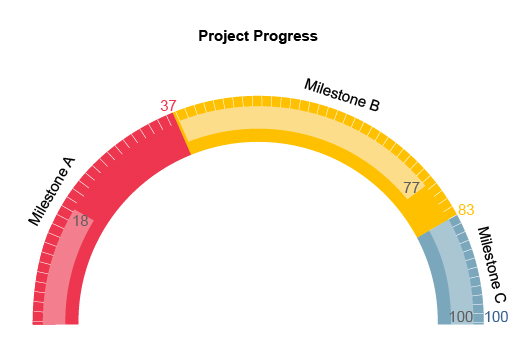
Gauge Chart
Gauge Your Progress.
Accelerate Your Growth.
The Gauge Chart is the most effective visualization when you need to assess performance, track progress and make better decisions quickly.
Whether you’re creating reports or measuring results on your own, the Gauge Chart is the perfect visualization that brings valuable insights right to the surface.
ChartExpo’s innovative chart creator allows you to develop Gauge Charts in 3 easy steps so that you can dive straight into your visual analysis.
Google Sheets
Microsoft Excel
Free 7-day trial (no purchase necessary). Pricing starts at $10 per month.
 ChartExpo for Google Sheets is
 used by 330,000+ users worldwide!
Click this link to watch a ChartExpo for
Google Sheets single-user installation video.
Click this link to watch a ChartExpo for
Google Sheets admin installation video.
Click this link to watch a ChartExpo
for Excel single-user installation video.
Click this link to watch a ChartExpo
for Excel admin installation video.
What Is a Gauge Chart?
Think of the Gauge Chart as your personal speedometer to evaluate the speed of your growth and performance.
It shows your results along a curved bar, quickly visualizing where your performance is at and where it could be. With this knowledge, you’ll be more than ready to elevate your results to the next level.
That’s just one of the many ways the Gauge Chart delivers immediate value and insights into your data.
Gauge Chart Definition
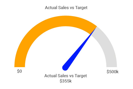
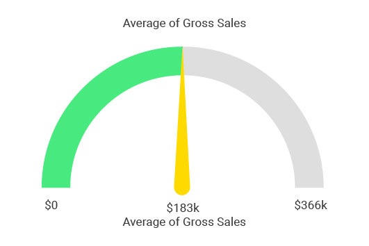
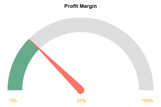
The Gauge Chart is a familiar type of visualization that’s also known as the speedometer chart or dial chart. It typically depicts a single data item along a curved, qualitative scale.
The name of the speedometer chart comes from this unique circular graph shape that resembles a car’s speedometer.
It’s essentially one bar that shows a total value or a target goal. That total value could be 100% or an actual value.
For example, you could use the Gauge Chart to track the completion of a quantifiable goal. The full Gauge Chart bar would represent 100% completion. The fill of the meter tells you how close you are to completing the objective.
Alternatively, the Gauge Chart could show a single metric with a target value you hope to reach. If you want to raise your number of leads to 100 in the week, dynamic gauge charts can help you actively monitor your progress to this goal.
As mentioned, a Gauge Chart typically shows one metric. However, you may come across a dial chart that includes 2-3 different needles marking multiple data items results along the same speedometer scale.
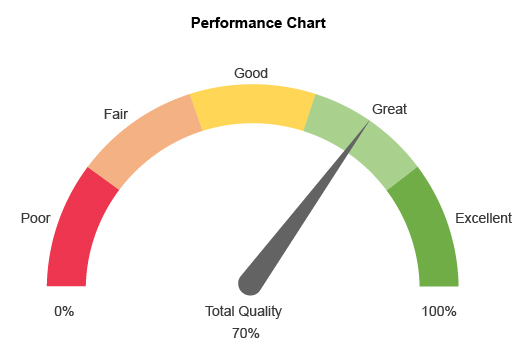
Similarly, you may see a colored Gauge Chart, where sections of the progress bar appear green, yellow or red to reflect good, average and poor performance.
Using this method is valuable if you have accurate benchmarks or averages available. You can then quickly gauge when performance falls into the red or rises into the green.
Gauge Chart History
The history of the Gauge Chart runs parallel to the history of gauges themselves. These devices are one of the first practical uses of circular data visualizations.
Eugene Bourdon, a French engineer, invented the gauge in 1849, naming it after himself. The Bourdon gauge allowed steam engines on train locomotives to measure steam pressure accurately.
Bourdon developed his gauge to try and prevent accidents caused by over-pressured steam locomotives exploding. These types of tragic accidents declined considerably after the introduction of the Bourdon gauge.
Others quickly realized the value of the Bourdon gauge and it soon became a necessity in many major systems and industrial machines. It was vastly more accurate than other instruments of the time.
Aside from its superior accuracy, Boudon’s gauge was a success due to the simplicity of the visual component. The needle showed the level of steam pressure, while the numbers along the circular range told engineers the exact value of the pressure in pounds per square inch.
This meant that steam locomotive operators and machinists could evaluate the steam pressure at a glance, even without looking directly at the numbers.
Boudon’s device highlights many of the useful qualities of the Gauge Chart, particularly how easy and quick it is to read and understand. In one look, you can tell whether performance is high or low based on the position of the needle.
Gauges quickly became popular tools in many fields, even outside of steam engines and machinery. Now, we’re so used to gauges and speedometer charts that they are highly familiar visualizations to use in your data analysis.
Gauge Chart Examples
Looking at examples of Gauge Charts helps you better understand how this visual analysis tool works and how to best use your Gauge Chart template.
Let’s explore some standard Gauge Chart examples.
Vehicle Speedometers: Arguably, the most recognized example of a Gauge Chart is the speedometer dial in a car.
The position of the speedometer’s needle corresponds to the numbers along the outer edge of the Gauge Chart. These numbers reflect speeds (in miles per hour or kilometers per hour). So, if the needle is at the marker for ‘60,’ the driver knows they are traveling 60 mph (or kph).
The beauty of this design is the driver doesn’t have to avert their eyes from the road for more than a moment to read the gauge. In most cases, you know if you’re speeding based on the position of the needle, without even reading the numbers.
This is not unlike looking at the face of a clock. You can tell the time by the position of each needle, even if there are no numbers.
Net Promoter Score Gauge Chart: Businesses have to keep a close and careful watch on the attitudes and feelings of customers. A net promoter score (NPS) is a standard tool to quantify these sentiments.
It’s typically a 0-10 survey scale. High marks in the 8-10 range are positive brand promoters, while lower scores are passive or brand demoters.
A dial chart can visualize this data and give you a fast and effective gauge of your promoter scores. This type of Gauge Chart usually uses colors to reflect the positive, neutral and negative ranges of scores.
Project Progress: One of the best methods for how to use a Gauge Chart is tracking the progress of a particular project or goal.
The position of your needle or filled gauge reflects where in your progress journey you are, while the unfilled, remaining space expresses how much progress is left.
If you are 75% finished with your project, your Gauge Chart will be three-quarters full.
The only issue with this Gauge Chart example is that progress is often difficult to quantify. Many small tactics that positively (or negatively) impact progress aren’t easy to track or accurately measure.
That said, when you have an accurate progress Gauge Chart, it can be a valuable tool. You can use it to update timelines and discover the best ways to accelerate your progress results.
How to Read a Gauge Chart
A Gauge Chart is straightforward to read and understand. Since it mimics the appearance and function of a speedometer in a vehicle, it is also an incredibly familiar chart to many people.
Essentially, a Gauge Chart is a scale showing the value of a single data item. The value will then determine where along that scale the data reaches.
For example, the speedometer gauge in your car may show a range between 0 miles per hour and 160 miles per hour. The central needle then moves as your speed increases. At 80 miles per hour, it would be in the direct center.
This is exactly how Gauge Charts work. A curved bar, slightly resembling a partial doughnut chart, includes a minimum and maximum value. You read a dial chart by seeing how full this bar is and what the value of its level is based on the scale used.
Not only does the Gauge Chart show you the value of your data, but also the room left for improvement. You can think of this remaining space as the opportunity hidden in your data!
You can chart more than one item on a Gauge Chart by using more than one needle or mark to reflect the two different points of data. However, this isn’t common and it may be hard to draw any useful comparisons with this approach.
Colors are another optional component of Gauge Charts. You may see a speedometer graph sliced into colored sections to reflect different levels of progress or results.

When Do You Use a Gauge Chart?
Gauge Charts are highly versatile and suit many analysis goals, whether you’re comparing two sets of data, monitoring changes over time, measuring performance or otherwise.
The simple yet powerful way the Gauge Chart visualizes data makes it a dependable analysis tool. It will quickly become your favorite type of chart to use and include in your reports.
Thanks to ChartExpo, you can create Gauge Charts quickly and as often as you need!
Find out what else the Gauge Chart can do for you.
Monitor Changes and Performance over Time
Data is constantly changing, meaning your performance will also move up and down. One of your primary responsibilities is to ensure there are more improvements than declines to ensure performance continues to trend in a positive direction.
The Gauge Chart is a valuable data visualization tool for measuring these changes over time.
By visualizing the same data from two different time periods, you can quickly see if performance has changed positively or negatively. It’s a simple matter of looking at the needle of the Gauge Chart to see if it has moved at all.
Alternatively, you can mark your speedometer chart where performance was last time you checked the data. Then, you can compare this value and position to the current standing.
This saves you the hassle of making two Gauge Charts, one for each period.
Knowing when data changes helps you detect possible trends and shifts. These may be valuable opportunities or potential risks to your performance.
It’s particularly crucial when these changes impact your key performance indicators or are significant in magnitude.
The Gauge Chart is ideal for detecting these significant increases or decreases because you’ll recognize that the needle has moved.
Plus, the speedometer graph allows you to see these changes at a quick glance, meaning you’ll be able to act quickly to correct potential problems or seize emerging opportunities.
See When Performance Falls Below or Above Average
In your car, the speedometer gauge chart lets you measure your speed to know when you are going too fast or too slow. The same is true with a Gauge Chart measuring the performance of a particular metric.
You have a reasonable expectation of where your performance should be — your average or benchmark metric value. A Gauge Chart showing this data will immediately reveal if your results are below or above this average.
If you don’t have these benchmarks because the data is unfamiliar or you’re new to analysis, the Gauge Chart will help you recognize these values.
As you look at your dial charts more and more, you’ll start to recognize the typical or average location of the needle.
This will form the foundation for your benchmarks and allow you to instantly recognize when performance is above or below what’s normal and expected.
You can also use colors in your Gauge Chart to highlight low, average and high performance. This is a common tactic, especially when reporting your data to others that may not be familiar with what the normal data range is.
You may see a Gauge Chart with red, yellow and green sections to signify poor, neutral/average and good performance.
It’s just another way that a speedometer graph makes it easy and quick to interact with your data and gauge performance.
Compare Two or More Data Items Side by Side
The Gauge Chart is not your typical comparison analysis tool. Most data users wouldn’t even include it in the category.
Most comparison charts work by including many different data categories and items into a single visualization. This allows you to compare and contrast results across many components in your data.
Conversely, a Gauge Chart typically only shows one metric value. On the surface, this makes it impossible to use for comparison analysis. You have nothing to compare the data to, unless you include another metric or a past performance benchmark.
Even then, you’re only comparing two data points. That’s not the makings of a great comparison chart.
The reason that the speedometer graph is excellent at comparison analysis is because of its size and simplicity. This allows you to place several gauges on the same page, like the dashboard of your car or the control panel of a large machine.
Even if you place many Gauge Charts next to one another, the simplicity of this chart type doesn’t become overwhelming or difficult to understand. It actually makes the data more engaging and gives you a complete dashboard where you can analyze all of your metric performance in one place.
It is a highly versatile data visualization tool, especially to include in your reports.
Justify Your Timelines and Results to Stakeholders
Project deadlines and timelines are a common talking point when meeting with managers, clients and other stakeholders.
Timing is crucial to planning strategies and evaluating performance. Stakeholders not only care about the results you promise, but also when you expect to meet these marks.
Naturally, timelines tend to change. Unexpected problems or shortcuts may arise that will extend or shorten the time it takes to complete the project.
Measuring progress with the Gauge Chart allows you to track your results better and see how quickly they increase.
With this intel, you can set more accurate timelines or adjust current ones, avoiding tough conversations with stakeholders when you get behind schedule.
The Gauge Chart also helps you justify how long certain tasks require. A client may want you to generate 1,000 new customers overnight, but Rome wasn’t built in a day.
You can show these individuals past Gauge Charts that accurately show how long it will likely take to grow this audience.
This puts hard numbers behind your schedules, benchmarks and timelines, instead of inaccurate guesswork that leads to missed deadlines and poor long-term planning.

Advantages of Using a Gauge Chart
The value of the Gauge Chart can’t be overstated. It holds many benefits that you and your team will love when it comes to data storytelling and visual analysis.
You’ll quickly turn your data into actionable insights on improving your strategies and growing your organization.
These insights will allow you to tap into the hidden value of your data and produce outstanding results that accelerate your timelines and put you on a fast track to success.
Experience the power of the Gauge Chart firsthand with ChartExpo.
Evaluate Performance at a Glance
Data moves exceptionally fast. Not to mention, users have lots of tasks to complete in a day. Thus, you need tools that help you thoroughly understand your data in as little time as possible.
This is one of the qualities that makes Gauge Charts valuable. You can look at a speedometer graph and instantly see where the needle is and how much room there is for improvement and progress.
This visualization makes it so you don’t even have to look at the numerical values to understand the information. The position of the needle tells you almost everything you need to know.
Since Gauge Charts require very little space, you can arrange multiple speedometer graphs side-by-side for each of your key performance indicators.
This gives you a complete overview of your performance in just one look. You can rely on these Gauge Charts to evaluate performance and identify where and when you need to improve.
When you save time analyzing charts and reach insights faster, it allows you to react to changes and improve your results in less time. If your data changes unexpectedly, you’ll snap into swiftly, beating out other teams.
Translate Growth and Success into Something More Familiar
There are few chart and graph types as familiar as the Gauge Chart. Even if you don’t drive a car, you’re familiar with how a speedometer looks and operates. This is no different from the functions of the Gauge Chart.
The familiarity of the dial chart makes it a valuable data visualization tool for several reasons.
Most obviously, familiarity makes the insights more accessible because you don’t have to learn how to read the radial Gauge Chart. You already know how to because you’ve seen this type of visualization so many times before.
The Gauge Chart is also valuable because it allows you to visualize growth and performance in a highly accessible charting format.
Progress and growth are two things you know you have to track and constantly measure. Yet, they can also feel intangible and difficult to translate into an understandable medium.
Visualizing your progress with the Gauge Chart shows you a physical representation of where your performance is and how much room there is for improvement. This enables you to make better decisions regarding how you spend your time and focus your energy.
Set More Accurate Timelines, Benchmarks and Goals
It’s crucial to achieve your goals in the appropriate amount of time and understand how to set more accurate timelines.
Success and growth are the results of continuously meeting your goals and completing projects on time. The Gauge Chart helps you set and adjust timelines, benchmarks, goals and more.
For example, if you frequently use a dial chart to track project completion percentages, you’ll start to better understand how long certain types of tasks or objectives take. Applying these insights to your goal setting will take the guesswork out of creating schedules and timelines.
Similarly, as you use a speedometer graph to evaluate metric performance, you’ll become accustomed to knowing where the needle typically lies. This knowledge informs your benchmarks and makes it easier to quickly assess when your data is above or below the norm.
Setting more accurate timelines and benchmarks enables you to plan better and develop more successful schedules.
This is particularly valuable when planning projects with multiple stages of steps. With a reasonable level of accuracy, you need to predict when each stage will end and the next needs to begin.
Stakeholders, clients and other audiences also love when you can accurately forecast when a project will finish. You don’t want to give a client a 2-month timeline for a project that actually takes you 4 to complete.
Inaccurate timelines disrupt your workflow and can disenchant clients and other relevant parties. Thanks to the Gauge Chart, you’ll learn how to measure timelines and set performance benchmarks more accurately.
Improve Your Data Communication by Creating Compelling Reports
Gauge Charts are one of the best data visualization tools to include in reports and presentations.
The familiarity of online speedometer charts means audiences are already familiar with this type of visualization, making it a valuable means of conveying data.
Better yet, the speedometer chart template is one of the fastest visualizations at conveying information. You don’t need to look at the data values to know if performance is positive or negative. All you need to see is the position of the needle.
Another advantage of reporting with Gauge Charts is how compact the visualization is, allowing you to fit multiple speedometer graphs next to one another.
Think about a car’s dashboard. There isn’t just the speedometer chart; there are multiple gauges showing you your RPM, fuel consumption, engine temperature and more.
This highlights how easy and effective it is to include multiple Gauge Charts side-by-side to convey a significant amount of information in a small area. That’s exactly what you want for your reports!
Together, these three benefits make dial charts one of the best delivery methods of insights and complex data.
The more compelling your reports are, the more excited the audience will be about the information you present.

How to Create a Gauge Chart
To unlock the value of the Gauge Chart, you need to know how to properly create a speedometer chart in Excel, Google Sheets and other data tools.
ChartExpo’s online Gauge Chart creator gives you the tools you need to painlessly turn your data into a speedometer graph.
ChartExpo designed its Gauge Chart maker to be the easiest visualization tool available. Saving time with ChartExpo means you can get straight to the analysis and insights.
Create Gauge Charts online with ChartExpo and see how easy it is for you.
What Data Do You Need to Create a Gauge Chart?
The simplicity of the Gauge Chart means you need very little data to create this speedometer graph in Excel or Google Sheets.
Don’t let this simplicity fool you. A Gauge Chart is not simple because it is basic or less helpful than other visualizations. It’s the opposite. Displaying complex data in a simple form makes visual analysis exceptionally easy, saving you valuable time.
Thus, the Gauge Chart may be the best data visualization tool for depicting a single metric.
The data you need for a Gauge Chart is a metric and its corresponding value. You also need a scale to set the size and range of your speedometer gauge.
If you’re using this dial chart to track progress, this scale may be an easy 0 to 100%. In other Gauge Chart examples, you have to figure out the maximum ceiling for your data. You can estimate a maximum value or set a particular goal amount that you hope to reach.
The critical aspect of Gauge Chart data is it needs to be quantifiable. You can’t accurately measure where on the meter your results are if there are no numerical values.
If you want to have more than one data point in your online speedometer graph, you need to include this data in your Gauge Chart template.
For instance, if you want to compare sales goals over two locations, you need the sales numbers from both locations. Your Gauge Chart will appear with two needles, showing each area’s sales.
How to Create a Gauge Chart in Excel
ChartExpo’s innovative data visualization software lets you create Excel Gauge Charts in minutes.
The process is incredibly easy and requires no prior knowledge of ChartExpo. You also don’t need to be a coding wizard or professional data scientist. It is a universally accessible speedometer chart creator.
To get started with this speedometer graph Excel template, you first need to download the ChartExpo add-in from Microsoft App Source. The process is simple; you only need to follow the instructions on your screen to download the data visualization software.
After you’ve downloaded the Excel chart creator tool, it will appear under the “Insert” tab in the top menu and the “Apps for Office” option.
Opening ChartExpo will show you the complete collection of different chart types now available to you. Selecting the one you want to use for your data is the first step in creating a speedometer chart in Excel.
You can look for ChartExpo’s Excel Gauge Chart directly by entering it into the search bar.
With your Excel Gauge Chart template selected, it’s time to grab your data. Since ChartExpo integrates directly into your Excel environment, your spreadsheets and data are readily available.
Click and drag to target the data from your spreadsheet that you want to use. Then, you can use the “Create Chart From Selection” option. As an alternative, you can manually enter which cells to use into the Excel chart creator’s interface.
The final step is to simply click the create chart button. In moments, your new Excel speedometer chart will appear. You can then make minor edits to tweak the final product to your liking.
How to Create a Gauge Chart in Google Sheets
Creating a Google Sheets Gauge Chart isn’t much different from using the Excel Gauge Chart add-in, but it is still worth explaining for Sheets users.
To download the ChartExpo chart creator for Google Sheets, begin by clicking “Extensions,” then “Add-ons” and “Get add-ons.” You can find these menus in Google Sheets’ top toolbar.
This will take you to the Google Workspace Marketplace. You can also visit this resource directly through your web browser.
If you have the ChartExpo Google Sheets extension properly downloaded, you’ll find it under the “Extensions” and “Add-ons” menus.
Similar to the Excel chart creator, opening the app will show you the complete selection of chart and graph types available with ChartExpo. You can find the Google Sheets Gauge Chart by scrolling through these options or searching it directly in the top bar.
Once you’ve chosen the Gauge Chart in Google Sheets, you can begin setting the data you want to use in the visualization.
Since the Gauge Chart doesn’t require a lot of data, it is one of the easiest to create. You only need to input a few items into the chart creator and set a maximum range for your gauge.
Click “Create Chart” once you’re happy with your chart settings and review your results. You can edit minor details to help customize it to fit your preferences.
That’s how easy it is to create a Google Sheets Gauge Chart with ChartExpo!
Tips to Improve Your Gauge Charts
Despite the simple (but powerful) design, there are plenty of examples of bad Gauge Charts online.
What separates a good dial chart from a bad one? And, how do you ensure that you make the best Gauge Charts possible?
There are a few tips you can use to make better and more dynamic Gauge Charts.
Use colors: Colors are a critical component in visual data storytelling that people often neglect. Not only do colors help distinguish different data categories in many chart and graph types, but it also makes your visualizations more engaging.
You need to hold the audience’s attention long enough for them to read your Gauge Chart and understand the most vital insights. Colors can draw their eyes and keep them reading.
The most common application of colors in a Gauge Chart is to visually display bad and good values. Most gauges and dial charts do this. It allows you to immediately see if your needle is in the green, meaning positive results, or the red or yellow, resulting in poor or average performance.
Pick a range that makes sense visually: One of the few components of a Gauge Chart that requires extra consideration is the range you use for your visualization.
If you pick too small of a range, your data may quickly exceed it and your Gauge Chart will no longer be effective. You’ll have to make a new speedometer graph to accommodate the higher values.
Other problems appear when your gauge range is too large. It makes progress feel very slow, which can disenchant stakeholders or clients. A too-extensive scale also makes it harder to know what strategies or inputs produce notable improvements or results.
Even a significant jump in results may only produce a slight increase in your gauge reading, which you might overlook at a glance.
Scale your Gauge Charts as necessary: When you buy a new, faster car, you’ll notice the range of your speedometer gauge is different from your old model. A faster car means a bigger engine capable of higher speeds. Thus, the speedometer will have higher readings.
As your data results increase, there comes a need to scale your Gauge Charts to match. Luckily, scaling a speedometer chart is incredibly easy and only requires you to change the maximum value of your range.

ChartExpo — The Best Gauge Chart Creator To Use
Whether you’re creating a Gauge Chart or using a different chart type to visualize your data, ChartExpo is the number 1 choice for chart creators.
ChartExpo offers two unbeatable advantages to data users that will supercharge your visual analysis. First, this chart creator provides the most extensive library of visualization options. It includes different chart types ready for you to use.
Even better, ChartExpo is the easiest chart creator available. There are no complex rules to follow or time-consuming coding involved. The ChartExpo system uses just 3 simple steps, meaning you can create a Gauge Chart in minutes.
Stop wasting time with other chart creators when ChartExpo exists.
Why is ChartExpo the Best Chart Creator?
Data management and visualization have become critical organizational processes. You can’t ignore the value of data. However, it’s not immediately accessible.
For data to be valuable, you need to transform it into insight and actionable intelligence. Visual analysis is crucial to this evolution. You can “see” insights once you visualize the raw data.
ChartExpo offers the easiest and most effective method for turning raw data into beautiful, professional charts and visualizations. It is the best chart creator and Gauge Chart maker for several reasons.
More chart and graph types than ever before: Traditional data tools, like Excel or Google Sheets, include some standard chart options (bar charts, circular graphs, scatter plots, etc.).
Yet, modern data requires more advanced charts specialized for the information being shown. This is where ChartExpo delivers tremendous value. It includes different chart types for you to use to empower your visual analysis.
Professional charts in 3 easy steps: Aside from giving more options, the other benefit of the ChartExpo system is how quick and easy it is to create custom charts. You can create a Gauge Chart, or any other type of visualization, in just minutes.
No more unnecessary obstacles: Other Gauge Chart makers require users to write and edit lines of code to create visualizations. If you don’t already have coding experience, you may be out of luck with this data visualization software.
ChartExpo, on the other hand, is 100% codeless, meaning you don’t have to fuss with scripts or spend time learning coding languages.
Universal and accessible: Having an easy-to-use chart creator makes visual analysis more accessible than ever before. Your entire team can take part in building chart-rich reports and presentations and discovering insights through visual data storytelling.
More Visualization Options Means More Insights
With a menu of different chart types, you’ll never have a shortage of visualization options, thanks to ChartExpo.
More importantly, you’ll always have the right chart type to match your data. This is particularly valuable when working with complicated data sets that need a specialized chart to visualize.
ChartExpo includes many options beyond the Gauge Chart — many for very niche purposes. You’ll often find chart and graph types explicitly built for your data. That’s an advantage you can’t find with other chart creators!
Often, there are multiple chart and graph types that you can use to analyze the same data set. Each visualization provides a new way to view your data, potentially revealing insights you didn’t see before.
Thanks to ChartExpo’s selection of different chart types, you have many visual analysis tools at your disposal. In minutes, you can depict the same data using multiple visualizations.
This approach to your visual analysis guarantees that you extract all of the insights from your data and leave no stone unturned. Again, you never know which chart type will show you uncover new information.
ChartExpo makes it easy to change the chart and graph types you use. You can keep testing new visualizations until you find the proper fit.
Essentially, more chart options mean you get more value from your data!
A Codeless Chart Creator Removes Time-Consuming Hurdles
Data analysis is a time-consuming and arduous process. Charting can alleviate many of these headaches, but some visualization tools present even more challenges.
ChartExpo rightfully believes that visual analysis should remove complexity, not add to it by requiring you to deal with scripts and coding.
Not only does coding take extra time, but it’s also not a skillset that everyone has, meaning other Gauge Chart makers are inaccessible by most professionals.
ChartExpo does use JavaScript to create speedometer charts and other visualizations. The difference is that this data visualization software does all of the scripting and editing for you.
You never have to even look at the codes because ChartExpo does it all for you in the background! This will save you lots of precious time, even if you have coding skills.
The simple truth is that these scripts are inefficient. No matter how proficient you are at coding, you can’t create custom charts faster than ChartExpo.
Plus, if you make a mistake, you could waste even more time trying to find the error in your script. ChartExpo doesn’t make mistakes.
All of this is time you could spend extracting insights or making future data stories. In other words, having the best chart creator means doing more with the data you have.
With ChartExpo, anyone can create professional charts, making it one of the best data visualization tools out there.
Develop Your Data Culture and Become an Analytics-Driven Organization
Access to data and insights is one of the organizational hurdles many businesses are trying to resolve.
Companies understand that data is valuable and can be used by all departments. The difficult task is putting data, charts and other analysis tools in more hands.
This hurdle is particularly hard to overcome using a chart creator that requires you to manually code and edit scripts. Only those on your team with coding experience can properly develop charts with these charting tools.
Those without these skills can only request charts. Then, they have to wait for someone else to make their visualization. This leads to an unproductive, slow data culture.
That’s not what you want to thrive in a data-driven world.
ChartExpo gives everyone on your team access to charting and visual analysis, helping you develop a more consistent and thorough data culture.
With more parties involved in charting and acquiring insights, your organization as a whole can make better data-driven decisions.
Each department will ask and answer valuable analysis questions for their role in the organization. Decision-makers can then apply these insights to benefit the entire organization.
ChartExpo also empowers your data culture by helping you create and share reports rich with visualizations.
Thanks to this high level of visual data storytelling, you’ll give your audience(s) (clients, stakeholders, customers, etc.) the information they need to understand complex data sets without ever looking at a spreadsheet themselves.
That’s how an analytics and data-driven organization operates!
ChartExpo Pricing
ChartExpo for
Google Sheets
$10*
per month
(no purchase necessary)
*pricing starts at $10
per user per month.
Only in-app purchase available
ChartExpo for Google Sheets
single-user purchase video.
ChartExpo for Google Sheets
domain-users purchase video.
ChartExpo for Google Sheets
single-user installation video.
ChartExpo for Google Sheets
admin installation video.
ChartExpo for
Microsoft Excel
$10*
per month
(no purchase necessary)
*pricing starts at $10
per user per month.
Only in-app purchase available
ChartExpo for Excel single-user
purchase video.
ChartExpo for Excel domain-users purchase video.
ChartExpo for Excel single-user
installation video.
ChartExpo for Excel admin
installation video.
Custom Pricing
Blogs
How to Create IELTS Band Score Charts?
Click to learn how to visualize data with IELTS Band Score Charts?

How to Create a Gauge Chart in Google Sheets?
Click to learn how to create a Gauge Chart in Google Sheets. Also, we’ll address...

How to Plot a Speedometer Chart in Excel?
Click to learn how to generate a Speedometer Chart in Excel. Also, we’ll address...
