Sentiment Analysis Charts
Listen To Your Customers
Analyze every interaction, review and social media comment in one place.
Sentiment Analysis Charts help you understand what customers want and how to improve strategies. Stop getting lost in trying to read into intangible attitudes, feelings and other sentiments.
Make better decisions that align with what your audience actually wants.
Google Sheets
Microsoft Excel
Free 7-day trial (no purchase necessary). Pricing starts at $10 per month.
 ChartExpo for Google Sheets is
 used by 330,000+ users worldwide!
Click this link to watch a ChartExpo for
Google Sheets single-user installation video.
Click this link to watch a ChartExpo for
Google Sheets admin installation video.
Click this link to watch a ChartExpo
for Excel single-user installation video.
Click this link to watch a ChartExpo
for Excel admin installation video.
What Is Sentiment Analysis?
Sentiment Analysis is the process of taking raw text and mining it for positive and negative emotions. The text may come from reviews, social media interactions or other sources.
The goal of Sentiment mining is to discover how the audience feels. When you understand customer sentiment scores, you can take direct steps to improve these attitudes and win over your audience.
Learn how a brand Sentiment Analysis will grow your customer experiences.
Definition of Sentiment Analysis
Sentiment Analysis, also known as opinion mining, is a process of exploring text data for positive, negative or neutral feelings.
In other words, it is a natural language processing (NLP) method that detects when audiences are talking negatively or positively about a given topic.
Natural language processing means using technology and software to analyze written text. Thus, you’ll often see it referred to as “NLP Sentiment Analysis.”
Language has always been challenging for artificial intelligence (AI) and other machines to understand. It’s the reason why there is no perfect translation tool.
It’s tricky because software tools have a hard time picking up on certain intricacies of conversational language, like sarcasm, humor and other details that impact semantics.
The Internet has only made the job harder with shorthands, slang and a general lack of proper mechanics and grammar.
That said, NLP has come a long way in recent years. Advancements in AI have helped these tools better learn how to “read” and understand text data.
And, because NLP Sentiment Analysis relies on AI technology, the more data it receives (i.e., the more text it analyzes), the stronger its understanding of language grows.
NLP Sentiment Analysis tools focus specifically on detecting language related to positive or negative attitudes or feelings.
It looks for phrases that include certain buzzwords the software knows connect to positive or negative sentiments (like, dislike, hate, love, enjoy, good, bad and many others).
The beauty of Sentiment Analysis is it helps you understand the overall feelings shared by a large audience or across thousands of reviews and feedback responses.
We’ll explore Sentiment Analysis in greater detail in the following section.
How does Sentiment Analysis Work?
When people share feedback or review your products or brands, it’s a form of data. The information they share is either positive, negative or neutral.
To understand the difference between these three, let’s look at some examples:
Positive Sentiment: “The ramen was delicious and perfectly prepared!”
Neutral Sentiment: “Our food came out in an adequate amount of time.”
Negative Sentiment: “My wife got incredibly sick after eating here! Do not go!”
NLP Sentiment Analysis tools mine text data for these phrases or buzzwords and analyze whether the intention is positive, negative or neutral.
When the system detects a sentiment, it records the entry and quantifies it, putting numbers behind intangible attitudes and emotions.
In the simplest form, a Sentiment Analysis solution may tell you there are 95 positive sentiments and 5 negative, or 95% positive and 5% negative.
More advanced sentiment analyzers even understand degrees of positive or negative sentiment. So, when someone says they “love” a particular brand, the system may assign a +2 value to this, whereas “like” responses may only receive a +1.
NLP Sentiment Analysis solutions also record the topic of each individual attitude. This allows businesses to investigate sentiments regarding specific products, brands, locations, etc.
When you chart these results, you can find the most significant sources of positive and negative feelings. You know exactly what details require immediate attention and improvement.
In this respect, Sentiment Analysis directly fuels data-driven decision-making and helps teams learn the best ways to improve and grow.
Types of Sentiment Analysis
There are many applications of Sentiment Analysis in business. Your customers and target audience are sharing feedback.
If you don’t have the tools to listen and understand their likes and dislikes, you’ll struggle to deliver them the best strategies.
Let’s look at some of the different types of Sentiment Analysis.
Sentiment Analysis in Marketing: The goal of marketing is to reach the target audience, typically prospective customers or clients, and deliver value through messaging that encourages these individuals to purchase, subscribe, etc.
Thus, it is vital for these professionals to conduct customer Sentiment Analysis to understand what the market likes and dislikes.
Market Sentiment Analysis can even reveal valuable opportunities that businesses can seize. For instance, you might discover a particular feature or quality that customers want but can’t find from competitors.
Product Sentiment Analysis: One of the reasons why Sentiment Analysis is essential is the ability to know what people are saying about your products and services.
For example, an Amazon Reviews Sentiment Analysis can tell you exactly what customers like and don’t like about a particular product. You can use this intel to improve future developments and produce better items in the future.
Sentiment Analysis of product reviews also helps you detect potential defects and other issues in your products. The sooner you notice these negative insights, the quicker you can respond and resolve the issue.
Brand Sentiment Tracking: Aside from knowing what people say about your products, you also want to know how they feel about your brand(s).
Consumers tend to shop with the brands they like, even if a cheaper option is available. So, measuring brand sentiment is critical to understanding how your business is captivating audiences or turning them away with poor experiences.
This is especially true in an age where social media content is so prevalent. Everyone shares their opinions about anything online. Social Sentiment Analysis holds tremendous value for decision makers trying to improve brand reputation.
Employee Sentiment Analysis: Most of the Sentiment Analysis types described above focus on customers. It’s also good to investigate internal feelings and attitudes.
When employees are happy, they do better work. Plus, you have lower turnover rates and don’t have to constantly spend resources hiring new talent.
You can use employee sentiments to optimize HR strategies, like offering more relevant benefits or fixing issues that drive people to seek other job opportunities.
Examples of Sentiment Analysis
The best way to answer questions like, ‘what is brand sentiment?’ or ‘what is Sentiment Analysis in marketing?’ is to look at examples of each.
These examples will help showcase what is Sentiment Analysis used for and how it works in real scenarios.
Sentiment Analysis Example 1: Steven runs a successful flower delivery business. He wants to expand his company to include some basic gardening services.
However, he’s nervous about moving into a new space. He’s unsure about the challenges of this new endeavor. To be successful, Steven needs to know what is market sentiment for gardening service companies. In other words, what will his potential clients want and expect?
His market Sentiment Analysis will reveal these insights and many more. He can use this intel to get the new gardening services side of the business off to a good start. He’ll already know what services to offer, how to avoid common issues and more.
Sentiment Analysis Example 2: Amanda works in human resources for a large company experiencing an unusually high turnover rate. This is costing the corporation millions in having to fill frequent open positions.
She suggests conducting an employee Sentiment Analysis to better understand why individuals leave. The company agrees and devises an employee feedback form to encourage workers to share their thoughts and feelings.
With over 10,000 responses, Amanda needs a visual Sentiment Analysis tool to depict the results. She creates a Sentiment Matrix Chart to highlight how employees feel about certain topics related to their jobs.
Her chart not only reveals why employees are unhappy, but also the specific details causing these issues. She presents her findings to management and suggests reforming employee benefits and training to remedy these issues and reduce turnover.
Sentiment Analysis Example 3: Rashad owns an online ecommerce business selling computer accessories. He operates the company out of his home and has minimal space to store inventory.
He wants to know the best products on the market — the ones he absolutely must have in stock. Rashad performs an Amazon Reviews Sentiment Analysis for many tech products.
This activity helps him identify products with outstanding reputations. He’ll also learn the types of features and qualities customers care about the most. He uses this intel to optimize his stock to include only the best items that sell quickly, keeping his stock moving.

Advantages of Sentiment Analysis
Sentiment data is challenging to mine and understand because it is unstructured and buried in heaps of text.
Using text Sentiment Analysis, you can extract the most valuable parts that pertain to emotions and attitudes. These insights put context behind intangible feelings, enabling you to actively listen to customers and make necessary changes.
Hear what your customers are saying and make changes to improve attitudes.
Help Make Sense of Unstructured Text Data
Text data is unstructured, which presents several unique challenges. You can’t throw text into a spreadsheet like you can with structured information. This amorphous nature means there is no way to easily organize the data and analyze it.
Without Sentiment Analysis, one of your only options to engage with text data is to read it. This may seem easy enough, but what happens when you have thousands of reviews or feedback responses?
Suddenly, analyzing text by reading it becomes a massive undertaking. Plus, it takes a considerable chunk of time to read every individual response. You’ll run into feedback that is irrelevant and doesn’t hold value.
You’ll also run into a lot of unnecessary fluff in responses or details that highlight a unique situation. This information gets in the way of actionable insights that actually hold value.
NLP Sentiment Analysis reduces all of this text to its most essential parts and quantifies those pieces. Not only does this drastically reduce the required reading involved, but it also ensures that you see the “big picture” of your sentiment data.
Even through mountains of text data, sentiment detection extracts the core pieces that connect to concrete audience attitudes.
A timely analysis is extremely valuable. You want to respond to issues now, not later. Sentiment Analysis puts context behind unstructured data and limits the time it takes to engage with these details.
Put Quantitative Context behind Intangible Emotions
Putting aside the unstructured nature of text, sentiment data is doubly hard to make sense of because of what it is you’re actually analyzing.
You’re trying to make sense of feelings and attitudes that are overly subjective. How one person conveys their perceptions isn’t the same as everyone else, even when they use the same language.
For instance, someone may say, “I like eggs,” when they really mean, “Eggs are okay. I don’t hate them, so that must mean I like them.”
Another person may make the same statement about eggs and mean, “Eggs are one of my favorite foods.”
That’s a significant difference in attitudes and highlights how difficult understanding attitudes can be. We don’t always say what we mean or mean what we say.
Thus, reading too much into a single feedback response is dangerous. Your understanding of the individual's feelings may not align with their actual attitudes. Plus, you don’t want to base strategies on the views of a small minority.
The best way to approach intangible emotions is from a high-level view. You want to understand the overall attitudes, not be hung up on individual responses.
Sentiment Analysis Charts deliver clear context behind emotions that are otherwise hard to understand or analyze.
A Versatile Method of Understanding Feelings and Attitudes
With so many applications of Sentiment Analysis, it is a highly versatile method of engaging with your review and feedback data.
You can analyze reviews, social media comments, email feedback forms, customer comment cards and any other sources of audience sentiments.
To recap, here are some of the ways you can analyze different types of sentiments to achieve various goals:
- Reduce turnover rates by analyzing employee feedback to address workplace pain points and sources of discontent.
- Early warning detection for issues, defects and other crises by analyzing sources of negative sentiment.
- Develop better products and design the best customer experiences by recognizing audience likes and dislikes.
- Capitalize on competitor weaknesses by analyzing their audience sentiment and delivering better strategies.
- Actively detect changes in sentiments that may suggest new trends or shifts in audience attitudes.
There are countless other ways to analyze sentiments and produce value for your organization.
Remember, audiences want to be heard. They take the time to share feedback and reviews. If they don’t feel their voice is valued, they’ll go to another business that does listen.
One of the best customer experience practices is actively listening to audience sentiments and responding appropriately.
Sentiment Analysis Charts offer the perfect tool for making these discoveries and understanding your audience on a higher level.
Quickly Identify What is and isn’t Working
When you perform a Sentiment Analysis and chart the results, you visually depict how your audience feels about specific topics.
Visual analysis is far more efficient than reading text or numbers. Research suggests that the human brain can interpret a picture or chart 60,000 times faster than the raw information alone.
We also remember visual insights for longer and can recall them easier than something we read.
It’s the classic adage that a picture is worth a thousand words. Someone can take an hour to explain a particular image and you’d still never have a clear view of what they are talking about.
However, in a moment of holding a picture of that scene, you instantly see and understand everything.
Sentiment Analysis Charts provide this level of immediate comprehension. For example, you can look at a Likert Scale Chart and recognize whether attitudes are overall positive or negative. You can even see the specific details generating the best or worst audience perceptions.
Essentially, Sentiment Analysis Charts depict what’s working and what isn’t regarding audience attitudes.
You can look at the details creating the most positive sentiments to know what your brands or products are doing well. Then, analyze the weak points to look for areas that need improvement.
Spotting negative sentiments can be even more valuable. This feedback may help you detect potential defects or other issues that need immediate attention. You can stop possible crises before they happen!

Best Sentiment Analysis Tools and Visualizations
There are many Sentiment Analysis graphs and chart types to utilize. When you align customer response data to the proper Sentiment Analysis Charts, you immediately make sense of the feedback.
ChartExpo’s data visualization tool includes all the customer Sentiment Analysis tools you need to depict this valuable intel. Not only are these charts easier to understand than raw text, but they also provide a convenient and effective way to present visual data stories to other individuals.
Experience all of the Sentiment Analysis visualizations ChartExpo has to offer.
Sankey Diagrams
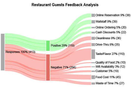
A Sankey Diagram shows the flow of data through multiple stages or series. You can use them in Sentiment Analysis to present the breakdown of positive, neutral and negative responses regarding numerous topics.
On the left side of the Sankey Diagram, you have nodes for the items you’re analyzing. It may be individual products, parts of your customer experience, etc.
The nodes on the right side of the Sentiment Analysis tool represent your different levels of sentiment. You may have only three nodes to show positive, negative and neutral attitudes.
You can take your analysis steps further by including more nodes to show different degrees of sentiment. For instance, you could have 5 nodes: poor, below average, average, above average and excellent.
As you analyze the links between both sets of nodes, you’ll be able to see the factors with the most substantial flow towards positive or negative sentiment.
You can color each connection to better distinguish between the different crisscrossing links of positive and negative sentiments.
Aside from seeing the flow between sentiments and data factors, Sankey Diagrams are also valuable because you can include multiple items in the chart without hurting readability.
Thus, you can include more information in one Sentiment Analysis visualization.
Sentiment Trend and Sparkline Charts
Audience attitudes are never set in stone and are constantly fluctuating. So many factors influence the audience’s perceptions.
Even the smallest detail can radically shift perceptions. The things customers love this month may be the reason they complain in the next period.
If you aren’t actively monitoring sentiment data and detecting these shifts, you may be missing significant factors contributing to the loss of positive perceptions. These factors could pertain to emerging crises that need immediate attention.
The best customer and brand sentiment tracking tools are trend charts. What are trend charts used for? Sentiment Trend and Sparkline Charts display changes in complete audience attitudes over time.
The difference between these two visualization Sentiment Analysis tools is how they display the data.
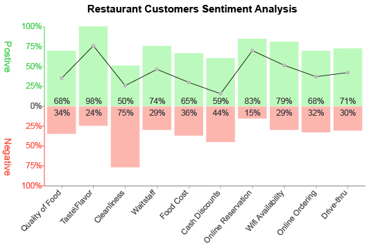
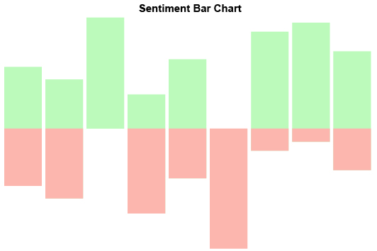
Sentiment Trend Charts use bars to compare positive and negative attitudes for each period. A line through the visualization shows how perceptions changed throughout the timeline.
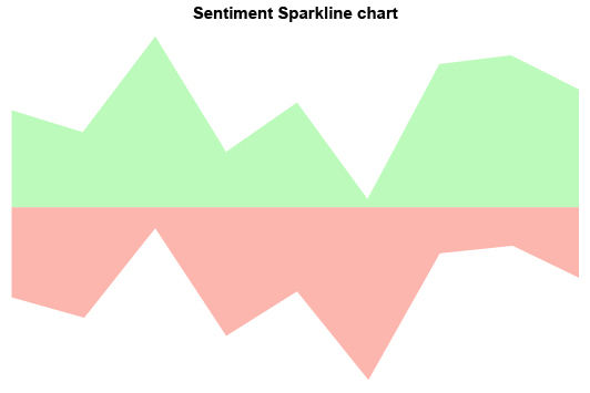
Meanwhile, Sentiment Sparkline Charts rely on a filled area design for both positive and negative feedback. Spikes and dips in the trendline’s trajectory help you recognize significant shifts in attitudes.
Both Sentiment Analysis Charts are helpful when monitoring overall audience perceptions. Which one you choose depends on how you want to display your results.
Trend Charts have the advantage of combining both lines and bars. However, the Sentiment Sparkline Graph can make recognizing critical changes to audience feelings easier.
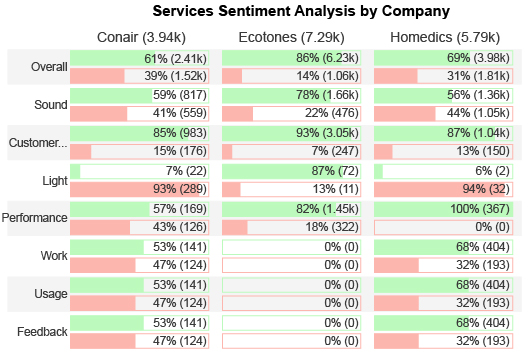
Comparison Sentiment Charts are another visualization tool for showing how attitudes change over time or through other dimensions. For instance, you could see how customer service sentiments differ between store locations.
Likert Scale and CSAT Scale Survey Charts
Many feedback forms attempt to qualify audience attitudes using a numerical scale where people can rate their feelings from 1-10, 1-5, etc.
“Tell us about your experience and what you liked most?” is an example of a short-answer survey question. It requires the audience to write a response.
Survey scale questions ask a similar question that doesn’t require a short answer: “Rate your experience today between 1 and 10.”
There are several benefits to using these types of scales:
- You’re already quantifying the data.
- It requires less time to complete your surveys, encouraging more people to participate.
- It’s easier to cater questions to the sentiment details you find significant at the time.
- There is less data to filter out compared to short answers.
- And more
That said, you still need a Sentiment Analysis Chart to help display and report the data generated from these scale surveys. ChartExpo offers multiple visualization options for scaled survey data.
Likert Scale Chart: The Likert system is a survey scale usually consisting of 5 points (although 4, 7, 10 and other variations exist). These points show two degrees of positive sentiment, two negative ones and a neutral ground.
Here’s an example of a Likert question and scale:
“Are you satisfied with the customer service you received today?
- Extremely satisfied
- Somewhat satisfied
- Neither satisfied nor dissatisfied
- Somewhat dissatisfied
- Extremely dissatisfied”
The Likert Scale Chart takes the response data and distributes it across each available option. This design uses bars to depict the breakdown of how many people recorded each response.
You can include results from multiple Likert questions in the same chart to give an even more complete view of audience sentiments.
CSAT Scale Survey Chart: A common criticism of the Likert Scale design is that the available responses are subjective. What one person considers extremely satisfying isn’t necessarily the same as others.
The Net Promoter Score or CSAT Scale system asks questions and asks users to rate their responses on a numerical scale.
Here’s an example of a CSAT Scale question:
“Would you recommend our products to others?”
Survey participants then mark their response on a 1-10 scale, with low numbers reflecting a low likelihood of recommendation and higher numbers meaning a solid chance of brand promotion.
Similar to the Likert Scale Chart, the data appears as bars along the numerical scale. The tallest bars demonstrate the numerical responses most people agree on.
This scale is helpful because it helps quantify attitudes. You know if you have an average score of 7/10, you have 3 points of sentiment score to improve.
The drawback is it isn’t always clear how to relate these numbers to actual feelings. You may wonder, “What is a sentiment score of 7 in terms of audience satisfaction?”
Tree Map Sentiment Chart
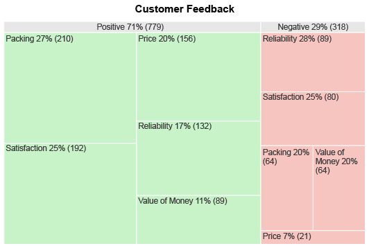
Tree Maps typically show hierarchical data through a series of layered rectangles. The item at the top of the hierarchy appears as the largest rectangle, which is then divided into smaller sections for each subcategory at the next level. These subcategories are then broken down into parts of the third level and so on.
You can also use the Tree Map Chart for sentiment data. You’d have two large boxes to encompass all your positive and negative sentiments.
The smaller rectangles dividing each larger box show you the individual sentiment items, meaning the most sizable ones are the most common feedback topics.
Tree Maps are ideal visualizations for Sentiment Analysis of customer reviews. With this data source, you don’t necessarily know the most common details or trends.
Luckily, one look at a Sentiment Analysis Tree Map and you’ll quickly identify the most significant sources of positive and negative sentiment. All you have to do is look for the large green or red boxes and check the label.
One of the best advantages of Tree Maps is you can include many items in your visualization. This allows you to track sentiments across every topic, product, service, strategy, etc.
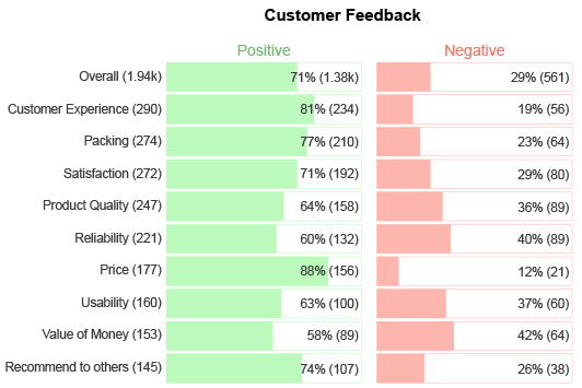
The Sentiment Matrix and Customer Satisfaction Charts are additional visualizations for the Sentiment Analysis of customer reviews.
Both graphs are excellent for including many details in the same visualization, allowing you to maximize your understanding of audience attitudes.

How to Conduct Sentiment Analysis
Sentiment text analysis requires careful planning. You don’t want to take on this challenge without making the necessary preparations. This process involves setting a goal, gathering the proper data and selecting the best Sentiment Analysis tools for your needs.
You’ll have no issues measuring sentiment if you complete each step correctly. With this process, you can create effective Sentiment Analysis Charts that require no explanation to comprehend.
See how to do Sentiment Analysis in Google Sheets or Excel for yourself.
Set a Clear Goal for Your Application of Sentiment Analysis
Even with the best Sentiment Analysis Charts, understanding audience attitudes takes time.
With a busy schedule and only a finite number of hours in a day, wasting this resource needlessly can be dangerous. Thus, it’s vital that every Sentiment Analysis project you undertake has value and purpose.
Setting a goal is an effective way to guarantee this value. The goal you set should relate to your organizational objectives. It can be in the form of a question that you hope to answer through your data analysis.
Goal setting provides several critical advantages that will benefit your entire analysis process. You should record your objective and keep it somewhere handy to refer back to as you work.
Selecting data: When your analysis has a clearly stated purpose, it helps you determine what information to gather. The goal steers your survey or feedback form questions in the correct direction to produce the best data.
Ignoring irrelevant details: Similar to selecting the correct data, an analysis goal also better ensures that you ignore the details that aren’t relevant to your intentions. Otherwise, you may start chasing every trend that catches your eye.
Choosing the proper chart: With many Sentiment Analysis Charts to choose from, it may not be clear which one is the “best” option. Setting a purpose for your project will help you align the chart type to match this goal.
Returning to or joining the analysis: Not every analysis process starts and ends in one session. You may have to pause the project to take care of more pressing matters. Alternatively, there may be people that join part way through.
By recording your goal, anyone can immediately identify the project’s purpose and get straight to work. There is no awkward period of trying to understand what’s going on in the chart.
The bottom line: setting a goal takes only a few minutes and the value it offers is tremendous.
Gather Your Sentiment Analytics and Data
Before creating any Sentiment Analysis Charts, you need data to visualize.
Again, you should refer to your analysis goal to help you decide which data to gather and even which sentiment sources to utilize.
For instance, if you want to measure sentiment for a particular product, you only want to gather the feedback relevant to that item. Collecting details for other strategies will create irrelevant data you’ll need to filter out.
The source of the data also matters. A product Sentiment Analysis will rely heavily on customer reviews on Amazon or other sites.
While there may be some relevant data in social media comments or other places, you’ll spend a ton of time digging through all the other stuff just to find one or two scraps of sentiment.
In the end, the ends don’t justify the means.
Remember, charting takes time, even with one of the best data visualization tools, like ChartExpo. You don’t want the process to take even longer by creating unnecessary work for yourself.
After all, Sentiment Analysis isn’t about analyzing individual responses. You’re trying to get the general consensus of how the audience feels. So, don’t feel like you need to track down every piece of related text.
Choose How to Do Sentiment Analysis of Your Data
You have a few charting options to choose from when it comes to Google or Microsoft Sentiment Analysis in Excel. We’ve covered many of these visualizations in earlier sections.
Again, your goal will be handy when selecting the best chart type for Sentiment Analysis. There are a few questions to ask to help narrow down your options.
Do you want to track sentiments over time? If the answer is yes, you’ll want to use a chart that measures sentiment over multiple periods of time. The best options are the Sentiment Trend and Sentiment Sparkline Charts.
Do you have a lot of sentiment data to analyze? If the answer is yes, check out visualizations like the Sentiment Matrix Chart, Tree Map or Sankey Diagram. You can display sentiments across several different items using these visual tools.
These charts are also valuable when you want to investigate which topics people mention most often regarding positive and negative attitudes.
Do your surveys use a numerical scale or the Likert approach? For this data, you’ll want to use ChartExpo’s CSAT Score Survey or Likert Scale Charts. These visualization tools show how results from these surveys distribute across each possible response.
Answering these questions should help you decide which Sentiment Analysis graph to use.
Make an Excel or Google Sheets Sentiment Analysis Chart
ChartExpo enables you to make any type of Sentiment Analysis visualization in less time and with fewer steps than other tools. Plus, you can continue using Excel, Google Sheets or another favorite spreadsheet tool.
To get started, you’ll need to download the Microsoft or Google Sentiment Analysis tool using their respective app sites. For Excel users, this is the Microsoft AppSource page.
If you prefer to conduct Sentiment Analysis online using Google Sheets, check out the Google Workspace Marketplace and search for ChartExpo.
Once you download the Sentiment Analysis Google or Microsoft tool, locate it in your respective program. You’ll fit it with your other add-ons (or add-ins for Excel users).
Opening ChartExpo shows you the main menu of visualization options. To create a Sentiment Analysis graph, enter “sentiment” into the search bar.
This will filter out all the other chart types, leaving you with only the ones relating to customer, product and brand sentiment.
Select the chart that suits your analysis needs and you begin the second phase of this Sentiment Analysis tool. Here you will need to add your data.
In the case of structured review data (think Likert Scale results or a numerical system), you can simply click and drag to highlight the information and add it to your chart.
If your data and chart type are selected, the final step is to hit the “Create Chart” button. Your new Sentiment Analysis visualization will appear instantly.
You can save this chart as an image or PDF for easy sharing over email and other communication channels.
There is no code writing, confusing settings or unnecessary hurdles, just straightforward charting!

Why ChartExpo is the Best Online Sentiment Analysis Tool
ChartExpo is one of the best data visualization tools, period. It doesn’t matter if you’re conducting customer Sentiment Analysis or charting any other type of data.
With a massive chart gallery, you always have the perfect visualization for your data. You can begin discovering valuable insights in as few as 3 clicks of your mouse. It’s that easy. There are no confusing scripts or coding required.
Witness the difference for yourself when you visualize data with ChartExpo.
A Straightforward Process for Visualizing Sentiment Analysis
Sentiment analytics are not easy for anyone. Not only are you working with unstructured text data, but you’re also trying to put numbers and understanding behind intangible things like feelings and attitudes.
ChartExpo helps make sense of these confusing details and displays Sentiment Analysis data in the most concise, direct ways possible. This delivery allows you to immediately detect the most significant audience insights.
It isn’t just ChartExpo’s Sentiment Analysis visualizations that provide value. It’s also the tool’s straightforward and intuitive charting system.
After you download the tool, ChartExpo enables users to produce professional charts in as few as 3 clicks.
Your first click selects the Sentiment Analysis chart type you wish to use (or any other visualization method). Next, you click and drag to grab the data you want to use in your chart creation.
The final step is the easiest; you simply click the “Create Chart” button. In moments, your new Google or Microsoft Sentiment Analysis graph appears.
The intuitive nature of ChartExpo’s interface aims to save time in the visualization process and enable you to interact with the latest insights swiftly. There are no unnecessary traffic jams or obstacles to overcome.
ChartExpo is how data visualization should be — fast and easy insights that help you immediately improve your strategies.
Zero Headaches from Scripts or Overly Complex Processes
ChartExpo didn’t reinvent the chart creation process. There’s no step in using this data visualization tool that you haven’t done before.
The value of ChartExpo’s system is the automation of specific steps that are time-consuming and cumbersome. The most significant hurdle that ChartExpo removes is the need to edit any scripts or coding.
Most other visualization tools offer a library of pre-written JavaScript templates that you can edit with your own data and settings. This is how tools like Excel or Google Sheets allow users to insert foreign charts.
There are a few inherent problems with these templates.
- You need some background in coding or programming languages to use these templates efficiently.
- Scripts create a skill gap that limits who from your team can produce high-quality visualizations.
- Editing these chart templates takes time, even for coding wizards.
- Mistypes and other mistakes are bound to happen, meaning you must troubleshoot the script to find the problem. This adds even more time to the process.
ChartExpo’s straightforward visualization system eliminates all of these issues. The tool still uses scripts, but it edits them for you each time you make a change in the interface. You never have to interact with any programming codes yourself; the tool does this for you!
This means no accidental mistypes or having to track down the source of errors. Automation saves time during the chart-making process, so you can commit all your attention to extracting insights and making data-driven changes.
Plus, anyone can use the ChartExpo interface to make advanced charts. Your whole team will be visually interacting with their data and discovering insights!
Achieve the Data-Driven Decision-Making Model
ChartExpo’s script-free system encourages more people to interact with their data and participate in the visualization process.
When organizations depend on tools that require manual editing of scripts, only a handful of individuals can actually produce professional charts.
Meanwhile, everyone else has to submit chart requests and wait. In some cases, there are so many of these demands that teams have to prioritize which charts to make. These decisions may lead to tensions between teams, especially if one group receives charting priority over another.
ChartExpo eliminates all of this internal turmoil by giving every individual the ability to make their own advanced charts.
Not only does this fix charting request logjams, but it also creates an internal culture driven by data and insights.
With everyone creating and analyzing their charts, data visualization becomes an interest shared company-wide. This common ground leads to cross-department collaborations and encourages people to share their latest findings.
This level of data communication produces the proper culture to survive the Digital Age. Your culture will drive decisions using data and insights, rather than assumptions or opinions.
Data-driven decision-making is vital to modern businesses. These choices are more accurate, leading to consistent growth. Your performance will steadily climb and experience fewer downturns or unexpected losses.
Don’t let other data visualization tools prevent you from becoming the data-driven organization you want to be.
Utilize ChartExpo’s Complete Visualization Library
ChartExpo includes all types of Sentiment Analysis charts, but that’s only the tip of the iceberg. One of the features that makes this one of the best data visualization tools on the market is its expansive library of chart options.
Compared to tools like Microsoft Excel or Google Sheets, ChartExpo offers more than double the number of charting options.
With so many visualizations, ChartExpo practically guarantees that you always have the best charts available for your data. It’s the last chart maker you’ll ever need!
ChartExpo offers many unique, specialized visualizations you can’t typically find. For instance, online advertisers love the Quality Score Chart for improving their campaigns.
Meanwhile, Sentiment Analysis graphs help marketers and other individuals make sense of customer attitudes and how to change them for the better.
That’s only a tiny sampling of the visualization options ChartExpo includes. There are also comparison charts, text relationship diagrams, multi-series line graphs and so much more.
Having more chart options directly impacts your understanding of the data and the number of insights you can uncover.
Each new chart acts as a fresh vantage point for the data. You can see the problem from a new perspective and see things you didn’t notice with other visualizations.
Since ChartExpo makes it exceptionally easy to create charts, you can quickly depict the same data using multiple visualizations. You’ll have a complete view of the data across multiple charts in mere minutes.
ChartExpo Pricing
ChartExpo for
Google Sheets
$10*
per month
(no purchase necessary)
*pricing starts at $10
per user per month.
Only in-app purchase available
ChartExpo for Google Sheets
single-user purchase video.
ChartExpo for Google Sheets
domain-users purchase video.
ChartExpo for Google Sheets
single-user installation video.
ChartExpo for Google Sheets
admin installation video.
ChartExpo for
Microsoft Excel
$10*
per month
(no purchase necessary)
*pricing starts at $10
per user per month.
Only in-app purchase available
ChartExpo for Excel single-user
purchase video.
ChartExpo for Excel domain-users purchase video.
ChartExpo for Excel single-user
installation video.
ChartExpo for Excel admin
installation video.
Custom Pricing
Blogs
How to Conduct a Profitable Crypto Chart Analysis?
Click to learn how to create and read Crypto charts for productive Crypto chart analysis. Reading Crypto charts will help you to find the most profitable investment opportunities in the market.

How to Conduct a Trend Analysis in Excel?
Click to learn how to conduct a trend analysis in Excel? We’ll also address the following question: what is the formula for trend analysis?
How to Use a Time Series Chart in Excel for Analysis?
Click to discover how to use a Time Series Chart in Excel for better analysis? We will also learn what is a Time Series Chart, its uses, and its components.

Best Market Research Survey Examples for Analyzing Results
Click to learn the best market research survey examples. Also, we’ll address the following question: what is a market survey?
Top 3 Good and Bad Examples of Data Visualizations
Click to learn the top 3 good and bad data visualization examples. Also, we’ll address the following question: what is data visualization?
