Survey Charts
Get More from Your Surveys
Survey results provide invaluable feedback on how to improve your strategies and eliminate looming threats.
Understanding your survey data isn’t always easy, meaning you could be missing out on this actionable intelligence.
ChartExpo’s survey graphs enable you to visualize this vital feedback to determine what matters most to your audience.
See what you’ve been missing in your survey data analysis.
Google Sheets
Microsoft Excel
Free 7-day trial (no purchase necessary). Pricing starts at $10 per month.
 ChartExpo for Google Sheets is
 used by 330,000+ users worldwide!
Click this link to watch a ChartExpo for
Google Sheets single-user installation video.
Click this link to watch a ChartExpo for
Google Sheets admin installation video.
Click this link to watch a ChartExpo
for Excel single-user installation video.
Click this link to watch a ChartExpo
for Excel admin installation video.
What Are Survey Charts?
Survey charts are graphical representations of feedback from audience or customer feedback forms.
Turning this feedback into a visual survey graph allows you to see trends and patterns in responses, giving you an overall better vision of the sentiments shared by participants.
Visual survey analysis gives you far more insight into how your customers and critical audiences truly feel and gives you actionable clues on improving satisfaction and your strategies as a whole.
Survey Analysis Definition
The simplest definition for survey analysis is the process of analyzing survey results and other feedback data from audience questionnaires and customer surveys.
You may receive hundreds or even thousands of survey responses to analyze. That’s a lot of valuable information that requires extra work to understand fully. This is where survey analysis comes in handy.
Another way to think of it is taking all of those responses and distilling them down to the most essential bits of information.
After all, a single survey response isn’t all that valuable. It only shows the attitudes and opinions of one person out of your entire audience. You don’t want to base decisions or make changes because of one person.
Instead, you want to analyze survey responses from the entirety of your audience and pull out common themes and sentiments shared by the whole (or at least the vast majority) of the group.
These insights are the ones that will lead to positive changes that all of your customers will appreciate and enjoy.
Unfortunately, knowing how to analyze questionnaire data and extract these critical insights is not easy. There are many survey data analysis methods, but which is the best?
The answer is charting. Presenting survey results with charts and graphs helps you reach the core insights in far less time and effort.
It’s the best approach for how to summarize survey results and interpret the data accurately to know what your audience is thinking and feeling.
The History of Survey Charts
The earliest record of a customer survey dates back to the 1750s. A merchant used a clay tablet to record customer dissatisfaction with his service and quality.
Fast forward over a century later, to the post-industrial revolution period, and customer feedback became a widely accepted and valuable resource for improving products and services.
Henry Ford was a big proponent of customer feedback and highlighted the importance of asking the right questions.
Many businesses since have found exciting ways to acquire and utilize audience feedback, before using that information to create better marketing campaigns and product offerings.
The real boom of customer feedback and survey analysis hit in the 1990s with the dawn of the Internet and email communication. Prior to this, all feedback had to be conducted in-person, over the phone or through focus groups.
Email surveys and online questionnaires combined to give marketing teams the power to amass mountains of feedback with very little effort. In response, the 1990s also saw the introduction of customer relationship management programs to help companies process customer data.
As the Internet has grown to include more channels and devices, especially mobile ones, the amount of customer feedback has grown exponentially, meaning it is even harder to analyze survey data accurately.
The importance of customer satisfaction survey results analysis has also grown. Today’s consumers value the customer experience tremendously, even more than pricing and product.
If you aren’t paying attention to your survey analytics report, you’ll miss critical insights into improving your strategies and maintaining a high level of customer satisfaction.
Survey Chart Types
When it comes to how to present survey results, you have many possible survey charts to choose. Understanding what is the best graph to use for survey results isn’t always obvious.
Ultimately, it comes down to the type of survey data you collect. This will help you decide which survey chart template to use.
Open-ended survey responses: An open-ended survey question is where you ask a broad question that requires participants to write a more detailed answer.
Examples:
- How was your experience with us today?
- What is your favorite thing about our business?
- Do you have any suggestions on how we could improve?
These survey questions often receive the most meaningful responses because customers can explain their feelings and attitudes in detail.
There are two issues with this. The first is that these responses are qualitative and unstructured. It’s much harder to analyze text responses than numerical ratings.
Secondly, open-ended responses can be very particular to the individual. You need to craft open-ended questionnaires carefully to steer responses away from personal experiences.
Close-ended survey responses: Most survey questionnaires have close-ended survey prompts. Participants choose between preset options that you determine.
These options may be a simple yes/no or agree/disagree. The close-ended survey question category also covers CSAT Scores (NPS score), Likert Scale survey and similar survey analysis examples.
Examples:
- How would you rate our product on a scale of 1-10?
- Did you receive adequate customer service today? Yes or no?
- How often do you shop here? Often, sometimes or rarely?
Close-ended surveys work best because you can have more control over the questions and responses available to audiences. Not only does this give you more useful information, but the data is also easier to analyze.
Since the data is quantifiable, you have far more options for how to analyze survey results from your questionnaires. ChartExpo provides dedicated Likert Scale survey charts, CSAT Score charts (NPS score) and other survey results analysis templates.
The other advantage of close-ended surveys is it's easier on participants. They don’t have to write a short essay about their thoughts. All they need to do is check the box or bubble that corresponds to their feelings.
This helps you encourage more responses because you ask less time and effort from participants.
Survey Graph Examples
The best method for understanding survey graph types and the different applications of these survey analysis tools is through examples.
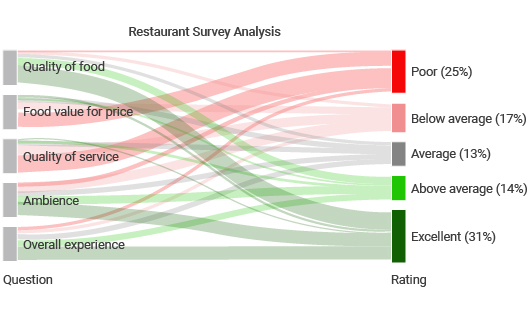
Here are some common survey results presentation examples that demonstrate how visualizing your audience feedback works.
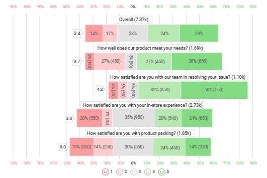
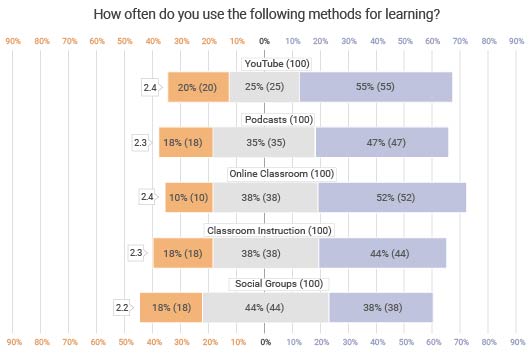
Likert Scale Survey Chart: There are many types of Likert Scales, depending on how many options you offer participants, such as a 5-point Likert Scale versus a 10-point one.
Let’s say you want to measure the quality of your customer service. You pose the survey question: “How would you rate your customer service today?” To allow participants to answer this question, you use a 5-point Likert Scale with the following survey responses:
- Very poor
- Poor
- Fair
- Good
- Excellent
When you graph your results, you’ll see how the audience’s feedback distributes across this scale. Then, you can analyze whether the results are overall positive or negative and which answers receive the most responses.
Survey Bar Graph or Pie Chart: If you aren’t using a Likert Scale or another method, a regular pie chart or bar graph can plot your survey results effectively.
These survey visualizations function similarly to the Likert Scale chart. It maps the distribution of audience responses using bars or pie slices.
A grouped survey bar graph is particularly useful because you can include multiple questionnaire items in the same chart, especially if you use a 2 or 3-point scale.
For example, if you ask 7 questions that customers answer with either yes or no, you can chart all of your data. You can put two bars side by side for each data item to reflect the yes and no answers.

How to Analyze Survey Data
Surveys require ample time and other resources to conduct. Knowing how to properly perform survey analysis ensures that you receive the absolute best value from these efforts.
Otherwise, you could needlessly waste your time (and the time of survey participants) with lackluster questionnaires that don’t lead to beneficial or valuable results.
ChartExpo’s survey charts empower your analysis, allowing you to access feedback insights more effectively and in less time.
Stop limiting yourself to only seeing what’s on the surface. Dig deeper with ChartExpo survey analysis tools.
Have a Proper Survey Goal
Every survey you create should have a goal or intention behind it. If you don’t think about why you’re conducting your survey, you’ll ask the wrong questions that don’t align with your goals or interests.
The goal of a survey is to provide you with actionable intelligence on how to improve your strategies. If you don’t ask questions that lead you to these insights, it wastes your resources and your customers’ time.
Thus, it’s crucial you have a clear purpose behind each survey you create. Each item you include in your questionnaire should support this goal and provide insights relevant to your intentions.
A crucial tip to improve your analysis of survey results is to start with a question — something you want to know that will add value to your understanding of your audience, your products, your strategies or all of the above.
For example, a pet store wants to survey audiences to learn about their thoughts on pet food. Specifically, they want to know how much pet food customers’ animal companions consume.
This knowledge will help the store with their retargeting, allowing them to push marketing messages when they know customers are running low on pet food.
Every question on the survey needs to pertain to this objective. The store wouldn’t ask, “Is the price of pet food important to you?” This doesn’t relate to the goal. The business might ask, “Is convenience important to you when shopping for pet food?” Convenience relates to the pursuit of remarketing.
Once you have this question in mind, it ensures that all the steps that follow add value and relevance to your business and understanding.
Develop an Actionable Questionnaire
Your survey analysis goal is the first step in the right direction, but you need to follow it with a good survey questionnaire.
Not only does each survey question need to relate to your objective, but they also need to add value to your business. Relevance is only part of the equation for analyzing survey data.
When Henry Ford began developing motor vehicles, he noted the importance of asking customers the right questions. “If I had asked people what they wanted, they would have said faster horses. If I asked the right question, they would have said a faster mode of transport.”
This highlights how crucial it is to review every question you ask and think critically about how to word them better. You also have to consider the available response options.
While there may not be a perfect recipe for writing the best questionnaires, there are some pitfalls to avoid.
Avoid general questions or statements: For your data analysis of survey results to be valuable and actionable, it needs to be specific. If your survey items are too general, it hinders this value.
For example, asking “Did you have a pleasant experience today?” is less valuable than asking specific questions about that experience. No matter how someone answers this general statement, you have no clue what made their experience pleasant or not.
Ask one question at a time: Every item on your questionnaire should ask one question or make one statement. If you ask multiple questions at once, participants will be confused. They may feel strongly about one part of the question, but less about the other, leading to inaccurate survey data.
Frame your questions to avoid bias: Creating proper surveys is a bit of a tightrope walk. You want to create questions, statements and responses that allow audiences to provide the feedback you find valuable. However, you want to be careful about being too leading.
For instance, “Don’t you agree that our business is the absolute best?” has heavy positive framing and extreme bias. This framing can influence how a person thinks and impact their feedback. Ideally, you want your questions to be as neutral as possible. Or, you can mix positive and negative framing in your questionnaire.
Charting Survey Results
As you start receiving feedback from your surveys, you need to begin thinking about how to display the survey results graphically.
Do you need to know how to graph survey results? Most likely the answer is yes, especially if you receive lots of feedback responses or you have a thorough questionnaire.
When you graph survey results, it’s far easier to see the big picture and fully understand your customer feedback.
Thanks to ChartExpo, you have several survey charts and graphs to use. This gives you plenty of ideas for presenting survey results. Here are some of the survey results presentation options you have:
Survey pie charts: With a pie chart survey maker, you can display survey results using each slice of the circular pie chart as one of the available feedback options. You can also use colors for the different slices to demonstrate positive versus negative responses.
The drawback to the pie chart survey visualization is when your results are similar in magnitude. Each slice looks identical and it’s hard to know which is more or less significant than the others.
Bar graph survey visualization: Bar graphs are another common customer satisfaction survey results presentation method. Visualizing survey data with a bar graph functions a lot like the pie graph survey. Each bar represents a survey response and the size demonstrates the volume of audiences selecting that option.
You can also use stacked or grouped survey bar graphs to include more data in your display. For instance, if you ask yes or no survey questions, you could group two bars for each survey item to show data from each response.
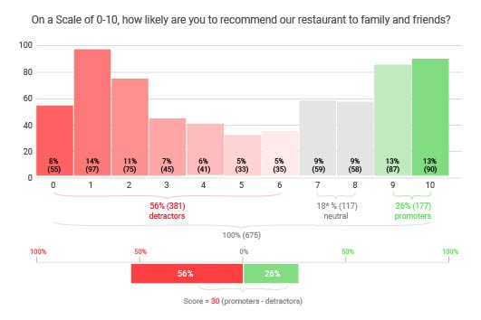
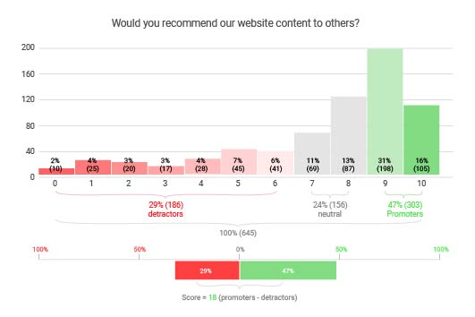
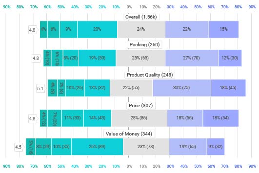
Plotting Likert and other rating scales: ChartExpo also has you covered if you need to visualize survey results using a Likert Scale survey, CSAT score (NPS score) or other similar survey analysis methods.
These scales are some of the best options for how to show survey results in a graph because of the straightforward structure that puts quantifiable data behind the attitudes and feelings of your audience.
ChartExpo offers several specialized survey charts, including:
- Likert Scale Chart
- CSAT Score Survey Chart
- NPS Chart
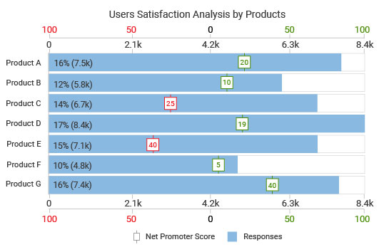
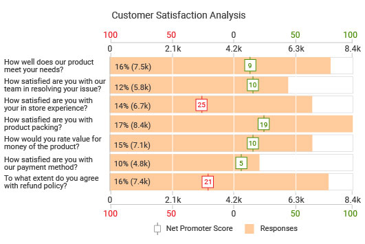
- Customer Satisfaction Chart
- And more
Analyze Your Survey Chart
At this stage in the process, you have visualized your survey results with a chart or graph. You need to analyze that chart to understand the audience feedback and gain those crucial insights into how to improve your offerings.
Reading a chart is pretty simple, especially if you know how to graphically represent survey data. The correct chart type will show survey results so that the information is immediately apparent and insights rise straight to the surface.
That said, there are a few survey analysis methods that will help you navigate the data.
Start with the most significant data first: When looking at a survey chart (or any other type of visualization), certain parts will jump out at you first. For instance, if you’re using a survey bar graph, the largest bars will draw your eyes.
These large bars, slices, etc., represent the answers with the most responses, making them significant items and an excellent place to start your survey analysis. If these responses are positive, you know that you’re doing something right in that area. Conversely, substantial negative sentiment demonstrates the most problematic parts of your strategies.
Don’t neglect unpopular responses: While you’ll notice the most prominent parts of data first, don’t allow yourself to be so distracted that you forget the smaller pieces.
For example, if you ask a yes or no question and 90% of the responses are yes, it’s still critical that you analyze survey responses in the remaining 10% that said no.
Sometimes, these small percentages hold the most crucial and actionable intelligence. Imagine if the question was, “Do you like our business?” It’s better to talk to the 10% who don’t like your business than celebrate the 90% that do.
Neutral responses are more crucial than you think: Likert Scale surveys and other tools often include neutral, middle-ground options. These choices don’t fall on the negative or positive side.
You may think about ignoring this data in your survey results graph. However, you’d be missing valuable insights. Survey participants with neutral responses may be on the fence about whether to feel good or bad about the topic. They may be the easiest to convince one way or the other.
Review and revise your survey questionnaire: As a final step, look at your survey results and see if any questions are worth removing or modifying. You might remove a question because it is no longer valuable or you’ve already answered it.

How to Display Survey Results
Surveys are universal tools that come in many different shapes and sizes. There are surveys with open-ended responses, Likert Scale surveys, and many other varieties.
To get the most value from your survey data, you need to utilize a survey graph that aligns with your type of questionnaire.
Thanks to ChartExpo’s expansive library of charting options for surveys, you’ll always have the perfect survey data visualization for your feedback, no matter how specific or specialized your data is.
Discover all of the survey graphs ChartExpo has to offer.
Understand Your Charting Options
Many people ask, “What is the best graph to use for survey results?” but there is no perfect answer because surveys are all different.
There may be more than one chart that accurately depicts your data. So, the first step in displaying survey results is knowing the different chart types available to you.
Moreover, you need to know how each survey chart functions and the advantages and disadvantages of using each one.
For instance, pie chart survey analysis works well, except when your data results are very close in value because it makes it difficult to compare each slice. In this case, a survey bar graph works better.
This is one of the many examples where understanding your survey chart options is vital. When you match your results with the proper visualization, it will more effectively show you the critical insights.
Thanks to ChartExpo’s long list of survey graphs, you have many options to use when deciding how to visualize your survey data.
Plus, this survey results graph maker enables you to quickly change between different chart types, allowing you to mix and match until you find the proper visualization.
How to Graph Survey Results in Excel
ChartExpo shows you how to display survey results in Excel with fewer headaches and less time.
To begin making survey charts in Excel using ChartExpo, you need to download the tool first. ChartExpo is readily available in the Microsoft AppSource store.
Once installed, ChartExpo appears in the Excel top menu bar under the “Insert” tab and “Apps for Office.”
Opening ChartExpo will show you the complete catalog of different chart types. To find the survey graphs, you have two options.
You can scroll through the available options until you find the Likert Scale chart, CSAT Score chart (NPS score) or another relevant visualization. Alternatively, you can use the search bar and enter the chart type by name.
With your chart selected, simply click and drag over the spreadsheet data you want to use in your visualization. Then, you can click “Create Chart From Selection” to produce an Excel survey chart from the data you’ve selected.
You can also manually enter the spreadsheet cells you want to use for your chart survey results.
After your chart appears next to your spreadsheet, you can make minor edits to it within the tool, such as altering fonts, colors and other details.
How to Graph Survey Results in Google Sheets
How to chart survey results in Excel isn’t much different from performing the same action in Google Sheets (or any other environment).
You can find the ChartExpo extension for Google Sheets in the Google Workspace Marketplace store. You can also access it by clicking “Extensions” at the top of your Google Sheets page. Then, click the “Add-ons” option and select “Get add-ons” from the resulting menu.
Coincidentally, the “Add-ons” menu is also where you’ll access ChartExpo in the Google Sheets interface.
Similar to how to chart survey results in Excel, when you open ChartExpo in Google Sheets, you’ll first see the library of visualization options. You need to choose the survey chart you want to use, whether the Likert Scale survey chart or another customer satisfaction chart.
Next, it’s time to set the data you want to use in your survey chart. You’ll tell ChartExpo what parts of your spreadsheet you want to use in your survey graph by inputting the cell labels and ranges.
Finally, click “Create Chart” and your new survey visualization will appear instantly. You can make slight adjustments to your survey graph, like changing colors, labels, etc.
Tips to Improve Your Survey Questionnaires and Charts
Making the best survey charts starts with your questionnaire. After all, if your survey itself is flawed, the resulting graph will also have issues. It may not lead you to the actionable insight you want.
Here are some tips to help you develop more actionable survey questionnaires and better overall charts.
Keep questionnaires short and to the point: You might think the more questions you include in your surveys, the more data you’ll receive. However, there are two problems with this approach.
For one, customers may not want to participate in such a lengthy survey. Their time is precious, of course. Second, more data isn’t always a good thing. It may muddle your understanding of the details that truly matter.
Thus, it is best to keep your questionnaires short and specific. Each question should relate to your survey analysis goals.
Vary your questionnaires: Your survey forms need to be engaging. You don’t want customers to quit part way through or not answer your questions at all.
An easy way to make your questionnaires more engaging is to vary each item. This means mixing questions with statements, changing between positive and negative framing, etc. These minor tactics will eliminate monotony from your feedback forms.
Use colors in your survey charts: Most survey responses or Likert Scale surveys have either negative, positive or neutral responses. Using red, green and gray colors in your charts will help visually signal these different sentiments.
You should also be strict with what you consider a positive and negative response. For example, in a 10-point Likert Scale survey, you may only want to consider a score of 9-10 as positive. While an 8 would be a solid score, there’s considerable room for improvement and it’s not an overwhelmingly positive score.

Advantages of Charting Your Survey Results
Did you know that the human brain processes visual information 60,000 times faster than raw text or numbers?
If you aren’t visualizing your audience feedback using survey charts, you’re not just missing out on valuable insights. You’re also spending too much time and energy digging through survey responses.
It’s time to realize all the advantages of charting your survey results. Stop utilizing tedious survey analysis techniques and start treating your brain to what it actually wants to see.
Understand What’s Working and What Isn’t
Receiving audience feedback is vital toward understanding what’s working and what isn’t. This applies to your marketing messages, customer experiences, products and everything else.
When something is working, it will show during the analysis of survey data. Participants will record positive feedback on the topic. Conversely, they will let you know of an issue by responding negatively to items that aren’t working well.
This type of feedback is precious to a business owner or decision-maker. You want to grow your business and improve customer satisfaction, but you may not know where to start.
As long as you have current survey data to analyze and chart, you’ll discover new intel on how audiences feel about your efforts.
These insights from your survey charts act as a roadmap for how to begin improving your strategies and offerings.
This gives you guidance on how to optimize your efforts and also ensures that you don’t waste time improving strategies that don’t need fixing.
After all, you don’t want to change a product or service that customers love without realizing it!
Using audience feedback, charts and other survey data analysis tools, you protect yourself from these mistakes.
Swiftly Identify the Most Significant Issues and Opportunities
In the Digital Age, making swift changes can mark the difference between success and failure. Customer perceptions change quickly and often. Your surveys will reflect these changes and give you the insight to respond in less time.
When you take too long to respond to audience feedback and changes to your survey data, your results suffer.
For example, one of your best-selling products suddenly starts receiving lots of negative survey feedback. This is a significant issue and a major indicator that something is wrong with one of your flagship offerings.
If you miss this sudden shift in audience perceptions, the problem could worsen and hurt your bottom line. Negative sentiment may spread and turn potential customers away from buying the product.
You want to detect the issue as soon as possible to have the chance to fix it and prevent this from happening.
Prompt response is valuable even when the data or change is positive. Your analysis of survey results may reveal emerging opportunities that require quick action.
Otherwise, you may miss the chance to capitalize or leave the door open for competitors to reap the rewards.
Visualizing survey data with charts and graphs shows you where these risks and opportunities are hiding in less time than if you analyzed survey data by hand.
That’s the advantage of charting your survey results. You can immediately see valuable insights and take action. You’ll eliminate potential risks and prevent negative sentiment, while capturing new opportunities and maximizing your brand promoters.
Get More from Your Surveys
Surveys require significant time and resources to create, disseminate and analyze. Even with digital channels, it still takes a lot of work to encourage your customers or clients to participate and take the time to offer their feedback.
After exerting all of this time and energy, don’t you want to guarantee that you maximize your return value?
Understanding how to put questionnaire results into a graph and leveraging survey charts enables you to get the most value from your audience feedback requests.
Visualizing the information transforms your survey data into actionable intelligence, improving the agility of your change and insight detection.
Visual analysis is faster than traditional methods because your eyes and brain work together to spot trends, shifts, outliers and other significant parts of data. Charting allows you to actually see your insights!
It’s far more efficient than manually tallying the numbers and analyzing a spreadsheet.
Since ChartExpo has multiple survey charts available, you can depict your data using different visualizations. Each new way you visually represent your data has the chance to reveal undiscovered insights and expand your understanding of the audience’s responses.
You’ll never miss any noteworthy changes to audience perceptions, attitudes or feelings, thanks to ChartExpo’s survey graphs!
Communicate Results to all Parties
Not only do these charts help you detect critical audience insights, but they also make excellent reporting tools that you can use to present survey findings to others.
Communicating audience feedback results to others helps your organization plan how to respond to survey data.
If you have to justify decisions to stakeholders, a survey analysis report example may be necessary to help these parties understand what’s happening from the customer’s perspective.
Chart surveys give you the tools to communicate the latest audience feelings and perceptions to stakeholders effectively. You can use these changing attitudes as reasons behind your latest changes to products, marketing campaigns and other customer-facing strategies.
ChartExpo’s survey graphs help distill substantial amounts of audience feedback into a simplified, visual format, providing an overall better approach to presenting survey results.
Remember, you may be very familiar with your survey data, but stakeholders and other individuals don’t engage with this feedback as often as you do. Survey charts help translate the data into a more convenient format.
These other parties will love the convenience of the survey charts because it allows them to understand the information you’re presenting in less time, meaning they can get back to their own projects.

What Is the Best Way to Analyze Survey Data? ChartExpo
Survey analysis is a crucial component of knowing how to improve your strategies and help your organization grow and improve.
ChartExpo’s catalog of survey charts and graphs offers the best way to analyze your audience feedback, ensuring you get the maximum value from these responses.
The ChartExpo system is built for accessibility, giving everyone on your team access to convenient charting and survey analysis. There is no fussing with confusing codes or scripts and you always have the right chart for the data.
Experience everything ChartExpo can do for you and your data.
3 Steps to Turn Raw Data into Engaging Visual Data Stories
ChartExpo isn’t the only survey graph maker on the market. Many survey analysis tools and software solutions are available to today’s data users. However, ChartExpo is by far the easiest and most accessible survey data visualization tool.
This simplicity when creating survey charts saves you many hours and headaches, without sacrificing visualization quality or freedom.
ChartExpo’s mission is to put effective, engaging charts in the hands of more users. In a world where data is king but extracting insights is painstaking, ChartExpo hopes to level the playing field by making visual analysis accessible by everyone.
The tool works through a straightforward 3-step process that converts your raw data into compelling visualizations. These impressive charts will bring hidden, valuable insights to the surface and help you make sense of even the most complex data sets.
Here’s how straightforward the ChartExpo system is:
Step 1: Choose your survey chart type: ChartExpo has a library of different chart types. Your first step is to choose the survey graph template you want to use. You can scroll through all of the available charts, or enter the chart’s name in the search bar.
Step 2: Select your data: This step in the process will vary slightly depending on if you’re charting survey results in Excel, Google Sheets or another platform. That said, it is an easy process no matter which tool you use. You simply select the data from your spreadsheet that you want to use or enter the cells and range manually.
Step 3: Create your chart: If you’re satisfied with your chart type and data selections, the only thing left is to click the “Create Chart” button. Your new survey chart will appear next to your spreadsheet instantly. You can then make edits or export the chart image.
This entire process takes only minutes, meaning you can get straight to the analysis stage!
Codeless Charting Gets Everyone Involved In Survey Analysis
One of the biggest headaches, when you use a survey results graph maker that isn’t ChartExpo, is the coding.
Most chart creators allow you to make custom charts through JavaScript and coding. There are a few inherent problems with this.
First, if you don’t have coding expertise, you have to either learn it or hire someone with the skillset. This also limits who in your team can chart survey results.
Then, you have to overcome the challenges of coding itself. Even an expert will occasionally make errors or mistype a piece of code, causing your entire chart to have problems. You may have to scan the script line-by-line to find the error. That’s wasted time you could spend on your survey analysis!
ChartExpo’s tool removes these unnecessary obstacles by offering a codeless chart creator. All scripting is done in the background; you never even have to look at a single piece of code!
This codeless survey chart maker lets you make charts in far less time than other tools. The best coding wizard can’t compete with how fast and easy ChartExpo is at data visualization.
Plus, it allows everyone on your team to participate in interpreting survey results and charting them, regardless of their coding backgrounds.
With more people participating in the process of how to present survey results in a report, you foster a stronger data culture and accomplish more with your survey feedback.
Customers will always feel that you’re listening to their concerns because you have an entire team making insightful changes based on their responses!
Discover New Ways to Present Survey Results
Apart from being the fastest and most effective survey graph maker, the other powerful advantage of ChartExpo is the number of different chart and graph types available.
ChartExpo’s complete menu of different chart types includes visualization options for you to choose from, even outside the scope of survey graphs.
There are charts for marketing and PPC advertising data, performing comparison analysis, dayparting, mapping energy flow and so much more.
With all of these chart and graph types, you have a visualization for every occasion and any kind of data, no matter how niche or complex.
The beauty of ChartExpo’s offerings, coupled with its effortless charting system, is the ability to view your data using multiple advanced charts simultaneously. It takes just a few clicks to turn a survey bar graph into a Likert Scale survey chart and back again.
Each time you visualize your survey data using a different chart type, it’s like viewing the information from a new angle. You never know what new insights you’ll discover using a fresh charting perspective.
For instance, you may miss certain details when investigating your data using the pie chart survey analysis approach. When you visualize the same information with a survey bar chart, these hidden insights reveal themselves.
Reach Insights and Make Better Decisions In Less Time
You have lots of survey data, but you lack the essential and valuable insight behind what all this data means. Data is useless until you can convert it into insights and action.
Faster and more accessible charting means you reach these valuable insights in less time and with less effort.
These insights inform your optimization efforts, allowing you to make more accurate decisions and spend your time and resources more efficiently.
Speed is a crucial element in understanding and applying your survey results. You don’t want to sleep on your customers’ latest attitudes and feelings!
After all, if there’s something that customers are displeased about, you want to remedy that issue swiftly. You don’t want it to grow into a more harmful crisis.
Faster insight detection and decision-making also give you a competitive edge. You’ll be able to respond to sudden changes in attitudes faster than other businesses. You may even be the first company to seize the newest opportunity or customer trend!
To put it simply, the faster you can turn data into insight, the more value your decisions will hold.
ChartExpo’s straightforward, efficient survey chart maker guarantees the speedy retrieval of insights, permitting you to make data-driven decisions swiftly.
Net Promoter, Net Promoter System, Net Promoter Score, NPS and the NPS-related emoticons are registered trademarks of Bain & Company, Inc., Fred Reichheld and Satmetrix Systems, Inc.
ChartExpo Pricing
ChartExpo for
Google Sheets
$10*
per month
(no purchase necessary)
*pricing starts at $10
per user per month.
Only in-app purchase available
ChartExpo for Google Sheets
single-user purchase video.
ChartExpo for Google Sheets
domain-users purchase video.
ChartExpo for Google Sheets
single-user installation video.
ChartExpo for Google Sheets
admin installation video.
ChartExpo for
Microsoft Excel
$10*
per month
(no purchase necessary)
*pricing starts at $10
per user per month.
Only in-app purchase available
ChartExpo for Excel single-user
purchase video.
ChartExpo for Excel domain-users purchase video.
ChartExpo for Excel single-user
installation video.
ChartExpo for Excel admin
installation video.
Custom Pricing
Videos
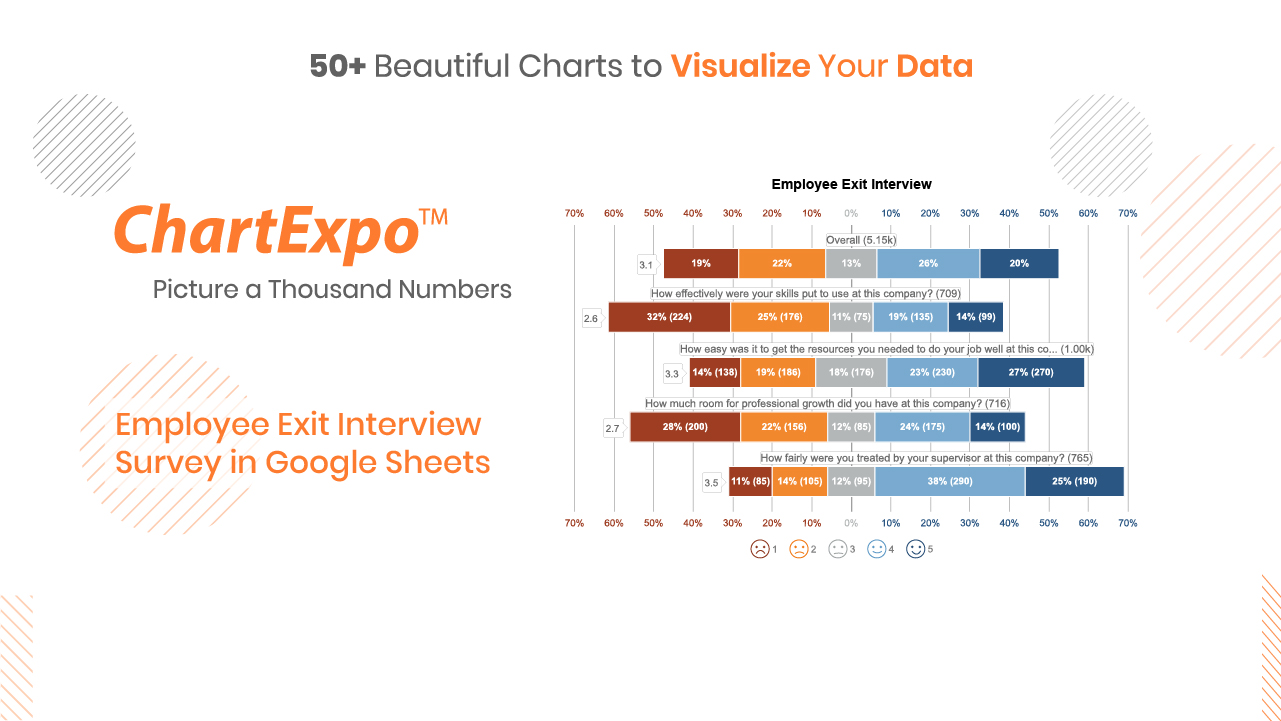
4:03
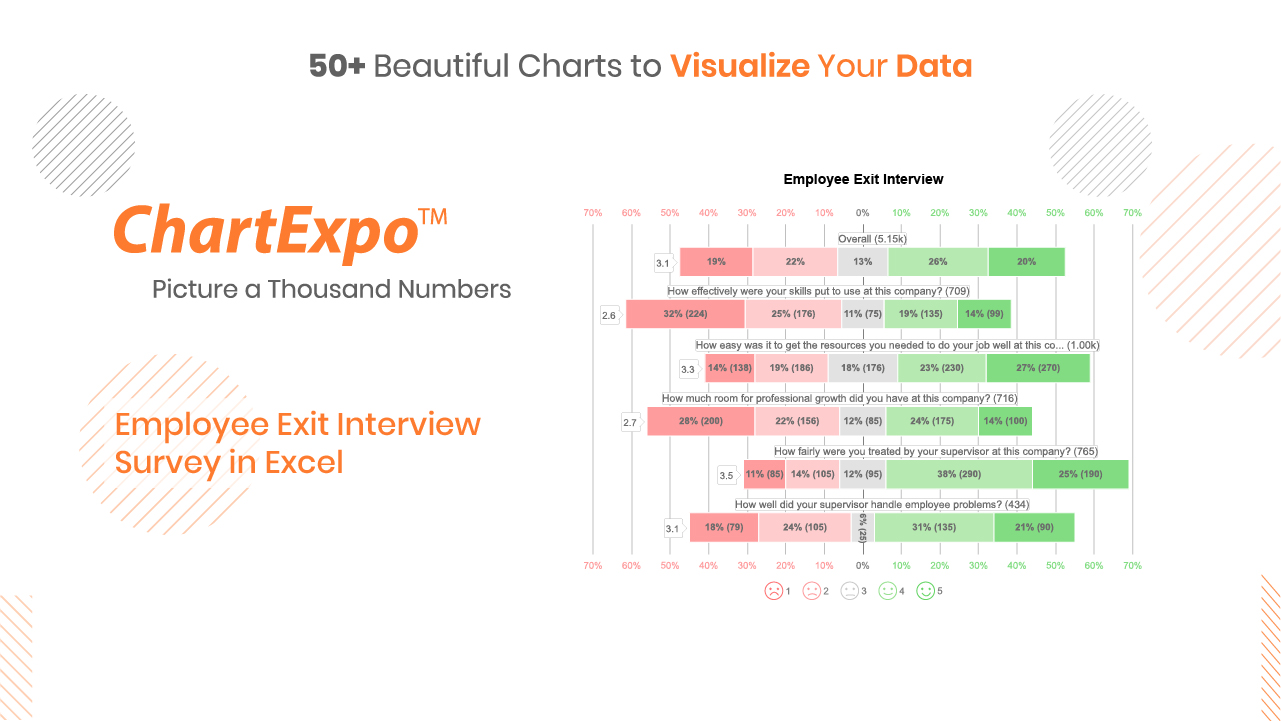
2:43
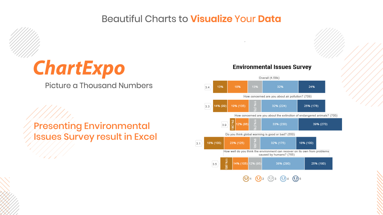
3:59
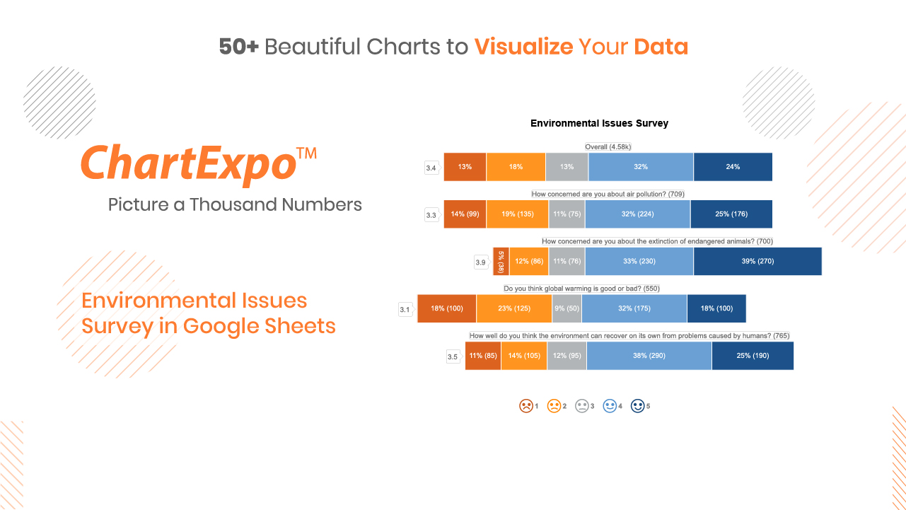
4:46
Blogs
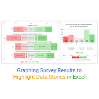
Graphing Survey Results to Highlight Data Stories in Excel
Click to discover how to visualize or graph survey results in Excel. You will also learn...

Likert Scale Types for Survey Analysis – A Complete Guide
A complete guide on the best Likert Scale types you can use in your survey analysis. Learn What is a...
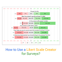
How to Use a Likert Scale Creator for Surveys?
Click to learn how to use a Likert Scale creator for your data stories. We’ll unveil fresh tips...
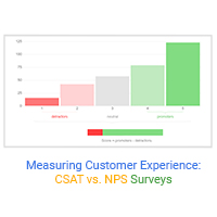
Measuring Customer Experience: CSAT vs. NPS Surveys
Click to learn how to measure customer experience using CSAT Vs. NPS charts. Also, we’ll address...
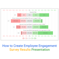
How to Create Employee Engagement Survey Results Presentation
Click to learn to create an employee engagement survey results presentation. Also, we’ll address...
