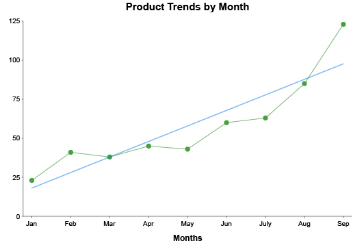
Line Graphs
A Simple Way to Chart Trends and Insights
A simple line can reveal countless insights.
Line graphs help you navigate through complex data sets and understand the complete story. It is one of the best visual analysis tools for tracking and comparing data over time.
ChartExpo offers the most effective way to create custom and advanced line graphs. It gives you even more value from your line graphs and other charts.
Find out how ChartExpo and line graphs enable you to do more with your data.
Google Sheets
Microsoft Excel
Free 7-day trial (no purchase necessary). Pricing starts at $10 per month.
 ChartExpo for Google Sheets is
 used by 330,000+ users worldwide!
Click this link to watch a ChartExpo for
Google Sheets single-user installation video.
Click this link to watch a ChartExpo for
Google Sheets admin installation video.
Click this link to watch a ChartExpo
for Excel single-user installation video.
Click this link to watch a ChartExpo
for Excel admin installation video.
What Is a Line Graph?
Line graphs are popular and familiar visualizations, making them excellent tools for displaying and reporting data. It is one of the first visual analysis tools people think of.
You can use the line graph design to make custom charts that match your data. However, this requires detailed knowledge of what a line plot is and how to use it.
Learn everything you need to know about the line plot graph.
History of Line Graphs
Line charts are centuries old. It was one of the first visualization types invented (alongside the bar chart) and immediately became a popular way to display statistical information.
William Playfair tends to get the credit for creating the line graph. In fact, Playfair is widely recognized as the inventor of graphical methods — charting. His advancements include line and bar graphs, pie charts and others.
Playfair’s line graph appeared in his work, “The Commercial and Political Atlas; Representing, by Means of Stained Copper-Plate Charts, the Exports, Imports, and General Trade of England, at a Single View. To which are Added Charts of the Revenue and Debts of Ireland, Done in the Same Manner by James Correy.”
Clearly, Playfair had a higher acuity for visual analysis methods than creating concise titles for his work.
Nonetheless, Playfair’s work was highly regarded and showed the world the potential value when you graph a line of data. The same publication also included an early example of a bar chart.
Considering that there were almost no ways to visually depict statistics and figures at the time, Playfair’s work was like simultaneously giving fire and the wheel to a prehistoric man.
It wouldn’t be long before these early line graphs and bar charts evolved into many of the visualization tools we rely on today. Now, everyone knows how to graph a line and read these charts.
Line Chart Definition
A line graph, or line plot, line chart, etc., is a data visualization that depicts data points connected by lines.
The position of these points relates to a quantitative measure. This count data may be dollars, people, clicks, degrees of temperature, etc. The higher the point is in the chart, the greater the magnitude of that value.
Typically, data in a line plot appears over a period of time. For instance, you might look at sales numbers for each month in the year.
That said, including a time-related component in line graphs is not mandatory. You can chart any two variables (or more in the case of multi-axis line charts) using the XY axes of the line plot.
The value of using a line over other visualization methods (bars, circles, etc.) is you can effortlessly track changes from one point to the next. This is why this visualization so frequently expresses data over time.
The simple nature of line graphs makes them powerful and highly versatile visualizations. Many variations of this chart have appeared over the years.
Due to this simplicity, line graphs are highly practical when reporting data findings. It requires very little explanation or background to understand a line graph.
How to Read a Line Plot
The beauty of the line graph is its straightforward design. You can understand what most line charts are “saying” without ever having seen this visualization type before.
This makes reading a line plot very easy. You’ve likely done it before, in school or elsewhere.
Line graphs use a Cartesian plane, which features the typical X and Y axes we see in most charts. This familiarity only adds to the readability of this chart type.
Thanks to the XY plane, plotting line graph data is very easy. Your two variables appear on opposing axes, making it easy to place each point.
Large spikes in the line indicate that the corresponding item has a high value or frequency. Conversely, dips in the chart reflect things with a lower-than-average relationship with the opposing variable.
When the plot line diagram shows data over time, there are a few patterns to look out for. These signal certain types of changes in the data.
Outliers: When these spikes or dips land far outside the typical range of your dataset, it’s a sign of an outlier. It’s a data point that is abnormal or anomalous. Sometimes, outliers are simply random occurrences. Other times, however, they are signals of more meaningful insights.
Shifts: Sometimes, there will be a spike or dip in the data that persists for several points, perhaps even permanently. This is known as a shift. These shifts can sometimes happen dramatically and completely alter what is “normal” for the data.
Trends: A trend is a more steady increase or decrease in data over time. The gradual increase or decrease gives you time to react, assuming you have the proper line graph to detect these patterns!
Line Graph Examples
The best way to understand when to use a line graph is to look at a real-world example of a line graph. By studying different line chart examples, you see the many use cases for this visualization and what types of insights you can discover during analysis.
Line plot example 1: One of the most common examples of line plots is to showcase rising or falling prices, sales, etc. It’s even an emoji on your phone.
In this example line chart, you’re looking at sales or prices over a specific time. Each data point corresponds to a particular time and the sales/price data for that period.
You can quickly tell whether the data is overall positive or negative and the times when sales were at their best and worst.
Line plot example 2: Paul is a pay-per-click advertiser managing ad campaigns that span thousands of different keywords. He needs a chart type capable of quickly detecting up and down trends in these search terms.
Line graphs work perfectly for him because he can quickly look at the results of his keywords and locate the ones with significant changes. Even with so many targets or items in his dataset, it’s easy to spot trends, shifts and outliers.
When a keyword gains or loses engagement, Paul will be able to detect the change and respond in a short amount of time. He’ll react to opportunities and emerging trends much faster than competitors, thanks to this example of line chart analysis!
He can even use a stacked or multi-line graph to include more keywords in his charts or use the double line graph design to compare two and decide which to use in a campaign.
Line plot example 3: Ashley owns a new ice cream shop in her town. After a summer of sales, she wants to see the correlation between hot temperatures and ice cream sales. Understanding how the weather impacts her business will help her forecast revenue in the future.
She creates a double line graph with one line showing the high temperatures and the other depicting her sales. Using this line plot, she can look at any day and see the temperature and her sales for that time.
Because Ashley is charting data with different ranges, she uses a multi-axis line chart. This gives her an axis with her temperature data and another for the sales in dollars. This extra component helps display the data more appropriately.

Types of Line Graphs
Over the years, there have been many variations to the line graph design. The simple nature of this visualization makes it easy to customize and alter.
Understanding the advantages and disadvantages of the different types of line graphs helps you match the proper visualization to your data.
By pairing the correct line graph with your data, your visual analysis reveals more valuable and actionable intel.
Explore all the ways line graphs can visualize your data and help you understand the story behind the numbers.
Simple Line Graph
Simple line graphs are the most basic and common type. Yet, don’t let the simplicity fool you. This is a powerful type of line graph that is capable of simplifying huge, complex datasets.
A simple line graph utilizes an X and Y axis and a single line. The Y-axis reflects your dependent variable and the X-axis shows the independent one.
For example, you might use a simple line graph to look at changes in weather for each day of the month. In this scenario, the X-axis would show the days and the Y-axis would have temperature values.
The position of each point along the line would tell you the day and the temperature. The higher the point, the hotter the temperature for that day.
By charting data between these two variables, the simple line graph allows you to understand their relationship better. You may notice repeating patterns, outliers or other important details in the line’s path.
In the above example, you may notice shifts in temperature that come with cold or warm fronts moving in.
It’s very common for simple line plots to use time as a variable. This allows you to track changes over time and see how your results have changed from one period to the next.
That said, there are instances where simple line graphs depict data that is unrelated to time.
Double Line Graph
A double line graph adds another component to the visualization by showing a second line. This allows you to compare results from two items in your data using the same set of variables.
Instead of only looking at temperatures for this month, you could include a second line to reflect the same month from the previous year. Inserting this second data series lets you see how temperatures have changed between these two periods.
Essentially, adding a second line opens the door to more interesting and actionable insights.
The comparative nature of double line graphs makes them valuable tools for comparison analysis. You can measure results from two items and determine which performed better.
Comparisons are best when it is between two items. You can directly draw similarities and differences to understand how your performance has evolved and shifted.
Since line graphs typically present timed or periodic data, you can use the double line graph to visually compare data before and after a certain change.
This comparative analysis strategy helps you validate certain decisions. For instance, let’s say you decide to alter your storefront or update your website. You can compare results from before and after these activities to see if the changes created a positive or negative impact.
Multiple Line Graph
A multiple line graph, also known as a stacked line chart, showcases even more data items in the chart. Instead of comparing two components, you can compare several at once.
However, it’s important to keep your multiple line graphs grounded. If you add too many elements, the visualization will quickly become too overwhelming and confusing to analyze appropriately.
If you have the proper balance in your multiple line graphs, you’ll be able to extract a substantial number of insights by comparing results across various items in your dataset.
The added elements can help you determine the best and worst performers, while also giving you insight into notable patterns that may further your understanding of the information.
You can also use the multi-line graph visualization to validate certain discoveries or conclusions. For instance, let’s say you create a line chart in Excel measuring sales data from the current year to the previous one to check your recent growth.
In analyzing this chart, you notice that in both years there was a significant drop in sales during April.
Curious if this is just a coincidence or a more noteworthy discovery, you create a multiple line graph that includes the same sales data from the last five years. The new chart gives you the evidence you need to decide.
Area Charts
Area charts are a unique type of visualization that plots data points in a connected line. The main difference between an area chart and a line graph is that the space below each line is filled.
This gives an area chart some of the functionality of a bar graph because you can compare each area’s size (and shape), just as you would compare the length or height of bars.
Depending on the data, the various shapes in an area chart layer over one another. You can use this design to look at how trends rise and fall, particularly ones that repeat routinely.
For instance, an outdoor company may look at sales for winter, spring, summer and fall product lines. Visually depicting this data along a timeline as an area chart will help the business recognize when interest for one season ends and the next begins.
Using this visualization, the retailer can plan marketing campaigns, sales and other strategies more effectively.
You can also create a stacked area chart. In this visualization, each shape is stacked instead of overlapping, meaning each component is a solid color and not transparent.
Stacked area charts are useful in making parts of the whole comparison. You can see how each item contributes to a larger sum. This also makes it an excellent visualization tool for mapping results from different stages of a process.
Visualizing data from each stage of a marketing funnel is a great example of when to use the stacked area line chart.

What Is a Line Graph Used for?
The versatility of line graphs allows you to use this chart for many different analysis types. It will quickly become a go-to chart type for many of your data visualization projects.
While the most common use is to track and monitor changes to data over time, you can also use line graphs for forecasting, comparison analysis and more.
Discover how to use a line graph in Excel, Google Sheets and other platforms.
Tracking Periodic or Changes over Time
The most common use of line charts is to visualize changes over time or in data that repeats periodically.
The path of each line in the graph shows you times when the data’s performance was up, down or in between.
There are so many instances where tracking changes over time provides valuable understanding to your team or business. Here are just some of the popular ways users analyze line graphs with this goal in mind.
Growth: Comparing a past period to the present one enables you to see how far you’ve progressed or grown. This is a great tool to include in reports to stakeholders or clients. It also helps you measure how much you need to scale to match growth for the future.
Remember, you don’t always measure growth by sales or revenue. You can also look at how site traffic, leads, clicks or other performance metrics have grown.
Seasonality: Many products and services are popular for only a certain period throughout the year. For instance, very few people shop for ski sharpening services in the summer.
Charting sales of different seasonal items throughout the year helps you see when these products gain and lose popularity. You can then adjust marketing, ads and other details to align with these trends.
Keyword optimization: Similar to seasonal products, keywords also fall in and out of style as people change their search habits. To make the most of your efforts on digital channels, it is crucial to keep tabs on which keywords are trending up or down.
Line graphs enable you to track the performance of several keywords simultaneously, giving you a complete view of which terms to target in your efforts.
Line Graph Comparison Analysis
Another practical method of using line graphs is to perform a comparative analysis between two or more items, dimensions, etc.
In other words, by visualizing more than one line in the chart, you can compare the results and better understand key factors that impact the performance of the variables shown.
For example, you might want to compare the annual sales data from two store locations. Using separate lines to depict the data from each store, you can compare and contrast the performance of each.
With this line graph visualization, you may discover customer shopping trends; detect weaknesses in one location versus the other and more.
In a multiple or stacked line graph, you have the opportunity to compare even more items in your dataset.
You can use this same comparison analysis method to validate certain trends or shifts. Sometimes, these patterns repeat periodically. For instance, you know that sales data will spike around the holidays.
In other situations, these fluctuations are signs of possible opportunity and risk. You can compare results from several periods to test whether a change is a recurring event or a signal of something greater.
If the event is recurring, the past data will reflect the same trajectory in the line graph. However, if the pattern is not mirrored in past data, you know that it is not a regular event and needs to be monitored and analyzed further.
Forecasting what’s Around the Corner
Data isn’t exactly a crystal ball, but it can be pretty good at telling you what’s about to happen. Line plots are particularly useful for predictive analysis and forecasting.
While data fluctuates up and down and can act sporadically at times, you can make some careful assumptions based on how the data is moving.
If you notice an upward trend, you can anticipate that the data will continue in that direction. The same is true when metrics start to decline.
Typically, action is required to move data in one way or another or change its course. When you can track and predict its path, you know the best times to act and create these shifts.
Speed is a significant factor in data analysis. The slower you respond to changes, the less value your actions carry. If you react to a common customer complaint months later, it’s not as effective as if you corrected the issue immediately.
Forecasting results with a line graph helps you anticipate negative or positive shifts and trends before they occur, giving you ample time to correct problems and capitalize on opportunities.
You can also forecast results by looking at the same data from different periods. Some changes will continue appearing each year, week, month, etc.
Knowing these patterns allows you to expect certain changes in behaviors or results.
Detecting Shifts, Anomalies, Trends and other Patterns.
Managing your data is a practice of monitoring the results and looking for noteworthy patterns. After all, if your data is steady, there is no reason for concern or action.
Line graphs are perfect data visualizations for creating dashboards and charts to monitor data for the trends, shifts, anomalies and other patterns that occur within your data.
Even without seeing any actual numbers or figures, you can recognize these events by simply looking at the path of the line and how consecutive data points behave.
When consecutive data points gradually increase or decrease, it’s a sign of a trend. If there is a dramatic jump between two data points, but then the data persists at its new level, it is a shift.
Outliers and anomalies are easiest to detect in line graphs. These events occur when a data point lies well outside the expected range. In a line, this appears as a huge spike or dip. It is instantly recognizable.
The way that line graphs visually capture these different patterns makes them exceptional tools when you need to monitor lots of other things in your data.
For example, a digital marketer may need to monitor hundreds of keywords, posts, landing pages, etc. With a line chart, they can quickly assess the performance of all of these details and find the ones with noteworthy changes worth exploring further.
It is truly an unmatched visual analysis tool for monitoring data and detecting risks and opportunities.

How to Make a Line Graph
Learning how to graph a line is something you might remember from grade school math class. Creating a line graph for data analysis is a slightly different undertaking.
You can make a line graph in Excel or Google Sheets with relative ease. However, these tools only work for simple line graphs. More advanced visualizations require better tools.
ChartExpo shows you how to create a line graph in Excel and other platforms in fewer steps and without headaches.
See how the most effective data visualization tool for line graphs works.
Have a Clear and Concise Analysis Goal
Your time is valuable. You have many tasks and responsibilities to manage in a single day, let alone a week, month and beyond.
When it comes to data visualization, you want to protect yourself from wasting valuable time and other resources on irrelevant and needless charts.
The best way to achieve this is by having a goal for your analysis.
An analysis goal dictates what you hope to answer or learn through this charting process. It saves you time because it keeps your analysis and chart creation focused and on task.
It will tell you what data you need to gather and even help you decide the best chart type to use. You should record this goal and refer to it as you collect data. This will ensure you only grab information relevant to the analysis.
Without this goal, it’s easy to get sidetracked by data that seems interesting but doesn’t actually support the purpose of your analysis. You may even abandon one analysis question entirely in pursuit of another. This leads to waste and redundancy in your data utilization.
If you have to pause the analysis and return to it later, this goal will refresh your memory as to the intent of the chart, allowing you to get straight back to work. It also helps other team members who may join in the analysis’ later stages.
Collect and Prepare Your Data for Making a Line Graph
With a clear goal set, the next step in the charting process is to collect and prepare your data.
If you’re creating a simple line graph, this is an incredibly straightforward part of chart creation because you’re likely working with a relatively simple dataset. You’ll only have two columns of data and however many rows you need to accommodate your independent variables.
When you start creating more advanced line graphs, like a multi-series line chart, your dataset grows larger and more complicated. The complexity of the information produces some additional challenges.
The most significant obstacle occurs when you need to join data from different sources. You have to prepare each set of data to ensure it correctly pairs with the others.
This preparation includes checking labels, units of measure and other details. For instance, if you’re gathering sales data across multiple locations, you may have figures in different currencies. You need to convert these values into one unit of measure.
The same goes for certain metrics. If you’re looking at website analytics, different tools may define or label “engagement” differently. You need to normalize these measures to join the data properly.
Before you move into the chart creation phase, it is absolutely imperative that you check over your datasets for any errors. This includes typos, missing or incorrect values, inconsistencies, etc.
Bad and inaccurate data leads to errors in your chart and damages the value of your analysis. You may end up making decisions based on incorrect information.
The more time you take preparing and checking your data sources, the better your overall charting process will be and the easier time you’ll have creating a line plot.
How to Make a Line Graph in Excel
There are many different approaches for how to make Excel line graphs. You can use the line graph maker Excel offers or choose another tool for creating a line chart in Excel.
Our recommendation for making a line graph in Excel is ChartExpo — the best data visualization tool for making professional charts in less time.
You can find the ChartExpo line graph generator for Excel from the Microsoft App Source site. After downloading the tool, you’ll find it in Excel the next time you open the program.
To find apps like ChartExpo in Excel, you need to start with either the “File” or “Insert” menu, depending on which version of the program you use. For most versions, you’ll use “Insert” and then select the “My Apps” submenu.
After opening ChartExpo, you’ll be asked to choose a chart type for your data. You have several options, including many different chart types outside of the line graph family.
You find a specific chart type by entering its name into the search bar.
Chart type is one side of the visual analysis equation. The second half is the data you’re charting.
With ChartExpo, you can highlight the data you wish to put in your line graph. Or, you can input your information manually using the tool’s interface. This is sometimes necessary with larger datasets where the components aren’t so easy to select by clicking and dragging.
Be sure to review your data and chart type selections for each line plot in Excel you make. If you’re happy with your choices, you can click the “Create Chart” button to finalize the process of creating a line graph in Excel.
You can save your Excel line plot and insert it into reports, presentations, emails, etc.
How to Make a Line Graph in Google Sheets
Don’t use Excel and want to learn the best method for how to make a line graph on Google Sheets? ChartExpo is still the answer and is readily available in the Google Workspace Marketplace.
To access this page and begin making a line graph in Google Sheets, click the “Extensions” tab at the top of any Google Sheets page. From this menu, click “Add-ons,” followed by “Get add-ons.” After you download ChartExpo, you’ll open the tool by finding it under the “Add-ons” section.
From here, the process of how to create a chart in Google Sheets with ChartExpo is nearly identical to making a line chart in Excel with the tool.
You enter your chart type into the search bar, select it and then begin inputting your data. Again, you can choose between inputting data through the simple, easy-to-use ChartExpo interface, or highlighting it with a quick click-drag of the mouse.
The latter method is faster because you can create a line graph in Google Sheets in just three clicks. One click chooses your chart type, a second click highlights the data you want, and the final one taps the “Create Chart” button to finalize your visualization.
Always be sure to closely review your data and save your work for each line chart in Google Sheets you make.

Why ChartExpo is the Best Line Graph Maker
ChartExpo is much more than a line graph creator. It assists you with every part of the visual analysis process, from charting and analysis to reporting and data communication.
It is the best data visualization tool because of how straightforward the interface is for making charts. There are no scripts, coding or other tedious and unnecessary hurdles.
You can transform raw data into actionable intelligence in as little as three clicks. It takes only minutes.
Experience the difference when you create visualizations with ChartExpo.
The Most Accessible and Straightforward Charting Tool
In the Digital Age, understanding your data is critical to success. If you cannot keep up with the latest metrics and respond to changes in the market and other conditions, it is easy to find yourself lagging behind.
Visual analysis is the most effective method of transforming raw data into actionable intel on how to improve strategies, make decisions and more.
Considering how often you need to make visualizations and dashboards, it’s imperative to have a tool that allows for speedy chart creation.
After all, data moves incredibly fast. You need a line chart maker that moves even quicker than your data to stay ahead.
ChartExpo offers one of the most efficient data visualization tools available. It uses a straightforward, three-step system to create your own line graph or another chart type.
Not only does this simple process save you time, but it makes creating advanced charts more accessible. There are no complicated settings or scripts to navigate.
Depending on your data, you can create professional charts in as little as three clicks. The first click selects your chart type, line plot or otherwise. A second click highlights the data you want to chart.
Once you have your visualization and data selected, you’re done. The last click is to hit the “Create Chart” button.
This is how charting should be.
Create All Different Types of Line Graphs and More
ChartExpo offers a complete chart gallery with more options than are regularly available in programs like Excel or Google Sheets.
Many of ChartExpo’s advanced visualizations focus on specific types of data and analysis. For instance, there are charts for digital marketing metrics, comparison analysis, resource and finance management, customer journey optimization and more.
Included in this charting library are visualizations for all different types of line graphs. Some of the examples of line graphs offered are:
- Simple line graph
- Double line plot
- Sparkline chart
- Area chart
- Double axis line and bar combo chart
- Multi-axis line chart
- Multi-series line chart
- And more
This list doesn’t include the many non-line graphs also offered through the ChartExpo data visualization software.
Having so many different chart types is a valuable asset. There is rarely only one visualization for each data set. You can typically use several charts to show the same data.
Each visualization provides a unique look at the information, giving you a new perspective and fresh insights to discover.
In other words, when you chart the same data using multiple chart types, you gain a more complete view of the data.
ChartExpo offers visualizations that other teams and competitors may not have access to, meaning you have an inside scoop on details they can’t see!
Absolutely No Coding or Scripting Required
Many tools for creating a line chart or other advanced visualizations rely on coded scripts to insert these visual analysis tools into Excel, Google Sheets, etc. This is particularly true of chart types that don’t already exist in these programs.
ChartExpo relies on the same scripts to help you make a Google Sheets line chart, Excel line plot, etc.
However, ChartExpo automatically writes and edits this script for you. You never even have to look at the code yourself.
Any change you make in the ChartExpo interface instantly and automatically updates the script to reflect the edit.
Other tools won’t do this for you. They give you the chart template and ask you to make the changes to build your line graph or other visualization.
This is a much slower process and it requires you to have some background in working with codes and programming languages.
Needing this expertise in code writing greatly hurts the accessibility of charting. It limits who can participate in developing visualizations because only those with the proper skillset can produce quality charts on time.
Manually editing scripts also leads to more errors, which adds even more time to how long it takes to create line graphs and other charts. One mistype can derail your entire visual analysis.
By automating the script editing, ChartExpo removes all of these hurdles and allows anyone to create professional charts.
Empower Communication with the Best Data Visualization Tool
With most other data visualization tools, only a select minority of people participate in chart creation. The rest of the team submits chart requests and waits for their visualization.
The problem with this approach is it is way too slow. The longer people wait for charts, the less relevant the analysis findings become.
You don’t want to notice a leak in your plumbing after the ceiling collapses. You want to detect this problem in the earliest stages, when it is manageable to fix. The same is true of data, whether a risk or opportunity insight.
The other issue is it limits the exchange of analysis ideas, reports and other valuable communications. Valuable insights end up in departmental silos.
In some situations, multiple teams are charting the same data and answering the same questions because they aren’t communicating. This redundancy wastes resources and slows down results.
ChartExpo prevents these problems with its straightforward and accessible data visualization tool. Giving more individuals access to charts has a profound effect on your internal culture and the ability to communicate data findings.
With everyone actively participating in creating their own charts, it fosters a natural culture around data and analysis. People will freely share their charts and findings with others, even across departments.
It’s this type of culture that leads to a solid data-driven organization!
ChartExpo Pricing
ChartExpo for
Google Sheets
$10*
per month
(no purchase necessary)
*pricing starts at $10
per user per month.
Only in-app purchase available
ChartExpo for Google Sheets
single-user purchase video.
ChartExpo for Google Sheets
domain-users purchase video.
ChartExpo for Google Sheets
single-user installation video.
ChartExpo for Google Sheets
admin installation video.
ChartExpo for
Microsoft Excel
$10*
per month
(no purchase necessary)
*pricing starts at $10
per user per month.
Only in-app purchase available
ChartExpo for Excel single-user
purchase video.
ChartExpo for Excel domain-users purchase video.
ChartExpo for Excel single-user
installation video.
ChartExpo for Excel admin
installation video.
Custom Pricing
Blogs
How to Create a Dual Axis Line Chart?
Click to learn what Dual Axis Line Chart is and How to create Dual Axis Line Chart in Google Sheets in few clicks without coding.

How to Make a Line Graph in Excel with Two Sets of Data?
Click to learn how to make a Line Graph in Excel with two sets of data? Also, we’ll address the following question: why do we use a Line Graph?

How to Make a Line Graph in Excel with Multiple Variables?
Click to learn how to make a graph in Excel with multiple variables? We’ll also cover an introduction to the Line Graph in Excel.

How to Make a Line Graph with Multiple Lines in Google Sheets?
Click to learn how to make a Line Graph with Multiple Lines in Google Sheets.
