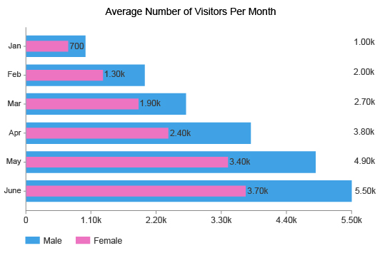
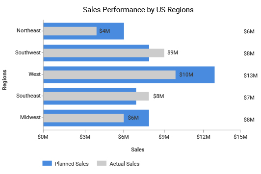
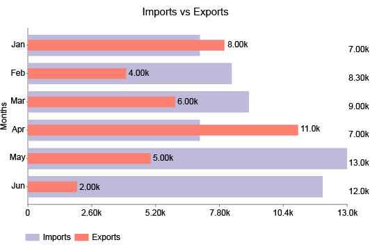
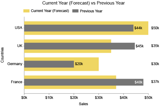
Overlapping Bar Chart
The Best Chart for Overlapping Data
Need to visualize a comparison between two interrelated items? The Overlapping Bar Chart is the answer.
You can use the Overlapped Bar Chart to measure progress towards a goal, make a before and after comparison, analyze actual values versus expectations and so much more.
Discover what questions the Overlapping Bar Chart can answer for you.
Google Sheets
Microsoft Excel
Free 7-day trial (no purchase necessary). Pricing starts at $10 per month.
 ChartExpo for Google Sheets is
 used by 330,000+ users worldwide!
Click this link to watch a ChartExpo for
Google Sheets single-user installation video.
Click this link to watch a ChartExpo for
Google Sheets admin installation video.
Click this link to watch a ChartExpo
for Excel single-user installation video.
Click this link to watch a ChartExpo
for Excel admin installation video.
What Is an Overlapping Bar Chart?
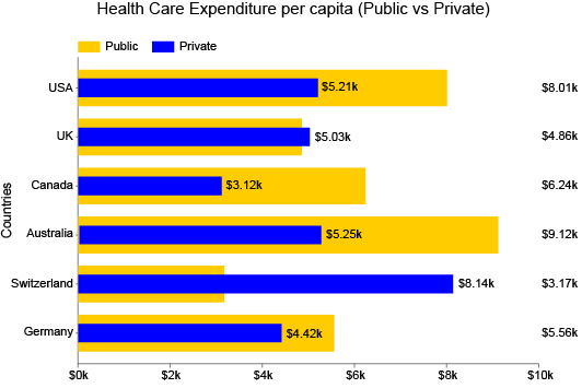
This style of bar chart displays overlapping data. Essentially, it is a superimposed graph where two bars overlap one another.
It is similar to a double bar graph or clustered column chart, but instead of comparing bars side-by-side, you’re layering them.
The Overlapping Bar Chart is valuable when one item you want to compare is part of the other. This part of the whole comparison holds tremendous value for businesses, especially for budgeting and resource planning.
Learn more about the overlapping bar chart and how to superimpose graphs in Excel and Google Sheets.
Definition of an Overlapping Bar Chart
An Overlapping Bar Chart is a type of comparison bar chart that superimposes bars on top of one another. This allows for more immediate comparisons to be made.
Overlapping Bar Charts require a relatively simple dataset; you only need two variables to begin graphing the results.
Typically, you only want to use two bars for each category in a graph overlap. Adding more bars makes it too difficult to read the overlapping data.
This guideline makes the Overlapping Bar Chart very similar to a double bar graph. In both instances, you're comparing two items that share a close relationship.
Overlapping Bar Charts are particularly valuable for displaying a part of the whole relationship, meaning one variable contributes to the other.
For example, you might use an Overlap Chart to show how one location's sales contribute to the business’s total revenue.
Superimposed graphs are also excellent tools for goal tracking. You can see your current progress versus your desired mark to gauge how much room is left for improvement.
This data visualization tool is also valuable for looking at data results over two different periods. You can use Overlap Charts to make a visualization snapshot of the before and after effects regarding a particular change you made to strategies.
Alternatively, you could use this chart to compare results from one period to the next to see how much you’ve grown or progressed. It’s a highly versatile way to compare data!
Overlapping Bar Chart versus Overlapping Column Chart
You may see this visualization referred to as an Overlapping Column Chart and wonder if there is a difference. The answer depends.
By definition, an Overlapping Column Chart is a bar chart, but this relationship doesn’t go both ways. Not all Overlapping Bar Charts are column graphs.
It has to do with the orientation of the bars. In a column chart, the bars are always vertical. On the other hand, bar charts display them either vertically or horizontally.
In other words, an Overlapping Column Chart is really a vertical bar chart with overlapping data.
For most analysis projects, the orientation of the bars comes down to a personal preference. Viewing data vertically or horizontally rarely has any benefits to the analysis itself.
That said, the one time where you may want to use horizontal over vertical bars is when you have long labels.
Labeling with vertical columns creates problems because we don’t read text from top to bottom. We read it left to right — horizontally.
To make vertical text easier to read, chart makers will try to stagger labels or display them at an angle. Unfortunately, if you have long category titles, this may not be enough to improve readability.
A horizontal Overlapping Bar Chart is the best solution if you’re struggling to arrange labels properly.
Overlapped Bar Chart Examples
Overlapping Bar Charts versatility provides many examples of how to use this data visualization.
Let’s explore some of the most popular ways to leverage Overlay Charts in visual analysis.
Overlapping Bar Chart Example 1: Mr. Smith teaches a high school history class. His students have been struggling with his tests, except those attending his extra-help study sessions.
To encourage more people to attend his study group, Mr. Smith creates an Overlapping Bar Chart to compare the average test scores of those who attended versus students who did not.
With this visualization, he’s able to show his class the dramatic difference one study session makes in the test scores. His next extra-help class will surely be full, thanks to his overlapping chart!
Overlapping Bar Chart Example 2: A growing retail company is ending its second year of business. The owner wants to see how sales have grown each quarter this year compared to last.
With an Overlapping Bar Chart, the company can overlay the quarterly sales data for the two years. This will give the team a complete view of their growth between the first and second years of business.
Overlapping Bar Charts Example 3: Amy manages a pay-per-click (PPC) advertising campaign for her business. She wants to monitor how effectively her ad messages turn views into clicks.
Amy uses the Overlapping Bar Chart to superimpose her ad views and clicks. This will enable her to see which keywords produce the best ratio of views to clicks.
Using this visualization, Amy can focus her time and attention on the keywords leading to high levels of website traffic. It also shows her how much opportunity remains in each keyword, meaning how many potential clicks are available.
Types of Overlapping Bar Charts
There are a few variations of the Overlapping Bar Chart. These different types help you perform various kinds of analyses.
Understanding these approaches to creating Overlapping Bar Charts helps you pick the correct type for your data and analysis goals.
Vertical Overlapping Bar Chart: Bar charts typically appear vertically because it’s more familiar to compare which column is the highest.
The only drawback of this bar chart type is when you have long labels. So, this is the best Overlapped Bar Chart if your data categories have short titles.
Horizontal Overlapping Bar Chart: The benefit of displaying Overlapping Bar Charts horizontally is it’s easier to present labels and titles.
If your categories require a long description or title, it’s best to use this type because it displays these labels in a format that’s easier to read.
Multiple Overlapped Bar Chart: Most superimposed graphs only feature two variables. When you overlay numerous items, it becomes overwhelming and difficult to read.
However, there are some instances where adding an extra layer to your Overlapping Bar Charts is okay. The main thing you want to be careful of is values that are too close to one another. When you layer the charts, it will be hard to distinguish the two items from one another.
So, if each item you want to overlay has very varied values, it makes it possible to superimpose more than two graphs in one chart.
100% Overlapping Bar Chart: In a 100% Overlapping Bar Chart, one variable in every category is set to 100. This means the largest bars across the visualization are the same height. Your second variable reflects your progress to hitting this 100% mark. Using this graph enables you to track multiple goals simultaneously.

When to Use an Overlapping Bar Chart
Overlay charts excel at analyzing parts of the whole. The superimposed graph makes it easy to see one variable's contribution to the larger sum.
With the Overlapping Bar Chart, you can compare sales and budget data, performance changes between two periods, goal progression and more.
It’s a highly versatile and concise visualization that’s great to include in reports and presentations.
See what else the Overlapping Bar Graph brings to the table.
Making a Part of the Whole Comparison
The way that Overlay Charts depict items on top of one another make them ideal for part of the whole comparison analysis. This looks at data that is inherently part of a more significant sum.
You can use this analysis method to determine the most and least effective contributors to performance. With this information, you can more strategically plan your resources and optimize your efforts.
A progress bar is a simple example of an Overlapping Bar Chart showing a part of the whole comparison. The ‘part’ is how much progress you’ve made and the ‘whole’ is the full bar.
This type of analysis is valuable for several reasons. Not only can you measure an item’s contribution to the sum or whole, but you also see the room left for improvement.
For example, imagine an Overlapping Bar Chart showing total unique customers versus rewards program participants. The difference between the two superimposed bars represents how many individuals you still need to encourage to join the loyalty program.
Making a part of the whole comparison across multiple categories or items shows you which areas have the most room for improvement or opportunity. This can help you decide which efforts to optimize first to produce the most significant improvements overall.
Make Before and After Comparisons
You can take the part of the whole comparison approach described above and reverse it. In this case, you aren’t measuring opportunity or room for improvement. Instead, you’re measuring how much you’ve improved.
With this method, you can see a before and after picture of results or compare past and present performance.
The best example is an Overlapping Bar Chart showing revenue between two periods. You can use this visualization to see how much you’ve grown between the previous year and the present and identify the best sources of improvement.
You can apply this time-based approach of using an Overlapping Bar Chart to specific events, changes, strategies, etc. This method gives you an excellent before and after picture of your data.
For example, say you recently updated the design and copy of your landing pages. You want to measure if this change positively improved performance.
You gather analytics from each page and superimpose the data to see how conversions from each page have increased (or decreased). An Overlapping Bar Chart with this data provides a complete view of which pages experienced the most significant change.
A more contemporary example of a before and after Overlapping Bar Chart is measuring the impact of COVID-19 on results. As we near the tail end of the pandemic, you can compare results pre and post-virus to know when performance returns to normal.
Tracking Progress or Goals for Multiple Items
Superimposed graphs appear much like a progress bar. You can use this resemblance as a goal-tracking tool across multiple categories.
With this approach, you have two options in how you create an Overlapping Bar Chart. You can set one variable at 100% for each item, expressing the completion of each goal. Your other variable would show the current progress for achieving the objective.
Alternatively, your goal may be a specific benchmark value. You can then compare this desired value to your current results to determine how much you still need to improve.
For example, let’s say a regional manager asks each store branch to set their own sales goal for the month. They can use these values as one variable and the current sales from these branches as the second to measure how each location is doing towards reaching the goal.
The manager then knows which areas require extra attention and management versus those that perform without help or any intervention.
Using this visualization to track your goals helps you optimize your time and energy on the efforts that need it most. As you improve progress in one area, you can jump to the next and continue this process until you push all areas to the desired benchmarks.
You’ll complete more goals in less time and keep your overall progress growing steadily.
Compare Expected and Actual Costs
Visualizing goals helps you with planning and optimizing resources. You can also use Overlapping Bar Charts to forecast your costs and better plan your budget.
The best way to do this is to compare expected versus actual costs. After all, spending doesn’t always go according to plan. You may budget $5,000 for advertising costs, but end up spending more than this mark.
Overspending is okay in small increments. Many teams will leave extra room in their budgeting to account for possible overspending. It’s sort of like a reserve fund to cover unexpected costs.
It becomes dangerous to overspend when your actual costs are much higher than anticipated. If you plan to spend $5,000 on advertising campaigns and end up spending $6,500, it’s a significant difference you should address promptly.
An Overlapping Bar Chart mapping expected versus actual costs allows you to swiftly detect overspending and address the issue quickly.
You can also use this type of visualization when you’re unsure what your actual costs will be. You don’t have past data to suggest what costs will be, so you base your expected costs on your best judgment using industry standards.
By putting your actual costs into an Overlay Chart, you can adjust your expectations moving forward and set more realistic standards. Moving forward, you’ll be able to plan these vital resources better.

How Do You Make an Overlapping Bar Chart?
Learning how to make Overlapping Bar Charts in Excel, Google Sheets and other platforms is the first step to using this powerful visualization.
If you want to avoid confusing settings and scripts in these programs to overlap charts, we recommend using ChartExpo.
ChartExpo offers a straightforward data visualization interface for overlaying graphs in Excel.
Explore how easy it is to overlap graphs in Excel or Google Sheets using ChartExpo.
Start with a Goal or Question
Any chart you make has to have an objective. What are you hoping to learn or discover by creating this chart?
Your analysis projects should support your overarching goals. Otherwise, the value and relevance of your charts are vastly limited.
By having a goal for your charts, you prevent yourself from making charts that don’t support your team’s objectives. After all, you don’t want to waste time and resources creating charts that aren’t relevant or valuable.
Analysis goal setting also serves other purposes.
- Chart type and data selection: When you have a clear goal, you know exactly what data to collect and you’ll have an easier time deciding on a chart type. Without this objective, you may be using data that doesn’t actually support your analysis’ purpose.
- Staying on task: As you’re grabbing data and beginning to create your chart, you may notice something you didn’t see before. Sometimes, data users start chasing this new “thing” without answering their initial question. Your analysis goal ensures you stay on task and finish answering one analysis question before moving to the next.
- Returning to chart creation: Sometimes, you may not finish creating a chart in one sitting. Unexpected disruptions may draw your attention to other projects. When it’s time to return to your chart, having a clear goal or analysis question will allow you to continue the work without having to ask, “Wait, what was I trying to do with this chart?”
For these reasons, you should clearly record your goal in a place where you can easily refer to it when necessary.
Collect Your Data and Prepare It for Charting
After setting a clear analysis goal, you have a distinct purpose for your chart. You know what data you need to collect.
That said, data collection isn’t always as easy as simply highlighting what you need and copy-pasting it into your chart.
There are some steps you need to take to properly prepare the information for charting. This process will ensure there are no errors or other issues in the data before you chart it.
While this takes extra time, it’s a crucial step. If you don’t check for errors, you may create wildly inaccurate charts. Using these visualizations to drive decisions and changes mean you’re taking action on bad intel.
Typically, people don’t think twice about the data’s accuracy in a chart. How can numbers be wrong? Thus, decisions based on data are made with extremely high confidence. When that data is flawed, these decisions can produce disastrous results.
Here are some things to look out for when preparing the data for charting:
- Errors: This is your top priority. You want to review and double-check your data for mistakes, such as incorrect or missing values, mistypes, inconsistencies, etc.
- Units: You may be combining data from multiple sources. Various sources may use different units of measurement for the same type of data. For instance, a global sales company may have revenue in dollars and euros, depending on the source. You need to convert these values into one unit to ensure accuracy.
- Labels: Similarly, you may have different data sources that use unique titles for the same metric. One source may use the label “ad views,” while another calls this metric “ad impressions.” These two labels record the same data. You don’t want to include one without the other because it will hurt your accuracy. You need to have both in your chart by setting labels to one universal metric that you’ll use.
After you’ve accounted for all of these potential issues, double-check your data again. If you’re sure there are no more errors left, you can begin the charting process.
How to Overlay Graphs in Excel
Let’s explore how to overlap graphs in Excel using the ChartExpo system.
While you can create Excel overlay graphs without outside help, the charting interface of Excel (or Google Sheets and other platforms) isn’t the most intuitive. This may make it difficult for many users to access advanced charts.
You can access ChartExpo through the Microsoft AppSource. After downloading the tool, you’ll have to check your version of Excel. This will dictate where to find the add-on.
In some versions, like Excel 2013 and the Excel Web App, you’ll find ChartExpo under the “Insert” menu. You’ll then click either the “My Apps” or “Add-ins” submenu.
Opening ChartExpo will start the process of designing your Excel Overlapping Bar Chart. You’ll need to select the Overlapping Bar Chart from the list of available options. You can enter it by name in the search bar to find it faster.
Next, you’ll need to add your data. You can do this by simply clicking and dragging to highlight the parts of your dataset you wish to visualize. Otherwise, you can enter the values through ChartExpo’s straightforward interface.
After finishing your Excel graph overlay, you should review the visualization to double-check everything is correct and how you want the information displayed. There may be minor details you want to change when you superimpose two graphs in Excel.
Keep in mind, ChartExpo’s Overlapping Bar Graph is not just another way of how to overlay two graphs in Excel. It is arguably the best chart to show overlapping data.
How to Make a Google Sheets Overlapping Bar Chart
If you don’t use Excel, ChartExpo also offers an Overlapping Bar Chart for Google Sheets. Knowing how to show overlapping data in Excel with ChartExpo is almost exactly the same as using the tool to create Google Sheets Overlapping Bar Charts.
The biggest difference is how to download the tool. In Google Sheets, you’ll find add-ons on the Google Workspace Marketplace. You can visit this site from Sheets by clicking “Extensions” followed by “Add-ons” and “Get add-ons.”
Enter ChartExpo into the marketplace’s search bar and you’ll find the tool ready to download.
When you open ChartExpo for the first time, we highly recommend scrolling through the entire library of visualization options. This will familiarize you with all the new and different chart types available.
Once you’re ready to begin creating your Overlapping Bar Chart in Google Sheets, you can use the search bar to look it up by name.
Entering your data is the same as in Excel superimpose graphs. You can highlight the parts of your datasheet you want to use or enter the values yourself.
If you’re happy with your selections, click “Create Chart” to finish. You can also change details you don’t like, such as editing colors, labels, etc.
Don’t forget to save your Google Sheets Overlapping Bar Chart so you can use it in reports, emails and other communications.

Advantages of Using an Overlapping Bar Chart
An overlapping chart offers one of the most straightforward approaches to comparative analysis. It’s even better than side-by-side comparisons!
You can easily track parts of the whole and make data-driven decisions about the most effective strategies to utilize.
Overlapping Bar Charts are also an exceptionally concise visualization type. It’s perfect for use in reports or when you have limited space to present your visual data story.
Find out all of the benefits of the Overlapping Bar Chart.
A Concise Visualization When You Have Limited Space
In all the talk about creating charts and analyzing data, we sometimes forget a crucial element of the process: communicating and reporting the findings to others.
Overlay Charts are ideal visualizations for communicating data for two reasons. First, an Overlapping Bar Chart shows information in an incredibly concise format.
You don’t want audiences viewing your reports to have to unpack visualizations or spend time trying to understand what the chart is showing. The correct insights and conclusions should be immediately apparent.
Overlapping Bar Charts offer one of the most concise ways to deliver comparisons and other valuable insights. Plus, everyone is familiar with how bar charts work, so there’s no explanation necessary to engage with this visualization.
The second benefit of the design of Overlapping Bar Charts is how little space it requires.
This is a huge help when you’re developing reports that include many different charts and graphs. You may be trying to squeeze more charts into your presentation and need a compact visualization that doesn’t take up a lot of room.
If you think about it, an Overlapping Bar Chart requires half the space of a double bar chart and even less than a grouped or clustered one. It’s the perfect addition to include in any report.
An Excellent Chart for Tracking Budget, Profits, ROI and More
Overlapping Bar Charts truly shine with financial data. There are so many ways to apply this visualization, whether it’s visualizing sales, return-on-investment (ROI) or otherwise.
It may just be the best data visualization tool for tracking where your money is going and how effectively you spend it.
Let’s look at just some of the many ways you can apply the Overlapping Bar Chart to financial data.
Expected costs versus actual costs: Trying to plan your budget more effectively? Use an Overlapping Graph to look at what you thought you’d spend versus what your activities actually cost.
Budget distribution: Some sources may argue that the Overlapping Bar Chart is strictly a comparison tool and isn’t capable of showing distribution data. This is not true. You can overlap bars to show how your total budget is spent across each quarter, month, etc. This shows you times when your budget is strained the most and least.
Visualizing profit margins: An Overlapping Bar Chart excels at showing profit margins. You have two variables: your overhead costs and the price sold for each item/service. The difference between these items perfectly visualizes your margins.
ROI tracking: Similar to visualizing profits, you can use an identical approach to show your returns on various investments. You can look at your costs versus the value of those efforts. The space between the two superimposed graphs is the strength of your returns.
Better Understand Which Strategies Produce Results
One of the popular goals of comparison analysis, which Overlapping Bar Charts excel at, is identifying the strategies with the most and least significance. In other words, comparison analysis can reveal what’s working and what isn’t.
Remember, data analysis is a two-sided coin. As lovely as it is to detect emerging trends and opportunities you can capitalize on to grow your results, you also have to consider negative impacts affecting your results.
If you don’t actively monitor and mitigate risks, you could be allowing minor problems to grow into devastating crises.
There are many ways to discover these insights using Overlapping Bar Charts. For instance, you can use one bar to show the benchmark or average value versus your actual results. This enables you to see when you’re falling below or above expectations.
Alternatively, you can look at results across various strategies from a past period to the present. With this visualization, you can see where progress is occurring and where you’re declining in performance and growth.
You can use this style of Overlapping Bar Chart to prioritize which items in your data require attention, whether it is a new opportunity or a potential risk that needs to be averted.
The speed of visual analysis using Overlapping Bar Charts enables you to swiftly capitalize on positive shifts and avoid negative ones.
A Versatile, Effective Chart Type for Displaying Information
While Overlapping Bar Charts shine at showing money-related data, don’t let that fool you. There are many ways to apply this visualization to answer various analysis questions.
Versatile visualizations are excellent charting tools to have in your arsenal because you can apply them to your data in so many instances.
Whenever you want to compare two items, you can use the Overlay Bar Chart. In some ways, it’s even more effective than a double bar graph because it has the added bonus of acting as a progress bar across multiple categories or items.
Leveraging the proper visualization for your data, like the Overlapping Bar Chart, gives you faster access to insights and a fuller understanding of the story behind the raw numbers.
The versatility of the Overlapping Bar Graph means it will be a popular go-to method for depicting your data and unlocking these valuable insights.
Overlapping Bar Charts also offer this versatility when creating reports and presentations to share discoveries with stakeholders, clients and other crucial parties involved in the analysis process.
The familiarity of the bar graph design makes using and understanding this chart type incredibly comfortable and effective.
The bottom line is you can never go wrong with the Overlapping Bar Chart when you want to superimpose data and draw valuable comparisons.

Why Is ChartExpo the Best Data Visualization Tool for Overlapping Bar Charts?
Excel and Google Sheets provide the perfect environment to collect and organize data. Yet, both tools stumble when it comes to chart creation.
ChartExpo solves many of the everyday struggles of data visualization. In doing so, the tool offers one of the best chart makers available. It’s easy to use and eliminates tedious and unnecessary steps.
All you need to do to use ChartExpo is select a chart type and enter your data. It’s that easy.
Experience a simpler way to produce professional charts and graphs.
ChartExpo Removes Unnecessary Skill Gaps in Charting
There is a common issue shared by almost all chart makers, aside from ChartExpo. The problem is how these data visualization tools add new chart types to Excel, Google Sheets, etc. They rely on pre-written scripts.
Essentially, what many chart makers offer is a library of coded templates. To use these “charts,” you need to have some level of familiarity with programming languages to add your own values, labels, settings, etc.
Not only do these chart scripts take extra time to use and edit, but they also create an unnecessary skill gap.
Since only people with coding expertise can effectively use these data visualization software solutions, it limits who actually has access to advanced charts.
This creates painful traffic jams with your analysis because Overlapping Bar Charts and other visualizations have to pass through the small handful of people with the coding experience to actually build charts in Excel or Google Sheets.
Sometimes, this is just one person responsible for all the advanced data visualization projects. Everyone else submits their analysis data and waits for their chart request to finish.
With your data constantly shifting and changing, dealing with charting queues is the last thing you want. By the time you create a visualization, the data and insights may be outdated and no longer applicable.
ChartExpo removes this skill gap because it does all the scripting for you in the background. You never see the code itself. Instead, ChartExpo automatically updates the script whenever you make a change in the tool’s interface.
With automated chart scripting, you never have to worry about mistakes in the code or learn JavaScript yourself. ChartExpo handles all of this for you! Anyone can use it to make advanced and custom charts.
Save Time Using a Straightforward Data Visualization Tool
Even the fastest human coder can’t compete with the immediacy of an automated tool like ChartExpo.
This is one of the best advantages of using ChartExpo. It’s a straightforward charting tool capable of creating advanced charts in as little as three clicks.
While removing the need for writing and editing scripts is a significant factor in these benefits, it’s also thanks to the tool’s accessing, three-step charting system.
The first step is to choose your visualization method. ChartExpo offers many different chart types. This gives you plenty of selection to pick from and align with your data.
After choosing a chart type, you need to select your overlay data in Excel or Google Sheets to add it to the chart. You can simply highlight the parts of your dataset you want to visualize by clicking and dragging the mouse.
All that’s left to do using the ChartExpo system is click the “Create Chart” button. Your new Google or Excel graph overlay appears instantly.
The straightforward ChartExpo tool makes data visualization as easy and accessible as possible by removing every unnecessary hurdle. What’s left are the only two components you need to create compelling, professional charts: data and visualization type.
There are no confusing settings, scripting or other hoops to jump through. It’s the simplest tool for converting complex data into visual intel to drive decisions and action.
Create the Data-Driven Culture you’ve Always Wanted
With a more accessible chart maker offering timely charts in just three clicks, you can start building the data-driven culture you need to thrive in the Digital Age.
What does a data-driven culture look like? To truly be a data-driven organization, you must base company decisions and actions on insights and accurate intelligence.
This means removing guesswork, assumptions, opinions and other ineffective and dated ways that teams traditionally made decisions.
That said, a data-driven team needs a solid foundation to truly be effective. This is where the culture side comes into play.
A solid data culture is one that relies on insights and data-driven intelligence in everything they do. It’s not just about driving data-based decisions, but also communicating and sharing insights freely and effectively across teams and departments.
With this level of reporting and communication, teams openly share insights and collaborate on analysis projects. They may even brainstorm together the most effective strategies to implement to capitalize on data opportunities or mitigate potential risks.
Sharing findings and insights is particularly crucial. When teams don’t share, insights stay within departmental silos. This raises redundancy in your analysis projects, needlessly wasting resources on questions that others have already answered.
ChartExpo helps you develop a data-driven culture by giving more people access to advanced charts. You can save every data visualization you make as an image or PDF file, making it effortless to share charts, graphs and dashboards in emails, documents, presentations, etc.
It’s Much More Than a Tool to Superimpose Graphs
ChartExpo is more than just a tool for learning how to overlay charts in Excel, Google Sheets, etc. It is a robust data visualization tool with a huge library of different chart and graph types.
It effectively doubles the visualization options available in these popular spreadsheet programs. With these new chart types, you always have the perfect visual tool to display data and show insights to others.
Plus, more chart types lead to more insights and actionable intel you can use to make better decisions.
Most of the time, there isn’t just one chart type that works for the data. There may be several. Each visualization shows the information in a new way. It’s like looking at the same problem from a different perspective or vantage point.
The more angles you have to view your data, the greater your understanding. You’ll uncover new intel you didn’t see from the first or even second chart.
ChartExpo’s straightforward data visualization software enables you to swiftly change chart types and analyze your data using different graphs.
You can easily see your data from all the angles you need to understand the big picture!
ChartExpo offers many specialized charts for marketing, finances, customer journey mapping and so much more. No matter what data challenges your business faces, ChartExpo’s library has the different chart types you need to conquer these obstacles.
ChartExpo Pricing
ChartExpo for
Google Sheets
$10*
per month
(no purchase necessary)
*pricing starts at $10
per user per month.
Only in-app purchase available
ChartExpo for Google Sheets
single-user purchase video.
ChartExpo for Google Sheets
domain-users purchase video.
ChartExpo for Google Sheets
single-user installation video.
ChartExpo for Google Sheets
admin installation video.
ChartExpo for
Microsoft Excel
$10*
per month
(no purchase necessary)
*pricing starts at $10
per user per month.
Only in-app purchase available
ChartExpo for Excel single-user
purchase video.
ChartExpo for Excel domain-users purchase video.
ChartExpo for Excel single-user
installation video.
ChartExpo for Excel admin
installation video.
Custom Pricing
