Funnel Chart
Visualize Your Funnel.
Insightful Funnel Charts
in Minutes.
Funnels are common tools in business. They enable you to understand the stages of a process and how data moves through this system.
Funnel charts allow you to visualize this process, giving you immediate insight into every stage. Detect leaks and unintended slowdowns that hurt your results. You’ll also discover actionable steps to improve your results by optimizing your funnel.
Google Sheets
Microsoft Excel
Free 7-day trial (no purchase necessary). Pricing starts at $10 per month.
 ChartExpo for Google Sheets is
 used by 330,000+ users worldwide!
Click this link to watch a ChartExpo for
Google Sheets single-user installation video.
Click this link to watch a ChartExpo for
Google Sheets admin installation video.
Click this link to watch a ChartExpo
for Excel single-user installation video.
Click this link to watch a ChartExpo
for Excel admin installation video.
What is a Funnel Chart?
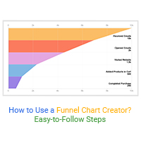
A funnel chart maps the flow of data through a process or period. With this high-level view, you gain a complete overview of your inputs across each stage. Then, see what you’re receiving as a result.
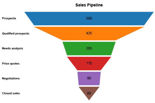
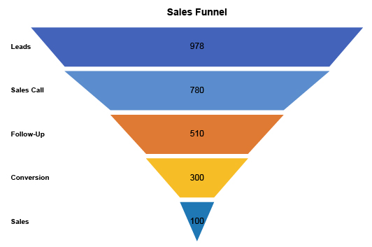
Funnel charts typically depict a sales funnel, customer journey funnel, etc. Funnels allow businesses to see results at their marketing funnel stages.
That’s only the tip of the iceberg. See everything that ChartExpo and funnel charts can do for your team.
Funnel Chart Definition
What is a funnel chart used for? A funnel chart shows how a specific input changes through each stage of a process. It’s helpful in seeing how a resource depletes through a process and which steps use (or lose) that resource the most.
Essentially, a funnel chart is a flow visualization showing how much data (or resource) enters the process and what comes out.
The chart’s name comes from its shape. At the top of the funnel, you have the most data. This represents the first stage and your initial input into the process.
As the process progresses through subsequent phases, that resource or input depletes, causing the funnel to narrow. The final stage often appears as a very narrow neck, showing your final results through the process.
Typically, funnel charts depict marketing or sales data. These visualizations share a close relationship with marketing funnels because of their shape and functionality.
Due to this connection, some data users mistake funnel charts as only a tool for marketers or sales teams. That isn’t the case. Funnel charts are actually an exceptionally versatile chart type for process and categorical data.
We’ll explore more about sales and marketing funnels in the next section.
What Is a Sales Funnel?
Understanding the sales funnel definition helps demonstrate how to use this chart type. The history of the sales funnel dates back to just before the turn of the 20th century, when E. St. Elmo Lewis created a funnel-shaped model to depict a customer journey from the first interaction to purchase.
For this reason, a sales or marketing funnel diagram is often referred to as a customer journey funnel. It shows how efficient a business and its teams turn leads or prospects into purchases and customers.
The sales funnel stages relate to each step an individual goes through before potentially becoming a customer.
Here is a breakdown of the marketing funnel stages:
Awareness (top of funnel): This is the initial interaction where a prospective customer becomes aware of a brand or business. Ads, social media posts, blogs and other digital marketing funnel tactics help generate awareness. Traditional cold calls are another method teams use to generate these first-time interactions.
Interest (middle funnel): Interest occurs when the prospect or lead takes some type of action beyond that initial step. This may be something as minor as visiting your website or clicking on a second blog on your page. More serious interest-level activities include participating in a webinar or offering their email for a newsletter or information request.
Consideration (middle funnel): As interest spikes, the prospect begins considering converting. The individual may participate in a demo or free trial during this consideration phase. They may even go as far as putting a product into a shopping cart. Essentially, it’s at this stage where they are on the fence between converting or not.
Action (bottom of funnel): The action phase is typically where a lead converts and becomes a customer. This action may be a purchase, subscription, booking, etc. It’s whatever activity your business considers valuable to growth and success.
Loyalty and Advocacy (bottom of funnel): The marketing funnel doesn’t end at purchase or conversion. Loyalty and advocacy are other steps in the process. Customer loyalty leads to future purchases and conversions. If loyalty grows into advocacy, the customer will refer others to your business.
It’s important to mention that various marketing teams view and utilize funnels differently. The above stages are the most common, but aren’t always used when answering what is a marketing funnel.
Types of Funnel Charts
Many funnel charts use horizontal bars stacked on top of one another to highlight each stage. The width of the bar demonstrates the value of the data at this stage.
For instance, when visualizing the customer journey, the width of a bar shows you how many customers exist in each stage.
Sometimes, you’ll see a funnel chart that uses trapezoid shapes instead of bars. This presents data in a way that’s more natural to the shape of a funnel.
No matter if you’re learning how to build a sales funnel chart using bars or trapezoids, reading the chart remains the same. The width of each shape reflects the value of data for that funnel step.
This is one way to classify the different types of funnel charts. Another way is to explore visualizations that closely relate to the sales funnel diagram.
Pyramid chart: If you turn a funnel visual upside down, it resembles a pyramid. So, a pyramid chart is essentially a pipeline funnel chart turned upside down. The smaller bar appears at the top of the visualization, with wider sections towards the bottom.
An example of a pyramid chart may be funding through different rounds of investing. You may need a small investment to get the company off the ground. Later stages, however, require much more substantial investments, resulting in a reverse funnel flow chart.
Area chart: An area chart is a type of line chart where the area beneath or above the line is filled in. This relates to the funnel chart because it shows data results over time or through stages.
Funnel Chart Examples
As you might expect, there are many ways to use a funnel diagram. After all, marketing funnels themselves come in many different iterations.
This section will outline some of the more common funnel chart examples.
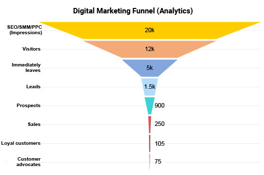
PPC advertising funnel / click funnel example: PPC or “pay per click” is a model for internet advertising. Businesses place search, display, video and other types of ads in front of viewers. Each time an ad appears, it’s known as an impression.
In a PPC funnel (also known as a click funnel), these impressions form the top of the funnel. The next stage is a click, meaning a potential customer found the ad enticing enough to click on it and visit your website. This is equivalent to the “interest” stage of most marketing funnels.
From this point, customers may convert and transition to the bottom of the advertising funnel. If they don’t, retargeting them with other ads may be necessary to facilitate their journey past consideration.
Email marketing funnel / content marketing funnel example: You can use a sales funnel example chart to specifically map results from email campaigns. Your top of funnel may include everyone who receives your marketing emails.
The next stage includes email recipients that opened the email you sent. Results may drop off dramatically here, depending on how successful and relevant your subject lines are.
Next, you may track how many people open that email and then take subsequent action, like visiting your website or interacting with content within the email message.
Finally, how many of the remaining email receivers convert based on that message.
Non-marketing funnel example: While the funnel chart closely relates to the marketing funnel stages, you don’t have to use this visualization to map your conversion funnel. There are other uses for it beyond sales funnel examples.
For instance, you could use a funnel chart to depict how efficiently your team uses insights. At the top of the funnel, you’d have the total number of insights you’ve pulled from your analysis projects.
Your next stage would be the number of insights scheduled for action, followed by how many times that action was actually taken. Your final funnel stage would reflect the number of insights reviewed at a later date.
This example shows you that funnel diagrams are more versatile than some data users give them credit for!

How to Create a Funnel Chart?
Visual analysis is critical to understanding the insights behind your funnel analytics. Raw numbers alone don’t tell you the whole story like charts do.
Building a sales funnel chart is easy when you use ChartExpo. You select the chart type, enter your data and press create. That’s it. There are no tiresome hurdles or complex tools to use.
ChartExpo is available to use whether you need a funnel chart in Excel, a Google Sheets funnel chart or a diagram for another type of program.
Have a Goal or Objective for the Funnel Chart
Funnel charts are valuable tools for businesses, but only if they pertain to your goals. Similarly, if you use a sales funnel builder with no objective in mind, you’re essentially doing busy work.
Before building sales funnel charts (or any other chart type), you should ask a fundamental question. “Why am I making this chart?” You need to know when to use a funnel chart.
More specifically, you should have a direct issue you want to solve or a question to answer. Sometimes, you’ll have more than one objective for your marketing campaign funnel chart.
Let’s say you may want to optimize your pay per click advertising strategies using a clicks funnel chart. You should have initial questions or objectives for this visualization, such as:
- Where am I losing the most potential ad traffic?
- Is my conversion rate acceptable?
- What’s the return on investment for this strategy?
These questions are all different. They hint at varying objectives you may be pursuing with your funnel creator.
Two problems occur when you don’t have a goal or objective for your sales funnel diagrams:
- You may make a funnel chart that doesn’t depict the data properly.
- Your funnel analysis will be directionless and lead to stagnant insights.
Having a goal for your funnel chart keeps your analysis and chart creation focused. Any insights you receive from the analysis process will directly impact your goals.
It’s about receiving relevant value from your marketing funnel templates and visualizations.
Gather Your Funnel Chart Data
Using your goal, you’ll begin collecting data to answer your analysis question(s). Again, this is why having this primary objective is so vital. It informs what data you need to gather for your funnel chart generator.
That said, gathering data isn’t always easy. There are a few mistakes you can make along the way.
Data accuracy: First and foremost, you need accurate data in your funnel chart maker. If you make a funnel chart with “bad” data, any insights you discover aren’t usable.
The real risk of inaccurate data is when you don’t know it’s errored. You may make decisions based on insights that aren’t valid. These decisions are made with exceptional confidence. After all, how can data be wrong?
The bottom line: thoroughly check your data for accuracy.
Normalizing datasets: When optimizing your sales funnel marketing, you’ll find yourself combining data from multiple sources. This presents some potential problems you need to be aware of before you build marketing funnels:
- Some data may be counted in both datasets; you need to remove the duplicates to ensure accuracy.
- Datasets may use different labels for the same data. “Conversions” in one set may be “subscriptions” in another.
- The way each source measures the same data may also differ. For instance, an international company may have sales data in multiple currencies. You want to convert the data to the same measurement type.
This process is also known as “cleaning” your data because you’re removing duplicates, merging labels and measurements and other tips to prepare the data for the sales funnel creator.
How to Create a Funnel Chart in Excel?
With your data cleaned and ready, it is time to create your funnel graph in Excel. Many data users use Excel as their primary tool for organizing and analyzing data. The ChartExpo add-in for Excel is readily available from the Microsoft App Source.
You can access the Microsoft App Source directly or through the Excel setup program. Downloading the program is easy and only requires you to follow the prompts as they appear on your screen (not unlike downloading any other program or extension).
The next time you open Excel, you can find ChartExpo by clicking the “Insert” menu, followed by “My Apps” or “Add-ins” (depending upon your Excel version). You’ll be able to see which add-ins you have available and activate ChartExpo.
Accessing ChartExpo in Excel will open the tool’s large library of visualization options. To find how to make a funnel chart in Excel, type the name into the search bar. You can also scroll through all of the available options in this online funnel chart maker until you find it.
While this method takes more time, it may be rewarding if it’s your first time using ChartExpo’s sales chart Excel tool. It will familiarize you with the different chart types available beyond
After selecting your chart type, you’ll need to choose the data you want to visualize. You can make a selection within your Excel spreadsheet by clicking and dragging. Then, you can click “Create Chart From Selection.” Your sales funnel in Excel will appear alongside your data set.
If your dataset is too large or complex for the click-drag method, you can enter the columns you want through their cell IDs. You’ll set a range to designate how many rows within each column you want to select for your funnel chart Excel template.
Again, once you’ve selected your data, you only need to hit “Create Chart” to finalize your sales funnel visual.
How to Make a Funnel Chart in Google Sheets?
Making a Google Sheets funnel chart follows a similar process as making a funnel chart in Excel. The only real difference is how you download and access the tool.
For Google Sheets funnel charts, you need to go to the Google Workspace Marketplace to download ChartExpo. You can access this marketplace from the Google Sheets page using the following steps:
- Open a Google Sheets spreadsheet (either existing or new).
- Click “Extensions” from the top toolbar.
- From the Extensions dropdown menu, hover over “Add-ons.”
- Click on “Get add-ons” from the following dropdown menu to open the Google Workspace Marketplace.
Once in this marketplace, search ChartExpo and follow the download instructions. The next time you access the “Extensions” and “Add-ons” menu, you’ll see ChartExpo on the list. Click the ChartExpo option to open it.
Similar to ChartExpo’s funnel charts for Excel, your next steps are to search for your chart, select it and add your data.
It’s best to manually enter your data and select which cells to use by hand. This gives you maximum control over what data enters your visualization.
Again, finalizing your funnel chart takes just one click on “Create Chart.” Your chart will appear as an image next to your Google Sheets dataset. This allows you to save it to use in emails, sales funnel presentations, reports, etc.
You can make small edits to your chart after it appears, such as changing fonts, an axis label, title and other details.

Effective Funnel Analysis Using Your Funnel Chart
A funnel chart is only as good as your ability to analyze it for actionable intelligence. You haven’t accomplished anything if you don’t put what you’ve learned about your funnels into action.
ChartExpo’s 3-step funnel chart creator ensures you extract insights from your data and put that knowledge to use.
Empower your marketing funnel with in-depth analysis that yields immediate ways to increase your performance and final outputs.
Extracting Insights from a Funnel Chart
Creating a funnel chart is critical, but what’s more crucial is the analysis of that chart. Ideally, you want to receive the most value from your chart. This means you need to be exceptionally thorough with your analysis.
To help in this endeavor, let’s walk through how to analyze a funnel chart properly. With this approach, you won’t leave any valuable intelligence undiscovered.
Look at your initial input and the final output: Since a funnel chart depicts the flow of data through a process, your first goal should be to analyze how much data is making it through the process.
This is a simple analysis of comparing the value of the first step — your initial input — versus the value of the final stage. This is your end result, or the output of data through your funnel.
If you have a considerable input and very little output, it’s a clear sign that your funnel pipeline needs a lot of attention. The difference between these two values also acts as a helpful benchmark that you can use to gauge how much you improve the process in the future.
Notice significant drops in value between consecutive stages: In any data analysis, you want to look at the most significant wins and loses first. These are the areas of greatest concern or opportunity.
In a funnel chart, you want to look for where the biggest leaks occur between two consecutive stages, especially as you near the end or bottom of the process.
These noticeable drops in value allow you to see the stages where you lose the most of your input.
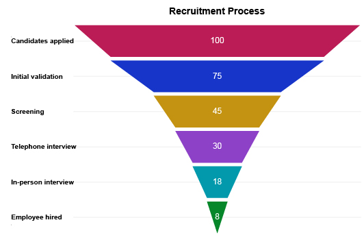
For example, at stage 1, you have 100% of your input. In stage 2, it drops to 81%, which isn’t too bad. However, the percentage drops significantly to 39% in the third stage.
That’s cause for serious concern! You’ll want to look at your strategies at stage 3 and see how you can improve this number to stop the leak.
Decide how to Optimize Funnel Results
Your analysis will reveal actionable intelligence on where leaks exist in your marketing sales funnel. You may even discover insights regarding what’s causing these problems and weak numbers between stages.
Now, you need to put these findings into action. Otherwise, you fail to actually put your data to use.
Since sales and marketing involve multiple teams and individuals, this may be a group effort. You need to decide the best strategy for communicating findings and brainstorming how to improve funnel results.
How you’ll optimize your funnel results will depend on what stage the most significant leaks occur.
In a PPC advertising funnel chart, you may find that you’re getting clicks through your ad messages but only a couple of conversions. Thus, you need to explore your website landing pages and devise ways to improve these to encourage more conversions.
This is where having a detailed sales funnel graphic with very specific stages comes in handy. It’s easier to spot the exact parts in the process that need improvement. Then, sitting down and discussing how to improve it is much easier.
You need to document how you decide to react to your funnel chart insights. This will enable you to test whether the adjustments you make cause improvement or not.
Set a Plan
Having a plan ensures that your data and insights lead to positive change within your organization. Again, failing to act on your data is one of the worst things you can do.
You’ve devoted time and resources to creating this funnel chart and analyzing it. If you don’t put those findings to use, it’s like preparing a fantastic meal but forgetting to turn on the oven.
It may seem silly, but it happens all the time to businesses. It’s easy to become sidetracked by other projects and forget about your analysis findings.
Alternatively, some teams neglect to convert insights into action because no one is put in charge of making the data-driven changes.
A post-analysis plan prevents these mistakes (and others). Your plan should answer several key questions.
What’s changed or been discovered? Clearly define in your plan the most significant takeaways from the chart. You want to pay particular attention to how these insights impact your business and its goals.
What actions do you need to take? Through your analysis, you’ve made specific decisions on how to apply the insights and make improvements. You want to state these actions in your plan clearly.
Who is responsible for making the changes? Designate the individuals in your team that are directly responsible for putting these changes into action. This ensures that someone is accountable for the post-analysis action.
When will you make the changes? You may want to set a deadline for when these adjustments need to be made. A deadline puts pressure on the team to put the changes into effect.
When will you review changes? You should set a second deadline for when you will review the changes you make. Did the changes you make create improvement? If so, how much?
Review Funnel Chart Again in the Future
Data analysis happens in two stages. The first, as described above, occurs immediately after you create the chart.
However, there is a second stage that some data users forget. This is the review stage. It’s a set point in the future where you review the data again.
The objective of the review is to see if the improvements you’ve made had the desired effect on your results.
Remember, it will take time for your data to accurately reflect any change you make to optimize a customer journey funnel. Thus, this review stage may take place months in the future.
Another reason you need to review your funnel chart again in the future is the ever-changing nature of data.
Despite your very best efforts to optimize your results and improve marketing funnels, your results will always change over time.
These changes occur for a variety of reasons:
- Customer attitudes, interests, wants, etc., are fluid and change frequently.
- New competitors may disrupt the market and impact your marketing/sales results.
- Competitors will change and improve their strategies, creating a ripple that also affects your efforts.
In short, analyzing your funnel chart isn’t a once-and-done event. It should be something you incorporate into your routine and perform at designated periods. This allows you to stay on top of your results, even when things shift unexpectedly due to external forces.

Advantages of Using a Funnel Chart
There is a reason that funnels have become universal tools in marketing and sales — they work!
The sales funnel graph provides an effective way to visualize how your results vary at each stage. You’ll detect the areas where you lose customers, sales, clicks, etc. These insights demonstrate ways to fix leaks to facilitate smoother sales funnels.
It’s an accessible and fast way to spot problems and optimize each funnel stage to maximize your final results.
Optimize the Funnel Stages to Maximize Results
The top of the funnel is the widest part because it represents the initial data input. In a customer journey funnel, the top of your funnel is the total audience of people aware of your business.
That’s a big group!
Funnel optimization centers around facilitating the highest number of individuals through each stage. The more people that make it through your funnel, the more loyal customers you generate.
At each stage, you’ll lose a percentage of this initial input. Thoroughly investigating your funnel visualization will reveal new ways to better facilitate the process you’re charting and reduce these losses.
Funnel strategy optimization is an ongoing process that you should do routinely. You’ll never have a perfect funnel (if you did, you wouldn’t call it a funnel), but you can improve it over time.
As you take actions to optimize results at each stage, especially the ones with the most significant leaks, the narrowest part of the funnel starts to widen.
The more improvements you make, the better this optimization becomes. You’ll also become more efficient at identifying the causes behind poor funnel results. This agility allows you to swiftly remove any customer issues hurting your results.
A wide bottom of the funnel means you’re maximizing your results and making the best marketing funnel possible!
Locate Problem Areas and Leaks in a Process
One of the objectives of conversion funnel analysis is to identify which stages produce the biggest “leaks.” A leak in your funnel represents a stage where you’re losing significant results.
For instance, you may have many customers that are aware, interested and considering your product or service. At the action stage, results dip significantly. This showcases the step hurting your final number of customers the most.
You need to investigate this leak and find out why potential customers are turning away at this stage. What’s stopping interested parties from ultimately converting?
The answer may be several things:
- A competitor has a significantly better option that is drawing business away from you.
- There is something wrong in your checkout or onboarding process that’s deterring potential customers.
- The cost is too high for customers to want to act. This cost isn’t always dollars and cents. It may simply be their time!
When improving your funnel steps, these leaks should be the first thing you aim to optimize. After all, resolving your most significant issues will produce the most immediate and substantial improvements.
Often, leaks in your funnels help you identify underlying issues in your customer journey. These problems get in the way of your growth and success.
It may be the issue driving your customers into the arms of competitors!
More than a Sales Marketing Funnel Graphic
Funnel charts have become closely associated with the sales and marketing funnels businesses use to track customer activities.
However, funnel graphs don't have to correlate to marketing funnel examples. You can use this visualization to map results through any process with multiple stages.
Let’s say you were hosting an event for 100 people. The top of your funnel would show all 100 people at the event. After an hour, you do a headcount and find that only 89 people remain. After another hour, the number falls to 66, 53, etc.
The online funnel chart would help you gauge interest and attention spans, providing valuable intel on how to organize better events in the future.
This example shows how versatile funnel charts can be. They are not just a marketing funnel visualization tool!
At its core, the funnel chart is a stacked bar chart representing data moving through a process. That process does not have to be related to sales or marketing.
It’s an effective visualization tool to see how resources or data change over time or through different stages.
An Accessible and Straightforward Chart Type
The benefit of charts and visual analysis is making complex data more accessible. You’ve probably looked at a massive dataset before and groaned. It’s not fun working with a wall of numbers.
Charts transform these raw numbers into something more pleasing and engaging. Not only does this make data more accessible to viewers, but also more enticing to look at and analyze.
Not to mention, visual depictions are several thousand times more effective than raw numbers alone. When you visualize data, you analyze it faster, remember insights longer and recall the information easier.
That said, some chart types are more accessible than others. As you add more elements to a visualization, there comes the point where it starts detracting from the value and accessibility of your insights.
Plus, some chart types are more familiar than others. We’ve all seen and used bar charts before.
Luckily, the funnel chart is both familiar and accessible. It uses simple stacked bars to demonstrate the data flow between each stage. The funnel shape is straightforward and easily understood by everyone.
In other words, you don’t have to spend time explaining how the visualization works to audiences. As soon as they look at the chart, they understand it.

ChartExpo: The Best Funnel Builder Available
ChartExpo is much more than a funnel maker. This data visualization tool includes an extensive library of different chart and graph types. You’ll always have the correct chart for your data, no matter how specific or complex your data.
It takes just 3 simple steps to create funnel chart and other chart types. You don’t have to edit scripts or do any coding firsthand to build funnel charts. The ChartExpo system does all of this for you in the background.
You can go from raw data to professional charts in mere minutes. Don’t believe us? See for yourself.
3 Easy Steps to Creating Sales Funnel Charts
ChartExpo is one of the easiest data visualization tools to use. It may even be the easiest, especially for building funnel charts.
It distills the complete charting process down to just three simple steps. This straightforward system removes any unnecessary parts of the process and automates others. You’re only responsible for the most crucial aspects.
Step 1: Choose your chart.
ChartExpo provides users with different chart types. Many of these visualizations have multiple variations, making the number of unique chart options even higher.
The first task is to pick which chart you want to use. To find the funnel chart template, you can either look it up using the search bar function, or scroll through the list until you see it.
Remember, there may be more than one chart that fits your data. One of the benefits of ChartExpo’s efficient visualization tool is you can effortlessly change the chart type in a couple of clicks.
You can see how your data looks using a variety of visualizations until you find the perfect fit!
Step 2: Adding your data.
Adding data to your graph is also easy with ChartExpo. You have a few options that depend on whether you’re creating an Excel funnel chart, using ChartExpo in Google Sheets or another program.
You can click and drag to select the part of your dataset to visualize. Alternatively, you can enter each cell and range you want to use for each variable and chart component.
Step 3: Creating your chart.
Believe it or not, the final step of the ChartExpo system is the easiest. Finalizing the creation of your chart takes just one click.
When you’re satisfied with your data selections, clicking the “Create Chart” button at the bottom of the tool finishes the process.
Through ChartExpo’s system, you could visualize your data in as little as 3 clicks of the mouse!
A Codeless Way to Create Sales Funnel and Other Visualizations
The critical aspect of ChartExpo’s efficient data visualization system is the removal of coding.
Most visualization tools use the JavaScript coding language to input different chart types into Excel and other programs.
These tools’ chart templates are essentially preset scripts that you need to edit with your own data, labels, etc. This requires at least some knowledge of coding.
You may only have one or two people available with a coding background. Any chart your organization wants to develop has to pass through these individuals, creating a significant traffic jam in analysis projects.
If no one on your team has this unique skill set, working with these scripts presents a substantial learning curve. It may take hours to develop a single chart. That’s far from the speed you need to respond to changes in your data.
The other issue is that coding takes time, even with experience. Plus, there’s a high propensity for errors. Mistyping a single character could error your entire chart.
Then, you’ll have to review your script line-by-line to find the problem.
ChartExpo removes all of this hassle by automatically handling all of the JavaScript coding in the background.
You don’t need any coding expertise to begin creating professional charts in minutes. This opens the doors for anyone in your organization to interact with data and create charts.
More Charting Options = More Insights
Excel, Google Sheets and other platforms are great tools for collecting and organizing data. However, they offer limited charting options, especially for more complex and niche data sets.
The ChartExpo tool consists of different chart types. This grows how many chart and graph types you have by a significant margin. With so many options, you’ll always find the best chart for your data.
The advantage of more chart options isn’t just a matter of having more variety. It actually leads to more insight and deeper intel into the story behind all your numbers.
Typically, there are multiple visualizations to depict your data accurately. While there may be a “best” option, that doesn’t mean other chart types are useless.
When you view the same data using different chart types, it’s like looking at a problem from new perspectives. Each chart offers a fresh angle and has the potential to reveal new insights you didn’t see in other diagrams.
Combining ChartExpo’s huge visualization library with its speedy chart creation allows you to see what your data looks like using different graphs and diagrams. It takes just a few clicks to visualize your data in a new way.
Thus, you can take one dataset and view it through the lens of several chart types. This technique will reveal more insight and provide an overall better understanding of the data.
Empower Data Communication with Compelling Reports
Visual analysis through charting isn’t just useful for your own understanding of the data. Visualizations are also valuable tools to communicate data and insights to others.
When you make an actionable discovery in data, it’s crucial to share the intel with others. Often, these findings will directly impact the work of various teams. This is especially true of funnel analysis.
Sales, marketing, customer experience, advertising and many other teams rely on these insights to improve and optimize their strategies. Funnel charts offer a convenient method of displaying valuable insights to these teams.
You can also use the visualizations to present discoveries to stakeholders, clients or managers. These parties may not be as familiar with the data and metrics as your marketing teams.
Yet, due to the simple nature of how funnel charts depict the information, even those who don’t work with the data frequently can still understand the information.
To survive in the Digital Age, data-driven insights and decisions are vital. Developing a solid internal data culture relies on your ability to share and communicate this intelligence throughout your organization.
ChartExpo is the charting tool you need to discover insights and share those findings with internal and external audiences.
ChartExpo Pricing
ChartExpo for
Google Sheets
$10*
per month
(no purchase necessary)
*pricing starts at $10
per user per month.
Only in-app purchase available
ChartExpo for Google Sheets
single-user purchase video.
ChartExpo for Google Sheets
domain-users purchase video.
ChartExpo for Google Sheets
single-user installation video.
ChartExpo for Google Sheets
admin installation video.
ChartExpo for
Microsoft Excel
$10*
per month
(no purchase necessary)
*pricing starts at $10
per user per month.
Only in-app purchase available
ChartExpo for Excel single-user
purchase video.
ChartExpo for Excel domain-users purchase video.
ChartExpo for Excel single-user
installation video.
ChartExpo for Excel admin
installation video.
Custom Pricing
