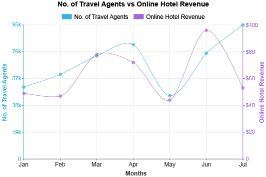
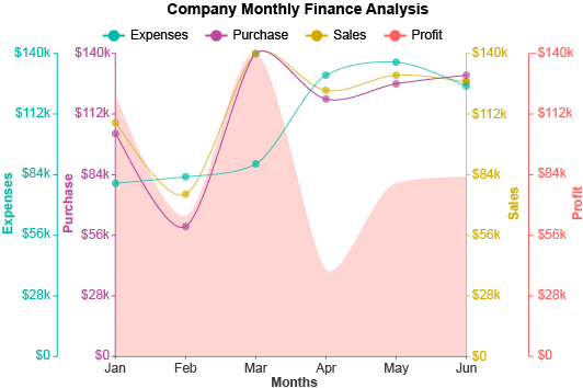
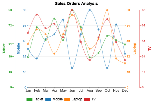
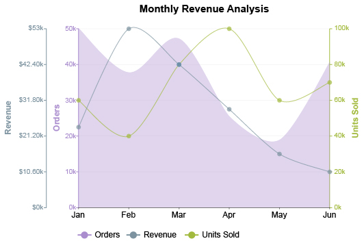
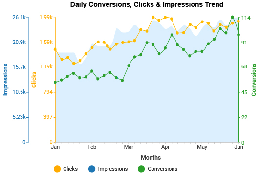
Multi Axis Line Chart
More Axes Equals More Insights
Most chart types rely on just two axes, a single X and Y. This restricts how much data and what kinds of information you can include in your visualizations.
The Multi Axis Line Graph removes this limitation, giving you more freedom and access to greater insight.
Understand more when you visually analyze data with the Multi Axis Line Graph.
Google Sheets
Microsoft Excel
Microsoft Power BI
Free 7-day trial (no purchase necessary). Pricing starts at $10 per month.
 ChartExpo for Google Sheets is
 used by 330,000+ users worldwide!
Click this link to watch a ChartExpo for
Google Sheets single-user installation video.
Click this link to watch a ChartExpo for
Google Sheets admin installation video.
Click this link to watch a ChartExpo
for Excel single-user installation video.
Click this link to watch a ChartExpo
for Excel admin installation video.
What Is a Multi Axis Line Graph?
A Multi Axis Line Graph functions like any other multiple or stacked line chart. However, this visualization uses multiple axes, giving you more flexibility in the data you can chart together.
A line chart with two Y axis components opens many new doors in your analysis projects. Adding even more axes only creates greater opportunity.
Stop limiting yourself to traditional chart types and learn about the Multi Axis Line Chart and how to use it.
Multi Axis Line Chart Definition
In graphical analysis and mathematics, an axis gives viewers a reference point to measure and scale data points and coordinates within the chart.
Most charts include an X and a Y axis. These two components form a coordinate plane. To understand how a coordinate plane works, consider the following grid:
| 4 | ||||
| 3 | ||||
| 2 | ||||
| 1 | ||||
| A | B | C | D |
ABCD represents the horizontal X axis of independent variables. These are the items, categories or other details that you’re measuring.
1234 shows the vertical Y axis of a line plot. This reflects your dependent variables, or how you are measuring the independent data.
So, if you have a data point at position D4, there is a relationship between these two variables or values. The independent variable D has a value or magnitude of 4 on the Y scale.
In line graphs, these two axes are essential. Otherwise, you won’t know where to place data points or how to draw this figure when you graph a line.
However, having two axes can also be limiting. It restricts you to just these guidelines for reference your data. What happens when you want to include more?
This is why we have the Multi Axis Line Graph. It is a line chart with two Y axis elements. Thus, the grid can look something like this:
| 4 | ! | ||||
| 3 | % | ||||
| 2 | 1 | ||||
| 1 | $ | ||||
| A | B | C | D |
Adding a secondary axis, or even three or four, creates more interesting connections and allows you to make more advanced charts.
How to Read a Multi Axis Line Graph
Most people know how to read a simple line graph. It’s something we learn in grade school. However, Multi Axis Line Graphs can be a bit different.
With each added axis, there is another line to chart the data corresponding to this variable. For instance, if you wanted to see temperature highs and rainfall totals for multiple locations, you’d have one line (and axis) for temperatures and a second for rainfall.
You can then look at the path of each line to see how the independent variables relate to each of these measures. This is not unlike how you might read a double line chart.
That said, you must be careful of each axis range. Multi Axis Line Charts are popular choices when you have data with dramatically different scales.
Imagine a car dealership charting its total sales figures for each month versus the units sold. One scale must be very large to chart millions of dollars worth of sales. Conversely, the scale for units sold may only need to go from 0-100.
That’s a significant difference. If you charted it on the same scale, the units sold line would be barely readable at the very bottom of the visualization, with the sales data at the very top.
When you read a Multi Axis Line Chart, it is crucial to pay attention to each axis’ range and label.
The position of data points in each line shows a relative position within that range, not necessarily a directly comparative one with the other scale.
If the line for units sold dips above the line of total sales, it does not mean that the business sold more cars than it made dollars.
Instead, this pattern would show that there were many units sold, but sales were lower than normal, suggesting people were buying more affordable, economical vehicles.
The bottom line is to be careful when reading a Multi Axis Line Chart and pay attention to each unique scale.
Types of Multi Axis Line Charts
There are quite a few variations of the Multi Axis Line Graph visualization. Discussing these different designs and models allows you to see the different ways to use this chart type. It also showcases the many reasons when to use this visual analysis tool.
Dual Axis Line Chart: This is the type of line graph described in previous examples, where you have a graph with two Y axis components.
A dual axis line chart is useful because it allows you to compare your data across two dependent variables.
You can use this visualization to see the impact of one metric on another or evaluate performance from two different angles.
Multi Axis Line Graph with Three Variables: Adding a third axis to your chart creates another line in your diagram and a fresh dimension to your visual analysis.
A good time to use a Multi Axis Line Graph with three variables is when you have several metrics contributing to a goal or process.
For example, a digital marketer may want to chart clicks, conversions and costs of keywords together. This allows them to make smarter (and more affordable) decisions about which search terms to pursue.
Multi Axis Line Graph with Four or More Variables: As you start moving into graphs with more than three variables, your visualizations grow exponentially more complex.
While this can be a benefit by allowing you to include more data and insights in your charts, it can also be a severe detriment. Your Multi Axis Line Chart may become too overwhelming to accurately analyze if it includes too many components.
Charting with a Secondary X Axis: All of the above examples of Multiple Axis Line Charts focus on adding a Y axis to your line graphs. However, you can also add a secondary X axis.
An extra X axis adds another set of dependent variables to measure. It can be helpful when you want to chart multiple series of data and compare performance between two or more primary categories.
For example, you may want to compare weekly sales data between two stores. The bottom X axis would reflect Mon-Fri of Store A, while a second X axis at the top of the chart shows Mon-Fri of Store B.
You can also use a Google Sheets or Excel secondary X axis to show two time periods or other details.
Examples of Multi Axis Line Charts
To understand how you might use Multi Axis Line Graphs in your own analysis projects, let’s look at some examples of line charts with secondary axes and more.
Multi Axis Line Graph Example 1: John and Jane are planning a vacation. They want to go somewhere with nice weather, but not too hot. And, they don’t want to go anywhere where it will rain their whole trip.
After narrowing their options down to a few choices, they decide to chart the data using a Multi Axis Line Graph. Each potential destination appears on the X axis, while two Y axes measure the data for yearly rainfall and high temperatures for each location.
With this dual Y axis line graph, the couple can quickly assess which destinations fit their criteria. They’ll see the places that are too hot or have too much rainfall and remove them from their decision-making.
Multi Axis Line Graph Example 2: Ryan is a pay-per-click advertiser who wants to evaluate the performance of his search ad campaign throughout the week.
Since he has several performance indicators, a Multi Axis Line Graph is a perfect visualization. For each point through the week, he can evaluate how his campaign performed for clicks, impressions, conversions, etc.
This multiple axis chart gives him a clear view of when performance is up or down. It also helps him understand how each metric impacts the other. He can respond to changes much faster than other advertisers, thanks to his Multi Axis Line Graph!

When to Use a Multi Axis Line Chart
The flexibility of Multi Axis Line Charts creates many instances where this visualization is useful. It allows you to answer more interesting and valuable analysis questions.
You can create a Multi Axis Line Graph to depict data with dramatically different ranges. You can also use dual axis line charts to compare items requiring unique scales. It truly offers exceptional freedom in how you approach visual analysis.
Explore how Multi Axis Line Charts help you discover insights in your datasets.
Depicting Data with Dramatically Different Ranges
An axis acts as a reference point for understanding the value and position of data within a set. The range of each axis has to encompass every point, from the lowest to the highest, to provide an accurate measurement gauge.
When combining data to chart different variables, you may run into a situation where the numerical scale of these measures is incredibly varied.
For instance, you may want to chart sales data in the billions versus the number of clients or units sold, which may only be 1,000 or 100,000. Even a million units sold is a drop in the bucket compared to a billion.
If you chart these two variables together on the same scale, the resulting visualization would be too skewed to make any sense of. You wouldn’t be able to gain any understanding or insight because the line for your sales would be flat at the top of the chart and your units sold would be squished at the very bottom.
The Multi Axis Line Chart solves this problem. With extra Y axes, you can present each variable on its appropriate scale and limit any skewing.
Added axes dramatically improve the readability of your charts, giving you clearer insight and an overall better understanding of the data.
That said, it is important to label your axes and ranges clearly. During analysis, you have to remember that the chart’s multiple lines do not show the same values and can’t be compared directly.
What you’re really comparing are the relative positions of each data point and how these distinctly different variables relate and impact one another.
Working with Multiple Units of Measure at Once
Similar to visualizing data with disparate numerical scales, you can also use Multi Axis Line Graphs to depict metrics using different units of measure.
For example, let’s say you wanted to chart average rainfall in inches versus average temperature for several locations.
Numerically, the values of each metric are reasonably close. You could, in theory, chart the data along the same scale range. The problem is it leads to confusion because you may not be sure which data points relate to temperature and which correspond to rainfall in inches.
The Multi Axis Line Chart visualization fixes this and displays the data in a neater, less confusing manner. This improves efficiency and accuracy in your analysis.
Digital Marketing is an area where this use of Multi Axis Line Graphs really shines. Modern marketing campaign managers have to simultaneously track many unique engagement and conversion metrics.
In pay-per-click marketing alone, you have to consider clicks, conversions, impressions, impression share, quality score, cost per click, cost per acquisition, conversion rate and more.
Multi Axis Line Charts are highly effective at managing these metrics for two reasons. First, line graphs are natural chart options whenever you’re tracking changes over time. A manager can quickly assess when a metric is performing below or above expectation.
Secondly, the Multi Axis Line Graph is one of the best data visualization tools for displaying multiple metrics in one chart. Just be careful you don’t include too many metrics and axes in your multiple axis charts.
It may become too overloaded with information to become helpful!
Visualizing Complex Relationships to Better Understand Them
What factors cause your data to move in either direction, up or down? This is a valuable analysis question to ask and answer.
After all, you need to understand the significant factors influencing your sales, traffic, customer satisfaction and other key performance indicators.
Otherwise, how will you hope to optimize your strategies to improve these vital figures?
Visualizing various metrics together with Multi Axis Line Charts helps you understand these relationships and how different factors influence one another.
In a Multi Axis Line Chart, you can look at the path of each line to help understand relationships between different metrics. If a spike in one line influences another metric line to peak, it could be a meaningful relationship worth exploring further.
For example, if you increase budget spending for a particular strategy, keyword, marketing campaign, etc., what sort of results do you see? Multi Axis Line Charts can show you.
Once you know these factors and understand the relationships and how various metrics impact one another, you know which levers and knobs to manipulate to regulate your data’s performance.
You can also better anticipate when results will change based on how other metrics perform.
Including Multiple Series of Data in One Chart
Aside from using the Multi Axis Line Chart to visualize additional measures or dependent variables, you can also add secondary X axis components.
Additional independent variables enable you to show multiple series of data in your charts. You can compare sub-items across several main categories.
For example, you can look at sales data across multiple stores or locations. Alternatively, you can use a line graph with additional X axes to explore the same data across various time periods.
Including multiple series of data makes the Multi Axis Line Graph an exceptional comparative analysis tool. You can quickly detect differences and similarities between each dimension’s results.
Through these comparisons, you can discover valuable insights, such as which categories produce the best and worst results. This can help you repeat successes in other strategies by taking what you’ve learned from your Multi Axis Line Chart analysis.
Alternatively, you can use a multi-series analysis to compare growth or change between two points in time. This is useful during major updates or strategy shifts, like remodeling a store or website, adding a new feature or product, etc.
You can use the Multi Axis Line Graph to chart data before and after this change. Analyzing the chart results will show you what the impact of this change was on your results and performance.

Benefits of Using a Multi Axis Line Graph
Allowing you to compare variables you wouldn’t normally be able to display together creates considerable analysis possibilities.
You can draw comparisons across datasets and see how one metric impacts another, even when they are separate from one another.
Plus, Multi Axis Line Charts enable you to include more details in a single chart, without hurting its readability. This is a massive advantage in reporting and developing valuable dashboards.
See the powerful capabilities of the Multi Axis Line Graph firsthand.
Compare Variables You Normally Can’t Chart Together
Multi Axis Line Charts open a lot of doors in analysis. A charting environment where you can visualize multiple variables in the same graph enables you to make comparisons that are not typically available in many other chart types.
You can answer more interesting and complex analysis questions and discover insights not seen with traditional XY line graphs.
Not only does answering these questions provide value and understanding, but it can also offer a competitive advantage. With Multi Axis Line Charts, you can learn things about your data and results that competitors can’t detect with their less advanced line charts.
In other words, you’ll be able to seize opportunities that competitors can’t even see! And, you’ll avoid risks and pitfalls that other companies walk right into.
A dual axis line chart excels at giving you the foresight you need to ensure your growth progresses at a steady pace, and you experience fewer declines, if any at all.
Charting unique variables furthers your understanding of what’s happening in your data, particularly the relationships between various factors. Without a Multi Axis Line Graph, it’s hard to find clear evidence of these correlations.
In short, a two Y axis graph, or a line chart with three variables or more shown, produces significantly more value and actionable intelligence during the analysis phase.
Learn More with a Single Multi Axis Line Chart
Each axis you add to the chart multiplies the number of potential insights by adding more dimensions and data points to the analysis. Thus, Multi Axis Line Charts can increase your insights exponentially.
In many ways, the design of the Multi Axis Line Graph functions as if you overlaid two different line charts on top of one another (or several, depending on how many multiple axes you include).
Without the Multi Axis Line Chart type, you’d have to create multiple simple line charts and then refer back to them one at a time. This is highly inefficient and wastes a lot of time.
Creating advanced charts in Excel or Google Sheets, like the Multi Axis Line Chart, produces more efficient visualizations. You can learn more from one dual Y axis graph than you can from several single line graphs.
This efficiency saves you considerable amounts of time, especially if you use a visualization tool like ChartExpo to help you make professional charts and graphs in less time.
You’re essentially gaining more actionable intelligence in less time because you only have to create one chart instead of several.
This value and understanding also translates into reporting. You can share one Multi Axis Line Chart with clients or stakeholders, instead of several simpler charts.
Make Relative Comparisons between Data with Varied Ranges
As mentioned, Multi Axis Line Graphs shine in two scenarios: (1) charting varied metrics and units of measure together and (2) depicting data with dramatically different ranges.
In the latter case, Multi Axis Line Charts help you show correlations between results with wildly different scales. You could compare values in the billions versus another metric on a scale of 1-100.
This is another example of how Multi Axis Line Graphs provide greater flexibility in charting. Many of the restrictions that other charts face don’t apply to two Y axis graphs and other Multi Axis Line Plots.
Remember, when you chart data with dramatically different ranges, you aren’t making direct comparisons between the values. What you’re actually doing is looking at the relative position of the data points.
For instance, a digital marketer may want to investigate the difference between total site visitors and those who make a purchase. The goal is to see if there are any overlapping patterns or other correlations between each line.
We can reason that more site visitors result in more purchases because you’re creating more opportunities for digital sales. If your dual Y axis graph shows a different picture, you know there’s something wrong that you need to address.
These types of relative comparisons are also valuable when you don’t know whether or not a relationship exists between metrics. You may be able to discover significant factors affecting performance that you couldn’t detect with simpler line graphs.
Experience a Versatile and Flexible Way to Chart Data
We’ve talked at length about how Multi Axis Line Charts open doors and create new analysis opportunities. Really what this means is that this is a highly versatile and flexible chart type.
The ability to chart data items that use different scales, units of measure, etc., means you have almost no restrictions regarding what data you can include in your visualization.
This versatility and freedom hold many benefits. A versatile chart means you can rely on the Multi Axis Line Graph for many of your analysis projects. Such an effective, go-to method for visualization saves you time and headaches in deciding which chart type to use.
The flexibility of Multi Axis Line Charts means you can plot almost any type of data with this diagram. And, you don’t have to worry about possible hurdles or restrictions other chart types possess.
These traits also serve you well in reporting. You can truly bend the chart type to fit what you want to present to the audience and how.
Plus, line graphs are incredibly universal, meaning stakeholders, clients, etc., are already familiar with this visualization type and comfortable analyzing it.
There is very little that the Multi Axis Line Chart can’t do!

How to Make Multiple Line Graphs with Additional Axes
Creating charts with multiple axes seems like a daunting task. It isn’t.
ChartExpo makes it incredibly easy to learn how to make multiple line graph axes. If you need to create an Excel chart with two Y axis ranges or make a secondary axis in Google Sheets, ChartExpo has you covered.
With the best data visualization tool for Multi Axis Line Charts, creating advanced charts in Excel, Google Sheets and other platforms takes only minutes.
There are zero headaches and no hassle.
Have a Clear Goal to Dictate What Data and Axes You Need
Charting should not happen unless you have a purpose or intent for the visualization you’re making. Typically, the goal is to answer an analysis question.
Whatever this question or objective is, it should relate to your overarching, organizational goals. In other words, you should gain some tangible value from answering this query.
When you begin to learn how to make an Excel chart with two Y axis components or a Multiple Axis Line chart in Google Sheets, it’s imperative that you start with creating a goal for your graph.
What do you want to know by developing this chart? Having this question clearly stated and recorded ensures you don’t get off course or create a line graph with two Y axis scales that don’t address this concern.
An analysis goal is particularly useful with the Multi Axis Line Chart because of how unrestrictive and flexible this visualization type is.
It protects you from needlessly including variables that don’t support your initial goal. In turn, this helps you avoid the risk of overloading your Multi Axis Line Graphs with too many details, especially irrelevant ones.
Analysis goals also benefit your charting efficiency, especially if you pause the analysis process for another project or invite others to join. You don’t have to try and remember the chart’s purpose because it is clearly recorded.
Think Critically About the Range of Your Additional Axes
One of the most complex challenges in how to add a secondary axis (or multiple axes) is setting an appropriate range for each variable.
While Multi Axis Line Charts help you combine data with drastically different ranges, you may have to play around with your axis scales to ensure that the visualization isn’t misleading or skewed.
When you have variables with diverse ranges, you can change the scale to make the data appear in different ways. This can be both a blessing and a curse. On the plus side, it gives you more freedom in how you want the data to appear.
However, you can accidentally misguide yourself or anyone else analyzing the chart if you aren’t careful. The problem is that people naturally assume items close together in a line chart are also close in value. This is how we read any other type of line graph.
For Multi Axis Line Charts, close data points between lines could be miles apart in value.
Imagine if you were charting sales data between two companies — a large enterprise and a small retail store. The enterprise may have billions in sales, while the smaller business only has $100,000 in total sales.
Depending on the scale you use, data points from the smaller company could appear higher than the enterprise for a particular period.
This may cause you to think, “Wow, this small company outsold a massive corporation!” This isn’t true; it’s just a visual miscue because of the scales used.
Thus, it is critical to review your Multi Axis Line Charts and meticulously test different scales to ensure the most accurate depictions of the information.
How to Add Secondary Axis in Excel for Line Graphs
Need to know how to make a multiple line graph in Excel with added axes and variables? There are a few methods of making Excel dual axis charts or an Excel graph with 3 axis scales or more.
An Excel secondary axis is possible using just this tool alone. However, you’ll have to overcome several obstacles and confusing settings just to make a double axis chart in Excel.
The better method to add an axis to Excel charts is to use a tool like ChartExpo. With ChartExpo, you can learn how to make an Excel line chart with two Y axis elements (or more) in mere minutes.
There are no confusing settings or scripts to edit. In three easy steps, you can transform your raw data into an Excel line graph with two Y axis scales or more.
Before using ChartExpo’s Excel chart maker, you need to download the data visualization software. You can do this through the Microsoft AppSource site.
If you’ve already downloaded ChartExpo, you’ll typically find the tool under the “Insert” menu at the top of Excel. Use the “My apps” or “Add-ins” submenus (it will depend on your version of Excel).
Alternatively, you may find the ChartExpo Multi Axis Graph maker under the “File” menu. Again, it depends on your version of Excel.
When you open ChartExpo, you’ll see the top level of the visualization library. To create a chart with a secondary axis or more, enter “Multi Axis Line Graph” into the search bar. This will filter all charts except the option to make an Excel line graph with two Y axis tools.
After selecting your visualization, the second component is your data. You can highlight the sections of your dataset you wish to use. Or, you can input the values yourself. You may also want to adjust the ranges and make other small settings changes.
The ChartExpo interface is incredibly straightforward, so making any minor adjustment is incredibly simple.
If you’re satisfied with your inputs, the final step is to hit the “Create Chart” button. Your Excel line graph with 3 variables, or dual axis chart in Excel, appears immediately.
Make a Google Sheets Chart with Two Y Axis Components or More
You can also use ChartExpo to create a chart with a secondary axis in Google Sheets. The process is very similar to making a secondary Y axis Excel chart.
The most significant difference in the process is how you access ChartExpo. When using Google Sheets, click on “Extensions” from the top toolbar. In the dropdown menu, tap “Add-ons” and then “Get add-ons.”
This will open the Google Workspace Marketplace, where you can search and download the ChartExpo chart maker extension for Google Sheets.
The next time you access the “Add-ons” menu, you’ll find ChartExpo listed. Opening this tool will show you the complete chart gallery this data visualization software offers.
Again, you can enter “Double Y Axis Graph Google Sheets” or another Multi Axis Line Chart type to filter out other results.
After choosing your Multi Axis Graph, you need to inform ChartExpo what data you want to visualize. You can highlight the parts of your dataset you want to use directly or manually input the values yourself.
The second method will take more time, but it may be necessary when combining several variables to create a Google Sheets graph with two Y axis components or more.
You can save any double Y axis graph or other Multi Axis Line Chart you make as a PDF or image file. This feature makes it easy to share and communicate your data findings with others.

Why Is ChartExpo the Best Data Visualization Tool for Making Multi Axis Charts
ChartExpo isn’t just the best data visualization software for Multi Axis Line Charts. It is one of the best visual analysis tools, period.
It offers the most straightforward and accessible method of creating high-quality charts in just minutes.
The intuitive system makes it easy to produce Multi Axis Line Graphs and other visualizations, saving you time in the process.
Experience a better chart maker, free from the hassle of annoying scripts and confusing settings.
A Complete Chart Gallery for Greater Depth in Visual Analysis
ChartExpo is incredibly useful when you want to make a graph with multiple Y axes or X axis features. However, it is much more than a Multi Axis Line Chart creation tool.
What ChartExpo offers is an entire library of professional charts and visual analysis tools. It more than doubles the number of options offered in data tools like Excel or Google Sheets.
These new options mean you always have the perfect chart type to match your data. When you can create this ideal fit between your data and graph, visual analysis happens swiftly and is more effective at producing actionable insight.
The ChartExpo charting gallery includes many specialized options for marketing, finance, pay-per-click advertising, customer journey management and more.
Plus, it includes simple and advanced charts for Excel, Google Sheets, etc. You get all of the classic chart and graph types (bar, line, pie, scatter plot and so on) and these more specialized visualizations.
The benefit of all of these different chart types isn’t just about having a more versatile library. More visualization options help produce more insights and understanding of your data.
In other words, more charts mean more value from your visual analysis projects.
This is because there is always more than one way to visualize your data. Different chart types offer fresh perspectives on the same dataset, which can reveal insights you couldn’t see before.
ChartExpo’s expansive library gives you every vantage point for seeing the story behind the numbers.
Charting at Its Most Basic and Effective Components
ChartExpo’s Multi Axis Chart excels at delivering timely insights on your data because of how efficient this chart maker is.
The ChartExpo system focuses on the two most crucial elements of chart creation: graph type and, of course, the data.
By removing unnecessary steps, like tricky settings or tedious scripts (more on this later), ChartExpo delivers one of the fastest ways to develop high-quality, professional charts and graphs.
You can make advanced charts in Excel or Google Sheets in as little as three clicks, including Multi Axis Line Graphs.
The first click is to select your chart type from the many different options available to you in the ChartExpo interface.
Next, you click and drag to highlight the data in Excel or Google Sheets that you wish to visualize. One more click on the “Create Chart” button, and that’s it.
Quick data visualization is crucial because of how much your data changes. Results can shift unexpectedly and instantaneously. You need a charting tool capable of making your visual analysis even faster than your data.
ChartExpo’s simple yet powerful data visualization software for Excel and Google Sheets is the answer to creating quick, professional Multi Axis Line Graphs and other visualizations.
You Never Have to Worry About Coding or Writing Scripts
One of the reasons ChartExpo is so much faster at data visualization than other chart makers is the removal of scripting.
Many other “best” data visualization tools offer a library of prewritten scripts. This is how tools like Excel and Google Sheets enable you to insert foreign chart types.
Using these other tools, you have to edit the chart template scripts with your own data and settings to create an Excel three axis graph or any other visualization.
There are a few problems with this approach:
- Accessibility: Working with these scripts is best if you have some experience with JavaScript or another programming/coding language. Without this skill set, creating charts will be slow and many of these tools will be unusable by many people in your team.
- Timing: Even if coding comes very easily to you, it will still take you some time. On the other hand, ChartExpo updates its chart scripts automatically, so you don’t have to.
- Errors: Humans make mistakes. A simple mistype as you’re editing a script can mean you have to painstakingly review each line to find the error. That’s even more time it takes you to create a chart!
ChartExpo removes all these issues by eliminating the need to edit scripts manually. The ChartExpo tool does all of this work for you automatically.
Any time you make a change in the interface, your visualization updates instantly. You never even have to see a piece of coding!
Communicate Findings across Your Teams and Stop Data Silos
By removing manual coding from the chart process equation, data visualization becomes a much more accessible activity.
Without any skill gap, everyone on your team can participate in the charting process and engage with data on a deeper level.
In today’s Digital Age, where many companies strive to become more data-driven, this is precisely the type of environment you want to create. You don’t want charting to be restricted or for data silos to appear.
Instead, you want to foster a solid data culture, where individual teams and departments are sharing reports, communicating findings and brainstorming on what data-driven changes to make.
ChartExpo helps you reach this point by making it easier to create charts and share reports. The straightforward, speedy data visualization tool makes it quick and easy to develop professional charts.
With more people participating in data visualization, charting and visual analysis become common ground between different teams. It’s no longer something that only a handful of people take part in.
It won’t take long for the data culture to grow. Soon, everyone will be sharing and spreading insights and other discoveries. That’s how a data-driven organization operates!
ChartExpo is the ideal tool for data visualization and communication.
ChartExpo Pricing
ChartExpo for
Google Sheets
$10*
per month
(no purchase necessary)
*pricing starts at $10
per user per month.
Only in-app purchase available
ChartExpo for Google Sheets
single-user purchase video.
ChartExpo for Google Sheets
domain-users purchase video.
ChartExpo for Google Sheets
single-user installation video.
ChartExpo for Google Sheets
admin installation video.
ChartExpo for
Microsoft Excel
$10*
per month
(no purchase necessary)
*pricing starts at $10
per user per month.
Only in-app purchase available
ChartExpo for Excel single-user
purchase video.
ChartExpo for Excel domain-users purchase video.
ChartExpo for Excel single-user
installation video.
ChartExpo for Excel admin
installation video.
ChartExpo for
Microsoft Power BI
$10*
per month
(no purchase necessary)
*pricing starts at $10
per user per month.
Only in-app purchase available
Custom Pricing
Blogs
How to Create a Multi Axis Chart in Excel?
Click to learn how to plot Multi Axis Chart in Excel. Also, we’ll address the following question: what is a Multi Axis Chart?
How to Use a Time Series Chart in Excel for Analysis?
Click to discover how to use a Time Series Chart in Excel for better analysis? We will also learn what is a Time Series Chart, its uses, and its components.
