Double Bar Graph
One Chart, Twice the Insights
Bar charts are popular and powerful data visualization tools. Why not double that value? Thanks to the double bar graph, you can.
With this chart type, you can add an extra layer of data to your visual analysis. It enables you to compare multiple data sets in the same chart.
See why bars are better in pairs.
Google Sheets
Microsoft Excel
Free 7-day trial (no purchase necessary). Pricing starts at $10 per month.
 ChartExpo for Google Sheets is
 used by 330,000+ users worldwide!
Click this link to watch a ChartExpo for
Google Sheets single-user installation video.
Click this link to watch a ChartExpo for
Google Sheets admin installation video.
Click this link to watch a ChartExpo
for Excel single-user installation video.
Click this link to watch a ChartExpo
for Excel admin installation video.
What Is a Double Bar Graph?
A double bar graph is a data visualization closely resembling a bar chart. The primary difference is that a double bar graph uses a pair of bars for each item in your data set.
The improved design over traditional bar charts allows you to compare two variables or sets of data with one visualization. Thus, double bar charts make for powerful comparative analysis tools.
Learn about double bar graphs and comparison analysis to better understand your data.
Double Bar Graph History
The history of the double bar graph is really the background story of bar charts in general.
To tell this story, we need to talk about William Playfair — the inventor of many chart types, including the bar graph.
In 1786, Playfair published The Commercial and Political Atlas; Representing, by Means of Stained Copper-Plate Charts, the Exports, Imports, and General Trade of England, at a Single View. To which are Added Charts of the Revenue and Debts of Ireland, Done in the Same Manner by James Correy.
This exhaustive and monotonous title wouldn’t interest most. However, within this publication, Playfair introduced the first bar charts and line graphs. (He would publish another piece a couple of years later that offered the first look at pie and circle charts).
At the time for statistics, this was like a prehistoric human returning to his tribe with fire and the wheel.
It wouldn’t take long for these visualizations to become commonplace in statistics. Soon, people began introducing variations to Playfair’s original bar chart, including the double bar graph.
History is a little murky on when exactly the first dual bar chart appeared or who invented it. Some forms of comparison visualizations appeared even before Playfair’s published bar chart in 1786.
So, we know that people were already conducting visual comparative analyses. It wouldn’t take long for people to recognize the power of the double bar graph in comparison. At best guess, multi-bar charts started appearing sometime in the 1800s.
Double Bar Graph Definition
The double bar graph is a pictorial representation of data that uses vertical or horizontal rectangles to reflect different items in your data set.
People typically use bar charts and double bar graphs to show categorical data. Every bar represents a particular item in your data set. In the double bar graph, the two bars show the same thing in two separate ways.
For example, your team redesigns the company website and wants to evaluate the performance of each page. Each pair of bars represents a page on the site and the two individual bars within that pair show page traffic before and after the redesign.
The height of each bar shows its performance for that particular page and period. With this visualization, the team can see how much performance improved and which pages still need attention.
Double bar graphs utilize a horizontal axis and vertical axis, or X-Y plot, to measure the magnitude or value of each bar.
Essentially, if you’re familiar with a bar chart, you can easily understand a double bar chart because it is very similar.
The only difference between a bar chart and a double bar graph is the latter shows two bars for each category. This enables the chart maker to visualize two variables or sets of data with one chart.
Types of Double Bar Charts
To have a complete understanding of what a double bar graph is, it’s essential to identify the different types of bar graphs used in visual data storytelling.
The first distinction is between a horizontal double bar graph and a vertical one. The only difference between these two types of bar charts is how the pictorial depictions of your data appear.
In a horizontal bar chart, the X-axis shows your count data. The longer a bar extends from right to left, the more value or frequency that particular item has.
Meanwhile, your bar pairs themselves list along the Y-axis. This is the reverse of a vertical bar chart, where your data items appear along the X-axis and the count metric appears on the Y.
Horizontal double bar graphs aren’t the most popular choice, but they do have their advantages.
Labeling is one advantage. In a vertical data representation, you have limited space to name each bar pair. If your titles are too long, it becomes a jumbled mess. While there are ways around this, like staggering the labels or having them at an angle, it can still look messy.
This may seem like a minor issue, but if you have a lot of categories or want to present a clean, professional chart, the horizontal bar graph can be a savior.
Horizontal double bar graphs allow you to list longer labels because the categories are oriented how we naturally read text.
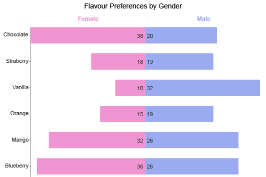
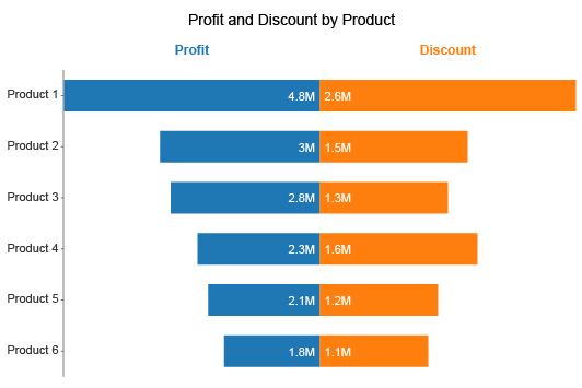
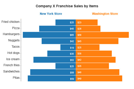
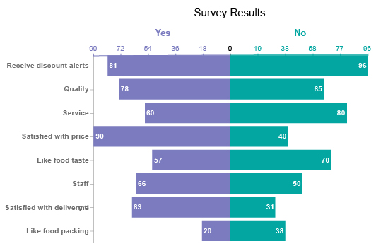
The other advantage is in creating a divergent double bar chart. Instead of placing bars side-by-side, this type of bar chart has them moving away from one another. This helps you draw comparisons quicker than the traditional method.
Another variation to dual bar charts is what’s known as a stacked double bar graph. This variation allows you to add even more data by dividing each bar into smaller sections.
For example, let’s say you wanted to compare quarterly sales from this year and last year across four separate locations.
Each location would have a pair of bars reflecting sales data for the two years you want to compare. Then, you’d divide those bars into four pieces to show the sales data of each quarter within those years.
The stacked double bar graph is the type to use when you need to include this extra layer of data and don’t want to use a clustered bar chart.
Double Bar Graph Examples
Rounding out this section, let’s look at some examples of double bar graphs. After all, the best way to learn about a topic is to see real world-applications!
Double bar graph example 1: Ms. Maple teaches a morning and afternoon kindergarten class. Halloween is approaching and she wants to know what kinds of candy to bring for the class party.
She polls each student across the two classes and charts the results using a double bar chart.
Each type of candy shows two bars to distinguish the preferences of the morning class versus the afternoon one.
Double bar graph example 2: A retail company wants to better understand its audience, particularly the buying tendencies of women versus men. This will allow them to better target coupons and other offers.
They chart the number of sales for various products based on the gender of the shopper. Each product bin shows two side-by-side bars for male and female customers.
With this visualization, they can see which items are most popular with these two audience segments.
Double bar graph example 3: Mark is a pay-per-click advertiser exploring new keywords to incorporate into ads for a client.
To evaluate these search terms, Mark needs to compare cost versus search volume. In other words, how much interest is there for these terms and what will each click cost his client?
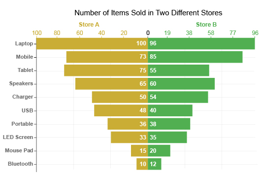
Since these two values have different ranges, Mark needs to include two axes for the count data. One will show the data range for clicks, while the other will express the value in dollars.
This is a case where a divergent horizontal double bar graph is useful. You can easily show the different ranges for each metric and the layout still makes comparisons easy.
With this dual bar graph, Mark can quickly find the keywords that fit the profile of high popularity and low costs. He needs to only look for items in the chart with a long bar for popularity and a short one for costs.

How to Create a Double Bar Graph
Chart creation is a vital part of data analysis. Making sense of data on its own, without the help of a chart, is too challenging.
The human brain isn’t designed for analyzing raw numbers. However, it is adept at understanding visual depictions.
Creating a double bar graph is easy, especially when you use ChartExpo. You can create beautiful, rich visualizations in just minutes.
Find out how to create double bar graphs in less time.
Ask yourself what’s the Purpose of the Chart
Charting takes time and other resources. You don’t want to needlessly waste these efforts by making poor or irrelevant charts.
It’s good to have a purpose or plan for your chart. This overarching objective will keep your charting on task and prevent you from making visualizations that don’t provide sufficient value to your team.
In many analysis projects, your goal is a specific question you hope to answer using charts. This question should provide real value to your organization.
Hopefully, the answer to your analysis question enables you to directly improve your performance and results.
You need to consider a few things as part of your goal. You’ll need to ask yourself what you want to measure and how you want to measure it.
In large datasets, you may not want to include everything in your chart. Too many items will overload your multiple bar charts and make them challenging to analyze. So, you need to strategically filter your data to only include the parts most relevant to your goal.
Standard bar charts take these items and measure them using a single measure. With a double bar graph, you’ll add another data layer by including a second dependent variable.
Sometimes, you may even have a second metric that you’re measuring.
As you add data, keep referring back to your goal. Is each new dimension you introduce relevant and helpful to this objective?
This preliminary work ensures that your chart is concise and tells the correct visual data story.
Decide What Style of Double Bar Graph to Use
There are many types of bar charts, which means there are also multiple variations to the double bar graph.
Once you establish the purpose and goal of your chart, you need to think about which type of double graph you want to use.
Each style of multi-bar chart has its advantages and disadvantages. Matching your chart’s goal with the correct type of bar graph unlocks more insights and even greater value.
The first thing to consider is whether you want a horizontal bar chart or a vertical one. The vertical grouped bar graph is the more popular option. However, the horizontal design might work best when you have long labels that become hard to read vertically.
The next question to ask is, “what chart type is best for my data?” This is when it starts to get tricky. Let’s review the options you have:
Vertical double bar graph: This is easily the most recognizable and popular option. There are many reasons to use this style. This is your chart when you want to analyze two datasets side-by-side or have a before and after picture.
Divergent horizontal double bar graph: The divergent bar chart is excellent if you want to measure two items with different metrics or ranges. It’s a less traditional way of drawing comparisons, but equally as effective (if not more).
Stacked double bar graph: You can add more detail to your double bar graphs using stacked bars. Essentially, this divides each bar into smaller parts. For instance, if you are comparing yearly sales data, you can also display quarterly sales for each period.
How to Make a Double Bar Graph in Excel
Knowing how to create a bar chart in Excel with multiple bars is vital knowledge for many data users. Excel is easily one of the most popular platforms for organizing data.
While you can create an Excel double bar graph without the help of ChartExpo, you’ll likely run into a few hang-ups. Excel’s chart creator isn’t as accessible or easy to use as ChartExpo, so it’ll take more time to create the same quality visualizations.
How do you make a double bar graph in Excel using ChartExpo and save time? It’s easy.
To download and use ChartExpo for Excel, you must visit the Microsoft App Source. After installing this data visualization tool, you can access it directly from within Excel.
Each time you open ChartExpo, the first thing you’ll see is the top level of the chart library. This includes all of the many visualization options available with ChartExpo.
You can use the search bar to find the chart you want directly. Simply type “double bar graph” into the bar and it will remove the other options that don’t fit the search.
With the double bar graph selected, you need to input your data. You can click and drag to select the parts of your dataset you wish to visualize.
Alternatively, you can input the row and column IDs and ranges manually. While this method takes longer, it may be necessary if you have a large spreadsheet and only want to use certain parts for your multiple bar graph in Excel.
The final step in the process is the easiest. Hit the “Create Chart” button to finalize your selections and produce your high-quality comparative bar graph in Excel.
You can save the chart as an image or PDF, meaning you can insert or attach this Excel double bar chart anywhere you need!
How to Make a Double Bar Graph in Google Sheets
If you use Google Sheets instead of Excel, you can still take advantage of the powerful benefits of the ChartExpo data visualization software.
Instead of the Microsoft App Source, you’ll need to go to the Google Workspace Marketplace. You can actually visit this app hub from within Google Sheets.
Click “Extensions” from the top toolbar and mouse over “Add-ons” in the resulting menu. This creates a left dropdown menu with the option to “Get add-ons.” Clicking this will open the Google Workspace Marketplace, where you can search and download the tool.
The next time you click the “Add-ons” menu under “Extensions,” you’ll notice the ChartExpo option.
From here, the process to create a Google Sheets double bar chart is almost exactly the same as creating different types of bar graphs in Excel using ChartExpo.
You select the data you want to visualize or enter it manually into the correct fields. Then, you set your data ranges and other settings. Once you’re satisfied with your selections, click “Create Chart” to finalize.
Again, the chart saves as an image or PDF, making it easy to share elsewhere and spread your double bar graph ideas and insights.
You can also make minor edits to the chart after creation. For instance, you may want to edit the labels on the double bar graph X and Y-axis to improve clarity. Or, you may want to change the colors of your bars to make the chart more aesthetically pleasing.

What Is a Double Bar Graph Used For?
Double bar graphs have several applications. They are some of the best charts for comparison analysis. After all, the strongest comparisons occur between two entities. You can compare the past to the present, measure the impact of a new strategy and more.
The double bar chart visualization also comes in handy when normal bar charts can’t get the job done. You can chart more data and measure multiple variables with a single chart.
Discover how powerful and versatile the double bar graph is.
Pictorial Representation of Data Makes Analysis Easier
The primary use of the double bar graph is the same as any type of bar chart. The purpose is to visualize data to make it easier to understand.
Science tells us that the human brain processes visual data (the things we see) 60,000 times faster than raw text or numbers. You also retain the information for longer and can recall it more easily.
You can spend an entire day staring at a spreadsheet and trying to make sense of it. Or, you can spend a minute or two with a chart depicting that data.
This is why we use charts.
Dual bar graphs work exceptionally well because of their ability to add another layer of data to bar charts. This comparative bar chart can include more details, thereby telling a more thorough visual story.
In other words, charts like the double bar graph are necessary for effective (and timely) data storytelling. They provide the most efficient way to fully understand your data.
A pictorial representation of data also makes data more universal. If you work in analytics often, you’re familiar and comfortable working with datasets.
Other individuals, like your clients and stakeholders, aren’t so comfortable with raw data. Charts bridge this gap with accessible visuals that anyone can understand.
Normal Bar Charts Don’t Always Cut It
Bar charts are an exceedingly popular visualization choice. The shape of the bars allows you to include many categories or items in the visualization and effortlessly compare them.
That said, standard, single bar charts have limitations. Mainly, they are one-dimensional in how they present data. You can only look at each category from a single perspective.
There are times when the basic nature of traditional bar charts doesn’t work for your analysis purposes. You may have other dimensions you want to add and visualize to complete your analysis.
In short, you need more depth in your charts.
This is why the double bar graph exists (and other close relatives, like the stacked or clustered bar charts). It adds a second (and sometimes third) layer of information, allowing you to learn more and make detailed comparisons.
You don’t need to create additional charts to include the extra data. You can do it all with a single visualization.
There are several benefits to this:
- Saves time: Creating any chart takes time. If you can make one chart that does the work of two (or 3 or 4), you save time.
- Better analysis: Similarly, including more information in your charts allows for deeper analysis. You can see more of what’s happening and make better decisions as a result.
- Tighter reports: When communicating data to others, you want to deliver concise presentations and reports. Double bar graphs help you condense many visualizations into a single chart, resulting in cleaner reporting.
Double bar graphs are just better when you need to add more details to your visual analysis.
Supercharge Your Comparative Analysis Projects
Comparison analysis is one of the most common approaches to data discovery and understanding. It’s the act of looking at multiple categories and drawing similarities and differences between them.
If you think about it, we perform comparison analysis all the time, even when we’re not looking at data or a comparative bar chart example.
For instance, when it’s time to make food for dinner, you open the fridge and start analyzing the “data.” You look at what ingredients you have on hand, how much time you have to prepare and cook, what you’re in the mood for, etc.
What about when stopping for gas? You will compare the nearest pump prices and choose the cheapest option. There are so many applications of comparison analysis and the comparative bar graph.
Bar charts are one of the best comparative analysis tools. You can easily compare the size of each bar to see which values are the highest or lowest.
Double bar charts allow for a more thorough comparative analysis. Instead of evaluating 10 categories with one metric or dimension, you can compare several items with subcategories and added dimensions.
The most effective comparisons happen between two items, which is why double bar graphs are so effective. There is no extra data to distract or muddle the comparison.
You can effectively double the insights of your charts by adding another bar for each category of your comparison bar graph.
Make Past and Present or Before and After Comparisons
Thanks to the double bar graph design, you can draw a few crucial types of comparisons, particularly regarding time.
The first comparison is measuring the same data between a past and current period. This shows you how far your performance has come from then to now.
For example, you could compare sales data from last year to this one. This comparison visually measures your year-to-year growth.
You must know where you’ve been to appreciate where you are now. The past-present comparison displays this data story perfectly. You can use the visualization to evaluate how much you’ve grown and how rapidly.
You can use this same approach to make a before and after comparison.
When you change your strategies or offerings, it’s vital to know whether or not it was the correct move.
You might redesign your stores, introduce a new loyalty program, change the company logo, etc. Whatever the case is, you need to answer the all-important question, “Did I make the right decision?”
Using the double bar graph visualization, you can chart data from before and after the change. This analysis provides direct evidence to understand whether it was a good or bad choice.
After all, you don’t want to rely on guesswork or assumption. You need definitive answers as to what works and what doesn’t.

Advantages of the Double Bar Graph
The versatility and many roles of the double bar graph create many advantages. It’s a powerful tool to further your understanding of data. You’ll discover deeper and more valuable insights, no matter how complex the data.
Its close resemblance to the bar chart makes it a familiar visualization to include in reports and presentations. It’s an excellent analysis and data communication tool!
Experience what happens when you chart and compare data with a multi-bar chart.
The Best Comparison Bar Chart Type
Many different chart types support comparative analysis. Many people consider bar charts at the top of the food chain of comparison tools.
However, the double bar graph is genuinely the better option because you can include more data in your charts. Not only do you make comparisons between each category, but also the pair of subcategories you’re measuring.
For example, a standard bar chart can show sales data for each store location. It’s a valuable chart for comparing performance in each area.
Meanwhile, a double bar chart can show the same details plus the sales data for each location from the previous year.
You can draw the same cross-comparisons and measure which store has improved most from the prior year.
By the same logic, you may be thinking that a grouped or clustered bar chart is even better. Why stop at two bars for each category when you can have three or four, right?
A double bar graph is superior to clustered bar charts because comparisons are best made between two items.
As you add more items to your comparison, it begins to muddle the analysis and becomes overwhelming. With two items, you can directly draw similarities and differences between the two without any distractions.
In the simplest terms, it’s easier to compare this versus that, rather than this, that and the other thing.
A Versatile Visualization Capable of High-level Analysis
Double bar graphs certainly hold tremendous value in comparison analysis, but don’t assume that it’s the only way to use this visualization.
Bar charts, including double bar graphs, are wildly versatile. It’s one of the reasons they are so popular.
Part of this versatility is how bar graphs act as custom charts. You can easily add new dimensions and layers of detail to the visualization, without sacrificing quality or readability (within reason).
This means you can add or remove elements to bar charts that fit your analysis needs. You can truly mold bar charts to your liking!
For example, you can make a divergent horizontal bar graph to compare results from two metrics simultaneously. Alternatively, you use the stacked double bar chart to add even another level of categorical data.
The second reason double bar graphs are versatile is the many types of analysis you can conduct with this chart.
Aside from comparison analysis, you can also investigate distribution, frequency and more. There are only rare instances where the multiple bar graph isn’t helpful to your data exploration.
Even if it isn’t the best chart for your data, it will still add a valuable perspective to complete your understanding of the information.
Quickly Identify the Most and Least Significant Parts of Data
The visual element of bars is highly effective for identifying the most and least significant parts of your data.
You amplify this advantage when using the double bar graph because you’re analyzing an even larger dataset. Quickly discovering the highest and lowest values is a critical insight rarely visible in huge volumes right away.
For any type of bar chart, all you have to do is look at the largest and smallest bars to identify your most and least significant values.
The most substantial items in a dataset are valuable for obvious reasons. These are the things with the highest importance because they show the highest frequency or magnitude.
Items in your data with the lowest values are also crucial to recognize. As lovely as it is to know your greatest strengths, weaknesses are arguably even better to know.
Low-performing data values often represent potential problems in your processes that require immediate attention. The longer issues go undetected, the more series they become.
Think of it as a leaky pipe. When the leak first starts, it’s an easy fix. However, if the problem persists, the leak can worsen, causing water damage, mold and more.
Through double bar graph visualization, you can instantly recognize issues and repair them promptly. This limits potential crises.
The lowest values also offer the greatest opportunity. They are the areas with the biggest potential room for improvement. That said, sometimes the weakest values are beyond repair and you need to pause or remove these strategies to protect your overall results.
Choosing a Familiar Chart Type Guarantees Readability
After creating any type of chart, you want to communicate your findings to others. It may be colleagues and team members, clients, stakeholders, etc.
When you report data, you want to deliver it in the best way possible. This ensures that audiences reach the intended conclusions and understand the information completely.
The different types of bar charts, double bar graphs included, make phenomenal reporting tools for two reasons.
The first we’ve discussed at length; bar charts are incredibly effective at displaying information, particularly for comparative analysis.
The other reason is simpler. Double bar graphs are amazing data communication tools because they require no explanation. Everyone is familiar with this visualization and understands how to read it correctly.
With less common visualization types, there’s less of a guarantee that audiences know how to read the chart. Since you don’t want audiences to misunderstand the data or reach the wrong conclusions, you may supplement an unfamiliar chart type with a text explanation.
If you include a double bar graph in your reports, you don’t have to supply any form of explanation. The audience already knows how to approach this chart type!
All you need to do is supply the necessary labels and titles.

ChartExpo: The Best Double Bar Graph Maker
ChartExpo is one of the best data visualization tools available, whether you’re making double bar graphs or another type of chart.
The power of the ChartExpo double bar graph creator comes from its simplicity and variety. Using this data visualization software opens the door to many new chart types that aren’t available with other tools.
ChartExpo is also one of the most accessible chart makers. It removes confusing settings, menus, coding and other hurdles. What’s left is a 3 step process that takes only a couple of minutes to produce professional charts.
See how charting should be.
The Most Straightforward Double Bar Graph Generator Out There
There is no shortage of chart makers on the market, which means you have many options when it comes to how to make a double bar graph.
That said, some of these options are better than others. What’s the best data visualization tool for making double bar charts? ChartExpo.
ChartExpo is the best data visualization software for several reasons. Arguably, the most critical benefit of ChartExpo compared to other tools is its simplicity. It is easily the most straightforward interface to use.
The ChartExpo system reduces the charting process down to its most essential parts. It is a 3-step process.
Choose your visualization: ChartExpo offers an enormous library of different charts and graphs. The first thing you need to do is select the chart you wish to use. You can look up a chart type by entering the name into the search bar.
For example, to begin making a double bar graph in Excel or Google Sheets using ChartExpo, you only need to type “double bar graph” into the search bar. This will filter out all of the other possible options, leaving you with only the visualization you want.
Add your data: Next, you need to tell ChartExpo what data you want to visualize. The easiest way to do this is to click and drag to select the part of your dataset you wish to use.
However, you may have a dataset with more information than you need for the chart, meaning the click and drag method doesn’t work. To separate the parts you need from those you don’t, you can enter the cell IDs you need manually, including the ranges for each column.
Create your chart: This is the easiest step in the entire process. Once you double-check that you have all the proper data selected, simply click the “Create Chart” button. Your new double bar graph is ready immediately and appears next to your spreadsheet.
You can save any ChartExpo visualization as an image or PDF file, allowing you to insert them into emails, presentations and anywhere else you need.
Eliminate Confusing Settings and Scripts
Beyond its 3-step chart-making system, ChartExpo makes data visualization more straightforward in another way.
Most other tools rely on writing and editing JavaScript code to insert new chart types into Excel, Google Sheets, etc.
When you pay for these other data visualization tools, you’re essentially getting several prebuilt scripts that you need to edit and adjust with your own data.
There are several issues with this approach to charting.
- No matter how fast you are at coding, using these scripts takes time. Yet, visual data analysis must happen quickly. Otherwise, you may be discovering outdated insights.
- Errors can occur because we’re human and make mistakes. Even a tiny mistype can crater your entire chart. This adds even more time to the process as you look for the source of the problem and resolve it.
- Someone on your team needs to have a background in using JavaScript. If you don’t have a person with this skill set, you can still use coded double bar graph templates. However, it will be a steep learning curve and add more time to the charting process.
- Many people across your organization require charts. Unfortunately, only those with the JavaScript abilities can create visualizations with these tools efficiently. This creates charting traffic jams where many departments may be relying on a single individual to produce charts.
You’ll notice from the above section that there is no mention of coding or confusing settings in the ChartExpo process. That’s because ChartExpo eliminates the need to script charts manually.
The system handles all of the tedious coding for you in the background. You never have to look at a single piece of JavaScript! This eliminates the risk of errors and guarantees the charting agility you need to stay competitive in the Digital Age.
Explore Different Chart Types and Discover New Insights
Aside from simplifying the process to create compelling visual data stories, ChartExpo also gives you a more robust arsenal of charting options. It’s far more than just an online double bar graph maker. It is a complete chart gallery with entirely new types of visualizations.
Excel and Google Sheets limit your visualization options to around 20-30 different chart and graph types. ChartExpo more than doubles this number, opening the doors to many fresh and interesting ways to visualize your data.
Many of ChartExpo’s visualizations are highly specialized charts that support things like financial analysis, digital marketing, early warning crisis detection and more.
Having a more comprehensive range of different chart types to choose from is an advantage for multiple reasons. Most obviously, more options give you more charting freedom.
The best visual analysis occurs when you correctly match your data to the right chart type. With ChartExpo, you never have to look elsewhere for that perfect visualization. You always have the best charts ready to go in minutes.
The other advantage is that you can graph the same information using multiple visualizations. For complex datasets, this is necessary to tell the whole story behind the numbers. Each new chart offers a fresh view of the data, unlocking insights you didn’t see with other visualizations.
In other words, more charting options mean more actionable intelligence for you and your team!
Empower Internal and External Data Communication
Reporting your data findings is critical to today’s organizations. The most data-driven teams are the ones that experience the greatest success.
Becoming data-driven isn’t easy. It requires a solid internal culture that recognizes the value of data and insights and uses both thoroughly across the organization.
At the foundation of this culture is data communication. This is your ability to share insights, collaborate on analysis projects and brainstorm the best course of data-driven action.
ChartExpo’s professional charts and accessible visualization software supercharge your data culture by establishing strong communication channels.
You can make compelling reports rich with detailed charts that deliver insights and understanding to those that need it. You can share charts with other departments and teams, clients, stakeholders, customers, etc.
Streamlining chart creation with ChartExpo enables you to swiftly share the latest data.
Since ChartExpo is so easy to use, anyone in your organization can create advanced charts to answer valuable analysis and double bar graph questions. There’s no waiting for chart turnaround times or picking and choosing which charts you have time to make.
This encourages more people to participate in data visualization and utilize insights in day-to-day activities. You’ll have a thriving data-driven culture in no time.
ChartExpo Pricing
ChartExpo for
Google Sheets
$10*
per month
(no purchase necessary)
*pricing starts at $10
per user per month.
Only in-app purchase available
ChartExpo for Google Sheets
single-user purchase video.
ChartExpo for Google Sheets
domain-users purchase video.
ChartExpo for Google Sheets
single-user installation video.
ChartExpo for Google Sheets
admin installation video.
ChartExpo for
Microsoft Excel
$10*
per month
(no purchase necessary)
*pricing starts at $10
per user per month.
Only in-app purchase available
ChartExpo for Excel single-user
purchase video.
ChartExpo for Excel domain-users purchase video.
ChartExpo for Excel single-user
installation video.
ChartExpo for Excel admin
installation video.
Custom Pricing
Blogs
How to Visualize Data with Double Bar Graph Maker?
Click to learn how to use a Double Bar Graph maker to create an interactive Double Bar Chart? What is a Double Bar Graph? Its uses and how to create it?
How to Create a Chart in Excel?
Charts and graphs are data visualization tools that help you make quick decisions by understanding data better. Learn how to create a chart in Excel?

Top 10 Types of Comparison Charts for Data Visualization
Click to discover the top ten types of Comparison Charts you can use in your data stories. You’ll also learn valuable tips about choosing the best graphs for comparing data.
How to Use Airbnb Data Visualization Designs?
Click to learn how to get started with Airbnb data visualization designs. You’ll also learn how you can succeed in your Airbnb data analysis project.
